Join our community

Reading 17/18 Puma Home Kit

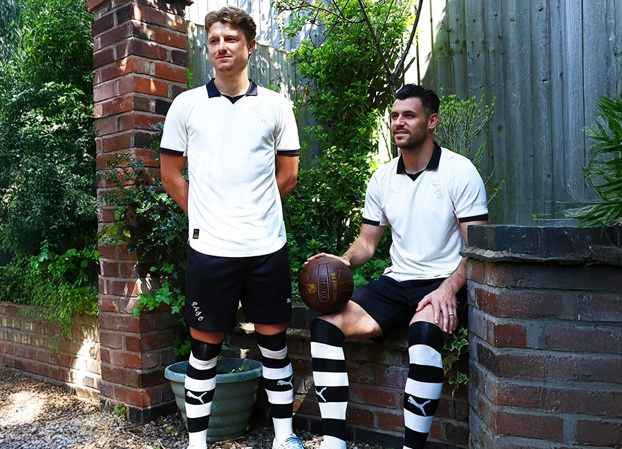
This is the new Reading FC home shirt by Puma for the 2017-18 season.

Lightweight polyester with moisture wicking technology. Designed to quickly draw sweat away from the body, keeping you drier and cooler for longer.
Seasonal Ascension graphic hoop to front and back.

Sign in or create an account to earn points for voting, keep track of your reviews, edit them, and more.


Write comments...
You are a guest ( Sign Up ? )
or post as a guest
Loading comment... The comment will be refreshed after 00:00.
  • This commment is unpublished.
    Royals75 · 7 years ago
    Probably the worst hopped top I've ever seen. f*c*
  • This commment is unpublished.
    Spirit of Stan · 7 years ago
    A modern shirt that lacks class. But for a club lacking class and any real history it's probably sutable and many of their fans will even like it (which would say much).
  • This commment is unpublished.
    Rexonthedex · 7 years ago
    @PT Yeah because Reading first wore blue & white hoops in 1871, the year they were formed. QPR were formed in, who knows when and who cares? Fake hoops? Talking out of your hoop mate
  • This commment is unpublished.
    PT · 7 years ago
    I understand why QPR fans refer to Reading as the fake hoops.
  • This commment is unpublished.
    Paul · 7 years ago
    Terrible kit good for reading
  • This commment is unpublished.
    CD · 7 years ago
    I donno what Puma are thinking this year with their hoops and stripes.
  • This commment is unpublished.
    Ants. · 7 years ago
    Oh dear.
  • This commment is unpublished.
    paulygee · 7 years ago
    Absolutely ..........


    ....meh. s*i*e.
  • This commment is unpublished.
    Greg · 7 years ago
    Compared with this seasons QPR top which is not too bad, but could be better - this one is atrocious. Absolutely god awful. 2 seasons in a row now for reading with the faded hoops on the reverse. I hope this becomes tradition because it makes them look like right mugs (which they are).
  • This commment is unpublished.
    Royals75 · 7 years ago
    @Royals75 Hooped*
  • This commment is unpublished.
    lolcat1 · 7 years ago
    nothing kit for a nothing club
  • This commment is unpublished.
    Wigan Forest · 7 years ago
    Supporting a rugby team that plays in hoops I understand the frustration that the only change in the shirts in thicker/ thinner hoops and changing the predominant colour. But after seeing this effort I don't think I'll grumble as much in future, Puma have had a shocker this summer with these dotted shirts :(
  • This commment is unpublished.
    Rexonthedex · 7 years ago
    @Spirit of Stan The fans don't get a say in what the shirt will be so it's a case of take it or leave it. What you mean by real history is winning trophies I guess? And class, f*c* me, name me a club that has class and I'll call you a lying c*n*
  • This commment is unpublished.
    Royals75 · 7 years ago
    @Rexonthedex Only for a few years and then they wore stripes for the next 50 years. And during the 80's / early 90s when modern day football identities (through the medium of TV) were being formed. Reading didn't wear hoops at all - while rangers were making their strip an icon. When people hear the term 'the hoops' they think of QPR or Celtic. And 'The R's' also QPR and not reading. It's sad but true (reading fan)

  • This commment is unpublished.
    Aj · 7 years ago
    Silly faded dots are awful....hopefully puma will drop them next season.
  • This commment is unpublished.
    Cupid Stunt · 7 years ago
    Bottom right pic, it's definitely love bless em.

    And has the back of the shirt faded in the wash?
  • This commment is unpublished.
    bcfc · 7 years ago
    awful sponsor