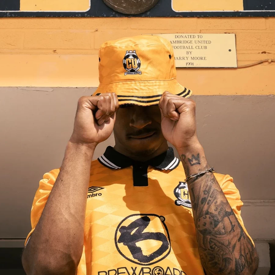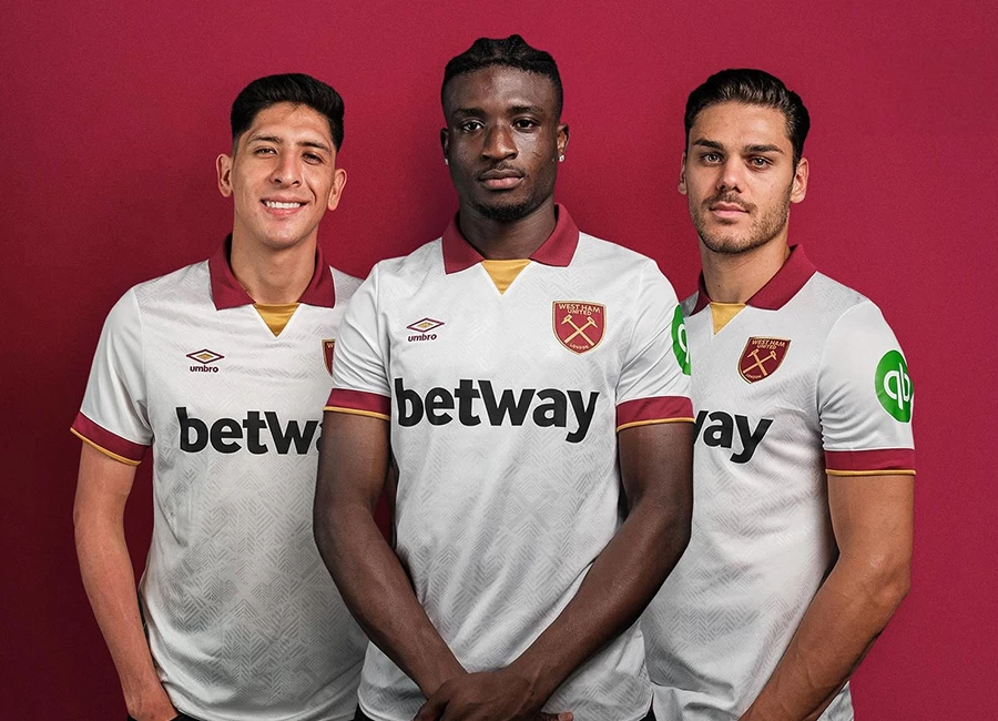
First the club, then the players, now the team strip. Another piece of the Gold Coast United jigsaw fell into place as the club’s inaugural playing strip was unveiled at Main Beach. Gold Coast United FC is an Australian football team based in Gold Coast, Queensland. It was officially announced as an expansion team for the A-League's 2009-10 season on the 28 August 2008.
Gold shirts, royal blue shorts and royal blue socks will make up the home strip, with an all white alternate to be used for colour clashes in away fixtures.
Sign in or create an account to earn points for voting, keep track of your reviews, edit them, and more.
Emblazoned on the front of both strips is the logo of the club’s major sponsor, Mineralogy, a company owned by Gold Coast United Chairman, Clive Palmer.
United CEO Clive Mensink said the logo represented the dedication showed by Mr Palmer.
“Having the Mineralogy logo on the front of our shirts shows the commitment of Clive Palmer to the future of Gold Coast United and his commitment to the local community to produce a Championship winning team.
“The strip colours are synonymous with the Gold Coast as well as being representative of the city’s traditional colours. We’re delighted with the strip and can’t wait to see our players wearing it for the first time when we take on North Queensland Fury at Skilled Park on June 23.”
Head Coach Miron Bleiberg, as ever, had a different take on the strip.
“A very well known football commentator said to me recently that we will have the home colours of Brazil and the away colours of Real Madrid,” he joked.
“I love the colours and I’m very proud of our strip. Everyone who lives on the Gold Coast will be able to relate to our colours.”


