Real Sociedad 09/10 centenary Astore kits

real-sociedad-centenary-kit.jpg

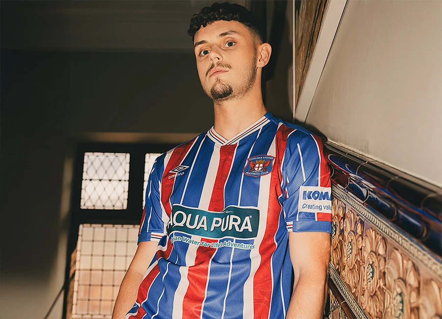
Real Sociedad unveiled their 09/10 centenary kits made by Astore.

As we know, the home design has been selected in a kit vote through the Centenary website, with most Votes have been received for this design - 9,699 of a total of 22,607.

Sign in or create an account to earn points for voting, keep track of your reviews, edit them, and more.

The away kit, on the other hand, has caused more surprise,as Xabi Prieto Aparecida was dressed completely in red.


Write comments...
You are a guest ( Sign Up ? )
or post as a guest
Loading comment... The comment will be refreshed after 00:00.
  • This commment is unpublished.
    CTEBO6 · 13 years ago
    cool
  • This commment is unpublished.
    juicemunki · 14 years ago
    smart
  • This commment is unpublished.
    fig · 15 years ago
    Glad they went with the zany stripes for the home kit. Definitely more interesting and imaginative than anything worn by any British club. The Spaniards (sorry, Basques) are far more daring and imaginative than the staid Brits, who continue to go with bland, conservative tripe.
  • This commment is unpublished.
    fabiolj · 15 years ago
    Both ugly
  • This commment is unpublished.
    steffen · 15 years ago
    Virkelig flott!
    nydelig trøye
  • This commment is unpublished.
    Guest · 15 years ago
    fantasy-kit-design, as in go wild and do what you want.
  • This commment is unpublished.
    hidgozer · 15 years ago
    netherlands got nike
  • This commment is unpublished.
    ManUnited001 · 15 years ago
    i like this as a training top more so than a match day top
  • This commment is unpublished.
    MW FROM WIDEOPEN · 15 years ago
    the red away shirt. I mean, its not like their biggest local rivals play in red and white stripes :silly: :whistle: :lol: as for teh two shirts, they just look really really cheap and quite nasty. The stripes look as though when they were developing the kit, they placed blue duct tape to mark the stripes out. as a result, it looks pretty nasty. Why not just ring up toffs and ask them to make some retro kits for them with the liga logo on the sleeves and names and numbers on the back? Granted, they may be a bit heavier and in the summer get a bit more sweaty, but at least they would look good.
  • This commment is unpublished.
    fsc · 15 years ago
    The badly-placed, clashing sponsors make this a disappointing centenary kit.
  • This commment is unpublished.
    Guest · 15 years ago
    i agree Erry these are amazin ill give u a 10
  • This commment is unpublished.
    Erry · 15 years ago
    Your netherlands kits are both wonderful! I don't understand why somebody voted it so low.
  • This commment is unpublished.
    larkhall bear · 15 years ago
    :-x :-x :-x :-x :-x
  • This commment is unpublished.
    fsc · 15 years ago
    The red one is a rip off of a Nike template (07/08 Fulham home top)
  • This commment is unpublished.
    fsc · 15 years ago
    If that won, how bad were the others? :unsure:
  • This commment is unpublished.
    fsc · 15 years ago
    away looks like nike GK templates from a few seasons ago

    and home, is just ________ , i\'m sorry i couldn\'t find a word that describes what i feel when i look at it, mess, trash, garbage, **** , crap awful, disgusting, etc. just aren\'t enough
  • This commment is unpublished.
    fsc · 15 years ago
    Away is nice
    Home looks a mess
  • This commment is unpublished.
    fsc · 15 years ago
    I\'m glad they went for the wonky stripes effect. Stripes can get really boring so its shows a bit of thought. Interesting collar design too. NIce one ASTORE
  • This commment is unpublished.
    fsc · 15 years ago
    It would have been better without the main sponsor :whistle: