kb banner 30

Huddersfield Town 2018-19 Umbro Home Kit

Huddersfield Town 2018-19 Umbro Home Kit

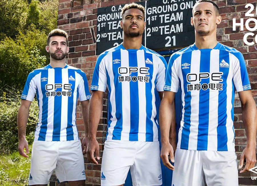
Huddersfield Town revealed the new 2018/19 home kit by Umbro. The new shirt, which features the distinct new logo of new shirt sponsor OPE SPORTS and new sleeve sponsor Leisu Sports, is the first kit to be revealed since the Club signed a new partnership with Umbro.

The biggest news from the reveal is that, for the first time in nearly 50 years, the Terrier makes a return to the shirt in its new, contemporary style!

Town first wore the Terrier on its kit for parts of the 1969/70 and 1970/71 campaigns after then-Chairman Frank Drabble introduced the nickname to the Club in his programme notes for a home game against Bolton Wanderers in late September 1969.

Sign in or create an account to earn points for voting, keep track of your reviews, edit them, and more.

The Terrier was then introduced to the players’ shirts, which were previously plain, for a league game at Blackpool on 15 December 1969 and was worn on both the home and away shirts as Town gained promotion back to the top division on English football under Ian Greaves.

Now, with Umbro pushing forward with contemporary designs, player-led performance insight, and compelling club stories, the new Terrier has returned for the second Premier League campaign!

Although the new Terrier will appear on Town’s shirts this season, it has NOT replaced the current Huddersfield Town crest; that is still the official crest of Huddersfield Town and will continue to be used in all other areas.

In 1977, Umbro introduced the iconic running diamond to the field of play. In the following decades the double diamond continued to adapt with the ever-changing face of the game.

For the new season Umbro‘s taping story evolves. Moving from the tradition to the contemporary. A fresh outlook on a Football staple.

Town’s home kit is constructed in lightweight durable fabrics and executed with great fit which can withstand the pressures of the modern game, whilst creating a wearable uniform for the fan. To aid comfort, ergonomic mesh panels have been constructed at the underarm providing maximum breathability.

The Terrier and bold styling are present on the kit; this is always at the heart of Umbro overall strategy, complimenting the team pitch presence.

Umbro has recreated an iconic and classic Huddersfield Town striped home shirt for the for coming season. The crisp lines with white crest, running diamond and branding gives a clean on-pitch visual.

The shorts feature articulated side seams and side panels help to make the 2018/19 season shorts agile, whilst adding performance. The elasticated waistband gives support and security for the whole 90 minutes.

 

Write comments...
You are a guest ( Sign Up ? )
or post as a guest
Loading comment... The comment will be refreshed after 00:00.
  • This commment is unpublished.
    Marco · 6 years ago
    I'm confused, this badge is an old one they have brought back then or a new design??? It's seriously cool. It looks modern but also like some retro 70's, kaizer chiefs, Pumas UNAM style. Its a bit mad but I love it :D Another great kit from umbro too.
  • This commment is unpublished.
    Craig · 6 years ago
    @Russel1311 Not a word to fans about the new crest from the club
  • This commment is unpublished.
    Russel1311 · 6 years ago
    The new badge is ok, as modern corporate-style logos go, and I'm sure fans were consulted fully in its design, but... it doesn't say 'Huddersfield Town' on it...
  • This commment is unpublished.
    Chris Allen · 6 years ago
    Well i have to say begrudgingly as a Leeds fan that i really like this, simple design perfect colour. Normally find Town kits pretty offensive and to be honest I've seen the Umbro design on other shirts and it just doesn't work but it looks cracking here.Shame about the Sponsor,would have been almost perfection without it. Good luck for next year,hopefully see you soon ALAW
  • This commment is unpublished.
    Lofty · 6 years ago
    I’m a Bradford fan but even I have to admit that is a nice shirt. Also, the badge is pretty decent too. I think Leeds could do with asking for a bit of advice in badge design :D
  • This commment is unpublished.
    Jacko · 6 years ago
    Umbro have nailed it here. That’s how to do stripes, and no plain back. That badge is epic, but should it not be embroidered into the shirt rather stuck on like that? Looks like it could peel off? It is a smart new badge though, can’t think of any of the recent changes that have been as good as that one, we’ll done Udders.
  • This commment is unpublished.
    John · 6 years ago
    @Marco No Marco this version of our Terrier badge has only come into play since we gained promotion back to the Premiership in 2017 & came under Chinese sponsorship, so to attract a worldwide audience (especially the Far East) we redesigned the Terrier??(i personally can't stand this new version) to coincide with the Chinese year of the dog.
    I'm not a happy bunny that we've ditched our traditional emblem & the 3 stars above it that symbolise us being the first team to win the league 3 times in a row which is part of our rich heritage & a feat that's never been surpassed?
  • This commment is unpublished.
    Ten can Stan. · 6 years ago
    These Chinese sponsors really are hideous. Nice kit though, and the badge change? Fantastic. Wish the Bee’s had have gone down this route with ours. Ours is ok but not anywhere near as radical, different or effective as that. Brave decision but I reckon most of there fans will love it, and the ones that don’t will grow to.
  • This commment is unpublished.
    Lilly White · 6 years ago
    Lovely kit Umbro, better than boring Nike efforts. That badge is a cracker. I can’t even recall what their badge was like before so it must be an improvement. Nice and simple like ours (spurs) COYS!
  • This commment is unpublished.
    Tony · 6 years ago
    Oh my!! That new badge is absolutely awesome, and I hate 'Udders as I'm a Wednesday fan :D Reminds me of our old Owl, simple and iconic, oh how I wish we still had that badge instead of this new horrid one. Why have we ditched such a strong design and changed to a stuffy old fashioned one just when anyone with any sense is doing the opposite!?
    Nice kit too, well jealous!

  • This commment is unpublished.
    Jimmy · 6 years ago
    Absolutely lovely shirt, perfect shade of blue and nice and classy. The Terrier is even better than the shirt. Such a strong design and is up there with some of the most iconic badges out there. The club released this 12 months ago, so people have been able to get used to it. And they have monitored fans reaction to it, which as far as I know has been hugely positive. It was designed by a Town fan too. Top shirt and top badge :)
  • This commment is unpublished.
    salah · 6 years ago
    cracking shirt but sponser ruins it
  • This commment is unpublished.
    DJW · 6 years ago
    A lovely kit and such a nice colour of blue, great job Umbro. Really pleased to have Huddersfield back for another season in the Premier League - good luck from a Watford FC fan.
  • This commment is unpublished.
    Aj · 6 years ago
    Cracking looking kit and good to see the Yorkshire terrier back....just a pity they didn’t stick to the original version.
  • This commment is unpublished.
    Mark · 6 years ago
    @Craig The Terrier is only being used for the 18/19 season. It is not replacing the club crest.
  • This commment is unpublished.
    Socrates · 6 years ago
    "The elasticated waistband gives support and security for the whole 90 minutes."

    That's good to know. No doubt someone was paid to regurg*tate such marketing twaddle.