kb banner 30

Juventus 2018-19 Adidas Home Kit

Juventus 2018-19 Adidas Home Kit

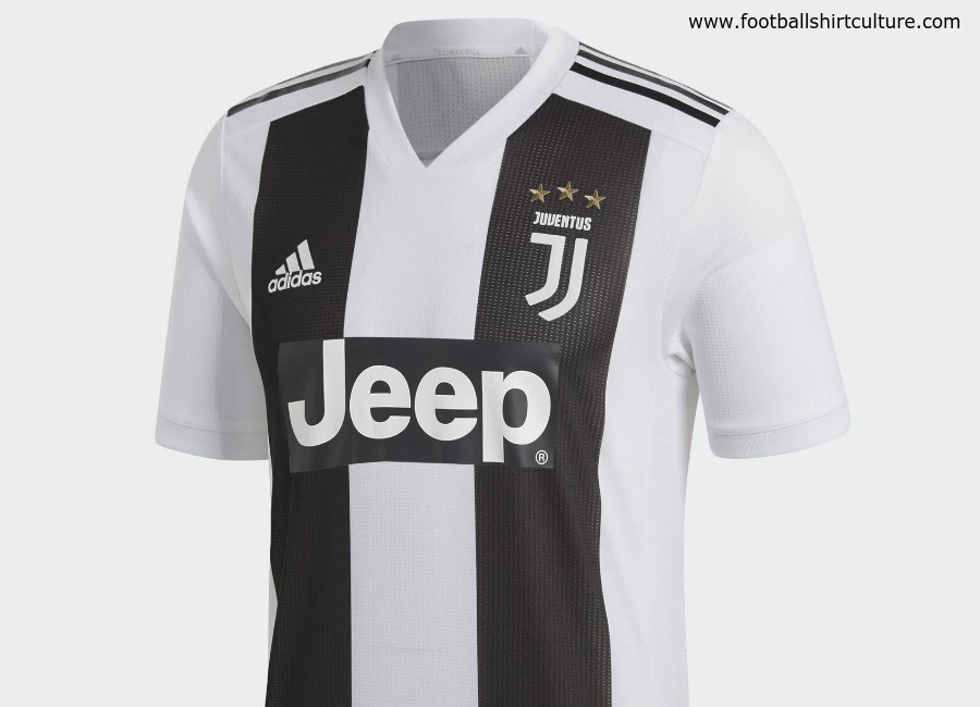
Juventus have revealed their new home shirt made by Adidas for the upcoming 2018/19 season.

The new jersey sees the club continue with its redesigned identity, "Black and White and More", whilst also honouring its rich history, as a unique new striping composition combines with the traditional black and white colours.

The new striping consists of two vertical stripes on the front with just one on the back; a bold and simple new design, offering a more contemporary look for a football style icon. The jersey also features the club’s modern new logo and the new Adidas authentic collar construction.

Sign in or create an account to earn points for voting, keep track of your reviews, edit them, and more.

Francesca Venturini, Designer at Adidas said: “Juventus isn’t just one of the most ambitious clubs in the world from a football perspective, but also in terms of having a bold and forward-thinking approach to design. The redesigned identity of ‘Black and White and More’ guides all of our work with Juve and allows us to innovate with modern interpretations of a historic club. This new home jersey is a great example of that.”


Write comments...
You are a guest ( Sign Up ? )
or post as a guest
Loading comment... The comment will be refreshed after 00:00.
  • This commment is unpublished.
    The tailer · 6 years ago
    This looks like an unfinished Juventus shirt.
  • This commment is unpublished.
    TheHunter · 6 years ago
    Yes, that Jeep sticker makes it look like an H. And the broken strip on the back is even worse, it looks so poorly thought out. Doesn't stand a chance to their 17/18 kit!
  • This commment is unpublished.
    D. Zoff · 6 years ago
    Too much white on a Juve strip.
  • This commment is unpublished.
    Waldschrat · 6 years ago
    This is not a Juventus kit.
  • This commment is unpublished.
    Gloria Scock · 6 years ago
    The sponsor material should be the same material as the black stripes. Looks cheap the way its just stuck on.
  • This commment is unpublished.
    Fiofiodor · 6 years ago
    [b]H[/b] stands for winning...
  • This commment is unpublished.
    Fighting Pride of Skem · 6 years ago
    Badge is woeful. Kit doesn't look right. Stripe on the back looks bizarre.
  • This commment is unpublished.
    Bob24 · 6 years ago
    Not a very good effort. I've no issues with the Juventus badge, but the two thick stripes and the sponsor's logo look terrible. Adidas have had 4 attempts at a Juve home kit, and only the current 2017/18 effort looks good.
  • This commment is unpublished.
    BaddersTUFC · 6 years ago
    Juventus should be thin black stripes. It’s not rocket science.
  • This commment is unpublished.
    Saul · 6 years ago
    That dodgy club badge just kills it..
  • This commment is unpublished.
    Old Lady · 6 years ago
    H


    HMMMMM
  • This commment is unpublished.
    DJ · 6 years ago
    @The tailer Not much you can do when UEFA rules require a “clean” space to legibly print the player’s name and number.