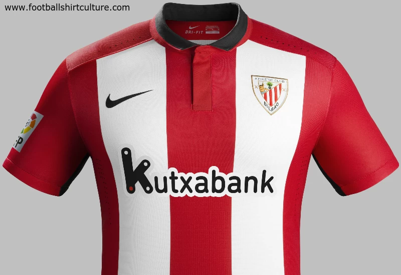
Athletic Club de Bilbao 15/16 Nike Home Kit

Nike has unveiled the new Athletic Club de Bilbao home kit for the 2015/16 season.

Athletic Club de Bilbao’s traditional red and white stripes have become wider and bolder — five stripes are built around a central block of red that travels from the collar down to the hem. A single red panel runs across the red shoulder blades and sleeves to accentuate this part of the body.

The shirt boasts a modern, tailored black polo neck collar with buttons concealed beneath the placket. There is a fine red trim around the edge of the collar, which can be turned up to reveal an all-red underside.

Sign in or create an account to earn points for voting, keep track of your reviews, edit them, and more.

Each of the shirt’s flanks features a black stripe, and these continue in white along the sides of the otherwise black shorts.

On the back of the neck sits a small Ikurrina, the Basque flag. This design represents Athletic Club de Bilbao’s pride in their roots.

The new home socks are black with a red band at the top, and a tonal stripe of small red and white chevrons on the calf.

 

Write comments...
You are a guest ( Sign Up ? )
or post as a guest
Loading comment... The comment will be refreshed after 00:00.
  • This commment is unpublished.
    GUiza · 9 years ago
    Poor catalogue shirt... In the good old days Nike's factory would have been bombed by Eta
  • This commment is unpublished.
    Gazhorn · 9 years ago
    Fantastic kit. Nice touch too with the Basque flag under the collar.

    Still strange to see an Athletic Club jersey with a sponsor although it is a local Basque bank.
  • This commment is unpublished.
    good · 9 years ago
    nike kits are always an amazing fit i think. they are tailored better than any other brand
  • This commment is unpublished.
    Your nan · 9 years ago
    The Spanish Brentford springs to mind, nice kit.
  • This commment is unpublished.
    Baskerville Hound · 9 years ago
    One of Nikes better efforts. I like the wider stripes which contrast nicely with the black trim. However what are those s*u*i* perforations on the shoulders. Apart from that I like it
  • This commment is unpublished.
    Kenetico · 15 years ago
    I agree with curswine. But maybe thats because i'm norwegian, and we're also playing with the flag on the chest. That's tradition :yes:
  • This commment is unpublished.
    · 15 years ago
    Of course it is a fantasy kit design. but still fantasy kits need to retain something which is identifiable to the team/nation which is drawn for and I just don't recognise Turkey from their FA logo, they are such a proud quite nationalist country that the use of national flag on the shirt looks more 'proper' than this.

    Also this logo is a pretty poor design and I don't think it's good enough to be seen on any shirt.

    but yeah, just my opinion.
  • This commment is unpublished.
    bastien · 15 years ago
    I think that this crest looks way better than the simple flag. Isn't it fantasy kit design ? So why not ?

    That being said, I'm not a fan of the numbering, looks more like circus than football, but... Why not !
    :smile:
  • This commment is unpublished.
    Guest · 15 years ago
    I think that this crest looks way better than the simple flag. Isn't it fantasy kit design ? So why not ?

    That being said, I'm not a fan of the numbering, looks more like circus than football, but... Why not !
    :smile:
  • This commment is unpublished.
    Guest · 15 years ago
    ^chill bro, hes new, let him do his thing

    GOOONER 4 LIFE
  • This commment is unpublished.
    mascotten83 · 15 years ago
    Yeah,right curswine.....
  • This commment is unpublished.
    Guest · 15 years ago
    petr cech wannabe sounds like a tart :D:
  • This commment is unpublished.
    · 15 years ago
    What's with the aggressive talk? I was just pointing out a few things and from watching Turkey play I am sure you will have noticed that the FA logo has never appeared on the kit, it is always the national flag.
  • This commment is unpublished.
    Petr Cech Wannabe · 15 years ago
    well sorry mister im to cool for you, i dont sit here and design kits all day, i play the sport
  • This commment is unpublished.
    mascotten83 · 15 years ago
    Is this a player shirt or goalkeeper shirt?
  • This commment is unpublished.
    · 15 years ago
    Doesn't matter too much if you're new, Surely from seeing Turkey play you'-) know this and just from watching football you'-) know a font such as that isn't very normal to see.
  • This commment is unpublished.
    Guest · 15 years ago
    Bad work I mean, and turkey national football team colours red and white. this black - red very bad design
  • This commment is unpublished.
    Petr Cech Wannabe · 15 years ago
    Im new so i dont know whats right and worng, plus i just slop stuff on there
  • This commment is unpublished.
    · 15 years ago
    Turkey have never used the FA logo on their shirts and the font isn't very football like, the rest is just template stuff so meh.