Chelsea 15/16 Adidas Away Kit

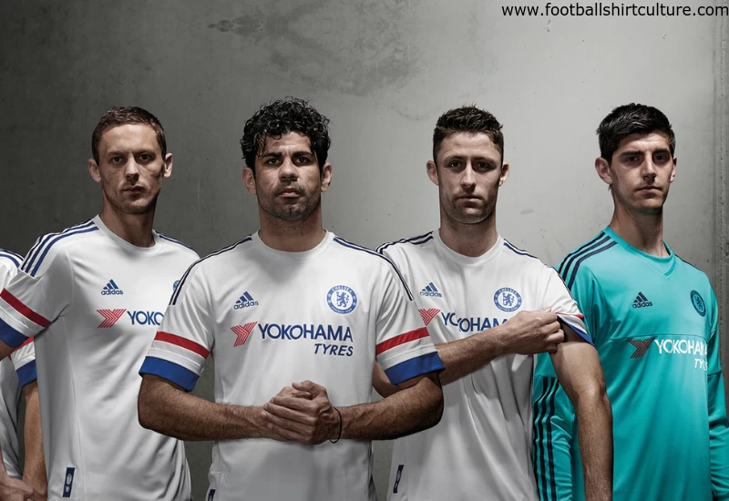
This is the new Chelsea away football shirt by Adidas.

The kit features a white, red and blue colour scheme which has been the theme of a number of classic away kits over the past 110 years.

A white kit was also worn by the club across its UEFA Champions League-winning season in 2012 and was last seen as a design scheme in the 2013/14 season when Jose Mourinho returned as manager for his second spell in charge.

Sign in or create an account to earn points for voting, keep track of your reviews, edit them, and more.

The design has been combined with the latest adidas performance technologies designed to allow players to be faster and more comfortable on the field. The shirt includes climacool ventilation technology designed to help keep the body cool and dry through breathable materials, fabrics and special stitching which provides greater freedom of movement and comfort without sacrificing flexibility and resilience.


Write comments...
You are a guest ( Sign Up ? )
or post as a guest
Loading comment... The comment will be refreshed after 00:00.
  • This commment is unpublished.
    Big Kev fae govan · 9 years ago
    absolutely beautifil il b gettin this n the rangers 3d kit this season

    god bless u chelsea gd proud british club like rangers blues brothers WATP
  • This commment is unpublished.
    tom bola · 9 years ago
    France away?
  • This commment is unpublished.
    aaaa · 9 years ago
    Bland and lazy yet again by Adidas
  • This commment is unpublished.
    Sep Bladder · 9 years ago
    Class
  • This commment is unpublished.
    The special bun · 9 years ago
    Looks like a training shirt. Bit lazy.
  • This commment is unpublished.
    Sunny · 9 years ago
    looks like a Lyon kit
  • This commment is unpublished.
    Baskerville Hound · 9 years ago
    Very ordinary
  • This commment is unpublished.
    Not a royal · 9 years ago
    I like the individual sections (particularly the bands on the arms, and the t-shirt style simplicity of the neck and shoulders), but for some reason the shirt as a whole - to me - looks over-complicated. I think maybe because of the blue band at the base of the shirt - I haven't been a fan of that band on most of the new Adidas shirts. When I cover that with my finger the kit as a whole looks much more refined! Just a personal view though.
  • This commment is unpublished.
    tanay16 · 9 years ago
    Love it!
  • This commment is unpublished.
    Gazhorn · 9 years ago
    Very nice. The sponsor actually works well with it.
  • This commment is unpublished.
    Polter · 15 years ago
    Wonderful kit.


    I love the shade of blue

    This template would also work perfectly for Coventry City FC