Everton 15/16 Umbro Away Kit

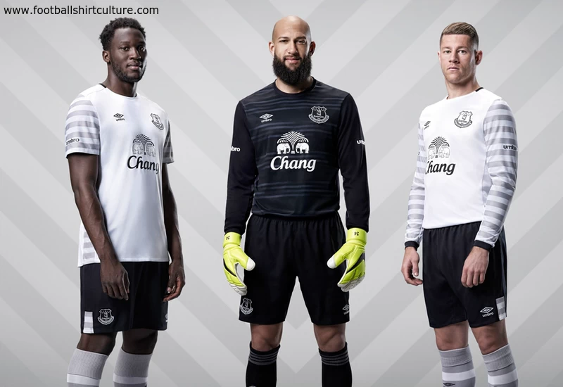
Everton unveiled the new 2015/16 Away kit by Umbro. The new white, grey and black kit - which will be worn for the first time during the overseas pre-season tournament - will be worn by Toffees fans and players on their travels throughout the forthcoming season.

The new kit, predominantly white with an eye-catching grey graphic detailing on the sleeves, is constructed using highly technical performances materials, including a textured mesh on the back for maximum ventilation.

The shirt also features a two colour crew neck collar while on the back of the shirt the letters NSNO are proudly displayed - a nod to the club's famous 'Nil Satis Nisi Optimum' motto - 'Nothing But The Best Is Good Enough'.

Sign in or create an account to earn points for voting, keep track of your reviews, edit them, and more.

Completed with a textured club crest and the Umbro logo embroidered on the chest, the kit is accompanied by black shorts with contrast grey panelling and white socks with a grey trim.

 

Write comments...
You are a guest ( Sign Up ? )
or post as a guest
Loading comment... The comment will be refreshed after 00:00.
  • This commment is unpublished.
    Dagenham Dave · 9 years ago
    Not a fan of this one.
    I think the sleeves look odd.
    Maybe it would have looked better if the whole shirt had the hoops
  • This commment is unpublished.
    dario2739 · 9 years ago
    I actually really like that.
  • This commment is unpublished.
    Sunny · 9 years ago
    looks like a woman's jumper
  • This commment is unpublished.
    The Cat · 9 years ago
    Amazing. And I think the long-sleeved version looks even better than the short-sleeves
  • This commment is unpublished.
    Tone Balone · 9 years ago
    I feel like Umbro are indulging us fanboys with those stripes on the sleeves and shirt sides. :oops: But I love it. The stripes are like having your cake AND eating it, too.
  • This commment is unpublished.
    Richard O Brien · 9 years ago
    They look like pyjamas
  • This commment is unpublished.
    Rowdy Rod · 9 years ago
    Tim Howard looks like Andre the Giant's ball bag and the shirt... the arms look like something out of Alice in Wonderland or some other stockinged-fairytale.

    Doesn't look right.
  • This commment is unpublished.
    Not a royal · 9 years ago
    Hoops work great on the short-sleeved version, look a bit odd on the longer sleeves.

    I love the little glimpse of the hoops on the shorts - very nice.
  • This commment is unpublished.
    bren333 · 9 years ago
    It does look better in the short sleeves, but at least Umbro are trying things.
  • This commment is unpublished.
    Sep Bladder · 9 years ago
    It's much better then anything else I've seen from Umbro this season. Plus they could have PumTRASH!!!
  • This commment is unpublished.
    Barefoot Cuntessa · 9 years ago
    Not as good as last season's white Everton shirt.
  • This commment is unpublished.
    Baskerville Hound · 9 years ago
    Nice kit . As ever Umbro produce style. However the long sleeve version just looks wrong
  • This commment is unpublished.
    soulboy slim · 9 years ago
    Great second kit, like it very much. Welcome back to the big league Umbro.
  • This commment is unpublished.
    Djer73 · 9 years ago
    I don't like the sleeve logos either, short sleeve shirt looks better dure to the hoops.
  • This commment is unpublished.
    Gazhorn · 9 years ago
    Great looking kit. I don't like the unnecessary 'Umbro' logos on the sleeves though.