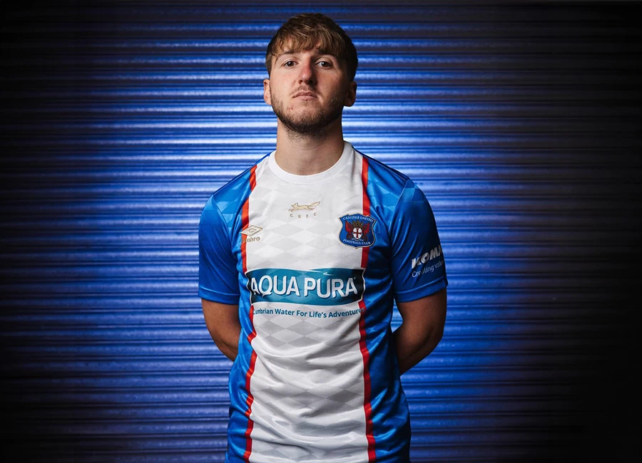
Fiorentina unveiled their new 15/16 Home football shirt by Le Coq Sportif.
The jersey is made of high-tech polyester. The back is made of the same material, but it is ventilated for better breathability and moisturewicking properties.
The brand has unveiled a new performance logo. It shows the rooster coming out of its triangle and looking to the right, on an arched tricolour base. As on the brand’s first jerseys, it is flocked on the chest, a proud reminder for players.
Sign in or create an account to earn points for voting, keep track of your reviews, edit them, and more.
Le coq sportif wanted to print the words “orgoglio viola” (viola pride) inside the neckline of the jersey as a tribute to Viola fans and their loyalty.
The sleeve features the timeless symbol of Florence, the lily. This flower is an allusion to the fans’ love for their city and the pride of being a Fiorentino.
The close-fitting, dynamic cut is faithful to the brand’s patterns. The flat seams help reduce chafing, keeping the players comfortable.
The brand has unveiled a new performance logo. It shows the rooster coming out of its triangle and looking to the right, on an arched tricolour base. As on the brand’s first jerseys, it is flocked on the chest, a proud reminder for players.
The sleeve features the timeless symbol of Florence, the lily. This flower is an allusion to the fans’ love for their city and the pride of being a Fiorentino.
The bottom of the jersey also features an authentic touch, the text «Produit Officiel - Garantie Qualité» («Official Product - Quality Guarantee»), a reference to le coq sportif’s origins in the knitwear industry. Early on, the factory supervisor would stamp all the products as certified compliant before they were released from the plant.


