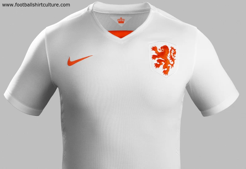
The Netherlands unveiled their new 2015-2016 away football kit by Nike.
The kit design represents the speed, movement and energy of the national team and combines innovative graphics with the iconic classic Dutch color palette of orange and white.
The shorts feature a printed gradient speed graphic consisting of orange and white light rays, which extends up the side panels of the shirt to represent their distinctive style of football.
The innovative graphic on the shorts creates a strong sense of motion and a blur of color and light when the Dutch players are in action.
The color in the graphic is most intense in the middle and the deep hue comes together near the waist on the shorts and on the hem of the shirt before gradually becoming lighter down the shorts and up to under the arms of the shirt.
The white base of the away shirt amplifies the famous saturated orange of the home shirt in the graphic, crest and numbers. The renowned Dutch graphic designer and typographer Wim Crouwel created a special font for the names and numbers on the kit. The bold and modern font also maintains a distinctly retro appearance, reminiscent of the style seen throughout football during the 1970s.
The away shirt continues to feature the enlarged lion symbolizing Dutch football values of simplicity, honor and unity. A pennant tab inside the back of the neck displays the crown that sits upon the lion’s head on their association’s crest.
The shirt also boasts a new Nike-specific streamlined, clean and modern V–neck collar in white with an orange triangle insert.
The new away socks are white with a wide tonal stripe of chevrons on the calf at the back.
While the new kit features Nike’s signature style and passion, it has also been designed to offer players the very latest in performance innovation, kit technology and environmental sustainability.

