Leicester City 15/16 Puma Away Kit

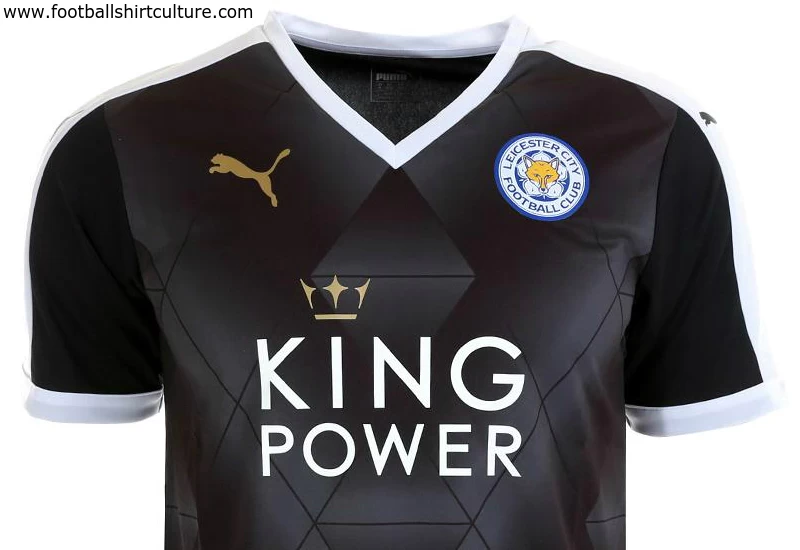
Leicester City revealed the new 2015/16 away football kit by Puma.

The shirt carries hints of white and gold and features a diamond pattern across the chest, with a white V-neck collar and white stripes running down the shoulders, complete with King Power’s new logo.

Shorts continue the black and white theme, with an easily-identifiable gold Puma logo on the left leg and City’s crest on the right leg. The socks are also black with a white stripe and feature ‘LCFC’ running down the back – it is the first time City will wear a black away kit since the 2012/13 season.

Sign in or create an account to earn points for voting, keep track of your reviews, edit them, and more.


Write comments...
You are a guest ( Sign Up ? )
or post as a guest
Loading comment... The comment will be refreshed after 00:00.
  • This commment is unpublished.
    Neil_LCFC · 9 years ago
    Quite like the shirt but with darker black shorts looks well dodgy.
  • This commment is unpublished.
    JimMc · 9 years ago
    Hate black kits. Especially when home shirt is dark. Nothing wrong with a white or yellow kit. Puma has done us over completely this season. All blue home kit (no white anywhere to be seen!) Terrible away kit. I hear there is a third white kit. I think if I buy a shirt it'll be that one.
  • This commment is unpublished.
    88milesperhour · 9 years ago
    I kinda like it!! sorry people!! I like that the shirt is a lighter colour than the shorts! I even think the pattern looks good on the shirt too!! I know it's terrible that I like it and I would dislike this comment myself if I could!!
  • This commment is unpublished.
    Yo-Yo. · 9 years ago
    I'm of an age where black should be the colour of the referee only.... Ah well, kids these days! I used to get up two hours before I went yo bed! Jumpers for goalposts!
  • This commment is unpublished.
    Quasar · 9 years ago
    And look at the colour difference between shirt and shorts. Doesn't look good.
  • This commment is unpublished.
    Ron Swanson · 9 years ago
    Don't know about King Power, those diamonds are 'king horrible...
  • This commment is unpublished.
    Jimbo and the Wiggles · 9 years ago
    Barnsley away but with pointless diomands.
  • This commment is unpublished.
    Tone Balone · 9 years ago
    I don't know why, but I can tolerate this color way more than the Arsenal shirts. Still don't like that off-color black sleeve bit, or the darker black shorts, but I can handle this shirt a little better.
  • This commment is unpublished.
    Oliver66662 · 9 years ago
    In the publicity picture it looks like someone put something in jamie vardys backside! hehe Look at his face he does not look happy!

    This would be a fantastic kit for a referee
  • This commment is unpublished.
    Footyfanatic · 9 years ago
    Enough with the diamonds. I thought Nike's armpit stripes were the worst pointless design element of this year. I was wrong.
  • This commment is unpublished.
    Sep Bladder · 9 years ago
    f*c* off PumTRASH
  • This commment is unpublished.
    pachyderm · 9 years ago
    that is s*i*! they did it to rangers too!
  • This commment is unpublished.
    Baskerville Hound · 9 years ago
    Not a fan of the diamonds at all Sorry Puma this is horrible
  • This commment is unpublished.
    Gazhorn · 9 years ago
    The cheaper Genesis version of the current faded-diamond pattern.

    I'll expect to see Watford's next away kit looking similar to this.

    Absolutely hate that low-cut v-neck.
  • This commment is unpublished.
    Chippy · 9 years ago
    Not a lover of pumas diamond style this season
  • This commment is unpublished.
    · 15 years ago
    Not a bad recreation of the kit in Pro Evo also pretty good guess at the shorts,