Urawa Red Diamonds 2015 Nike Away Football Shirt

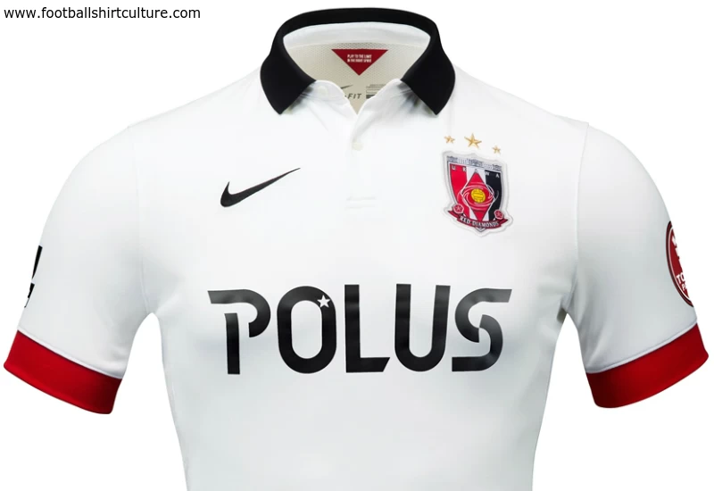
This is the new 2015 season Urawa Red Diamonds Away football shirt and kit, by Nike.

The white shirt is complemented with a neat tailored style collar in black and thick red cuffs. The crest is full colour and the Nike Swoosh logo and POLUS sponsor legend are both in black.

The Mitsubishi logo appears on the upper back and takes front and centre positioning for Asian competition matches.

Sign in or create an account to earn points for voting, keep track of your reviews, edit them, and more.

The Japanese J-League side's first choice Away shorts are black and the socks white, though these can be interchanged with the, respectively, white and black Home versions.

 

Write comments...
You are a guest ( Sign Up ? )
or post as a guest
Loading comment... The comment will be refreshed after 00:00.
  • This commment is unpublished.
    Youaint my real daddy · 10 years ago
    Dull
  • This commment is unpublished.
    Laslow123 · 10 years ago
    it's a nice shirt all the safe, Nike playing it safe from the looks of things, but that is not always a bad thing.
  • This commment is unpublished.
    Superfrank · 10 years ago
    Search for Hong Kong's 2014-15 away kit. It's exactly the same shirt. Wtf nike???!!!!
  • This commment is unpublished.
    prozac_gr · 10 years ago
    Nice shirt... I like the different colour of collar and sleeve's end...
  • This commment is unpublished.
    · 15 years ago
    I think the amount of logos strangely contributes to the shirt looking nice, without them this would look too plain and oddly enough the amount of sponsors South american teams use on their shirts kind of gives them their own unique identity.
  • This commment is unpublished.
    Guest · 15 years ago
    Good job, nice to see Bolivian teams between Barcelona & Man Utd shirts... :-)
    That being said, I'm not sure about few details :
    - First, you're new crest is 10x better than the original one. But I think the panther and 1908 should be more "visible". Maybe white.
    - I would also prefer it on the side of the shirt instead of in the center, so that the TIGO logo can be upper.
    - PUMA logos should also be white IMO.
    - PACENA logo spoils the back of the shirt in red & white... I know that sponsors fight to keep their colors even if it doesn't suit the club's colors, but fantasy kit design allows you to make everything you want with it, so...
    Imrove those few details and your very good kit will become a very very good kit ! :-)
  • This commment is unpublished.
    dylan keenan · 15 years ago
    Hmm...
    I feel that the Logo you designed, is slightly over sized, but is very good all over...