Liverpool 2017-18 New Balance Away Kit

Liverpool 2017-18 New Balance Away Kit

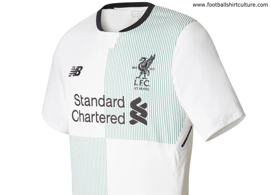
This is the new Liverpool 17/18 away kit by New Balance. The New Balance strip celebrates the club’s 125th anniversary year by continuing the retro-style theme for next season with a quartered green and white shirt that takes inspiration from the team’s first jersey in 1892.

The kit features an embroidered commemorative Liver bird crest and a subtle pin stripe within the design – and is completed by a black collar, black shorts and white socks with a green horizontal stripe and black trim.

Sign in or create an account to earn points for voting, keep track of your reviews, edit them, and more.


Write comments...
You are a guest ( Sign Up ? )
or post as a guest
Loading comment... The comment will be refreshed after 00:00.
  • This commment is unpublished.
    Willow · 7 years ago
    Huh, green and white? Everton won't be happy.
  • This commment is unpublished.
    Godless Ape · 7 years ago
    Shocking. This will come up at the end of season awards for worst kit, I have no doubt
  • This commment is unpublished.
    Pedrodelawasp · 7 years ago
    I preferred Adidas' bolder take on the green and white quarters from the 90s, but this is quite smart too
  • This commment is unpublished.
    Mark · 7 years ago
    Am I the only one that thinks this kit is rubbish? I mean for a Celtic third shirt sure, but as an away kit Liverpool will be wearing fairly regularly, it's hideous.
  • This commment is unpublished.
    Andi · 7 years ago
    "Sunday League kit suppliers attempts to rip-off a Premier League club design in abysmal fashion" chic is how I would describe this nonsense.
  • This commment is unpublished.
    Merseyswimmer · 7 years ago
    @Willow Why?
  • This commment is unpublished.
    Jamie ynwa96 · 7 years ago
    Nice kit, But not now..
    If they're going to make the Home such a Classic, the Deeper Red etc (what we SHOULD ALWAYS BE ANYWAY)
    They should've went with the Exact Opposite with an ALL white kit & red V'neck, Gold crest etc, and for a 3rd kit, exactly the same again in Our past DEEP yellow..(But none of that ridiculous illuminated see in the dark s*i*e...That's not Liverpool.
    LFC is a Club of Class, an THAT crap is common dirt and doesn't Suit Anfield...)
    The Away for 17/18, nice, but Also disappointing...
    (Apologies for waffling on)
  • This commment is unpublished.
    Glenn Hysen · 7 years ago
    Absolutely a masterpiece from New Balance. One of the best away kits ever!
  • This commment is unpublished.
    Sean · 7 years ago
    This is so tight. Perfect contrast to the home shirt, nice throwback to the awesome quartered Adidas kit of the 90s while giving it a slight modern twist. Didn't stop there, added unique custom socks. This si dope. Haters think about it for more than a second. ;)
  • This commment is unpublished.
    Modstalgic · 7 years ago
    I like it. VILLA had quarters away shirt a few years ago, always a smart design just ask Bristol Rivers ;)
  • This commment is unpublished.
    Jamie ynwa96 · 7 years ago
    @Godless Ape *totally agree with you*
    Nice kit, But not now..
    If they're going to make the Home such a Classic, the Deeper Red etc (what we SHOULD ALWAYS BE ANYWAY)
    They should've went with the Exact Opposite with an ALL white kit & red V'neck, Gold crest etc, and for a 3rd kit, exactly the same again in Our past DEEP yellow..(But none of that ridiculous illuminated see in the dark s*i*e...That's not Liverpool.
    LFC is a Club of Class, an THAT crap is common dirt and doesn't Suit Anfield...)
    The Away for 17/18, nice, but Also disappointing...
    (Apologies for waffling on)
  • This commment is unpublished.
    Spartan · 7 years ago
    Fantastic home kit. Great away kit. NB are really stepping it up.
  • This commment is unpublished.
    niguel nazinho · 7 years ago
    Nice kit, looks smart.
  • This commment is unpublished.
    Aj · 7 years ago
    Seen worse
  • This commment is unpublished.
    Monty81 · 7 years ago
    Not sure why people are so offended. They hate nike cos they are plain, they hate warrior cos they had mental designs and they hate new balance now because of this? You cant win. Its just a b*o*d* kit and itll change again next season. Get over it
  • This commment is unpublished.
    DIDI · 7 years ago
    @Pedrodelawasp I absolutely agree. The 90's was way much better.
  • This commment is unpublished.
    Jamie ynwa96 · 7 years ago
    @Mark Nice kit, But not now..
    If they're going to make the Home such a Classic, the Deeper Red etc (what we SHOULD ALWAYS BE ANYWAY)
    They should've went with the Exact Opposite with an ALL white kit & red V'neck, Gold crest etc, and for a 3rd kit, exactly the same again in Our past DEEP yellow..(But none of that ridiculous illuminated see in the dark s*i*e...That's not Liverpool.
    LFC is a Club of Class, an THAT crap is common dirt and doesn't Suit Anfield...)
    The Away for 17/18, nice, but Also disappointing...
    (Apologies for waffling on)
  • This commment is unpublished.
    Matt · 7 years ago
    The socks are epic
  • This commment is unpublished.
    Jim the Eagle · 7 years ago
    @Andi New Balance are far from "Sunday League". They have been making Sevilla kits for 2 seasons now and they are always smart designs and the quality of the kit is excellent.
  • This commment is unpublished.
    Vile Vince · 7 years ago
    Really smart kit!