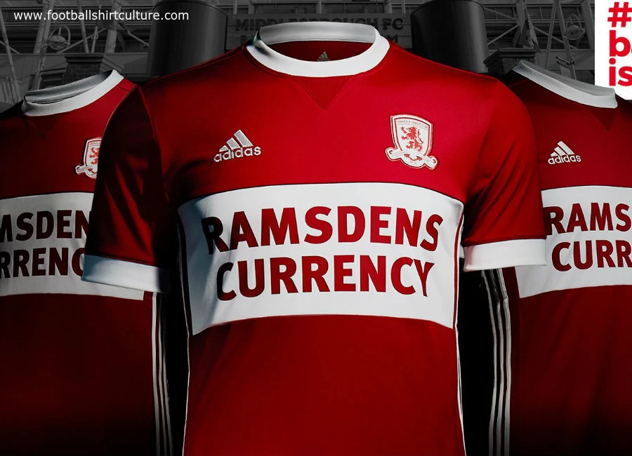
Middlesbrough 2017-18 Adidas Home Kit

Middlesbrough F.C. revealed their new home kit by Adidas for the 17/18 season, which includes the return of Boro's iconic white band.

The simple but eye-catching Boro-red design features a round neck and adidas' trademark three-stripe piping, and bears the new-look Ramsdens Currency logo of Boro's Principal Partner, Ramsdens.

Sign in or create an account to earn points for voting, keep track of your reviews, edit them, and more.


Write comments...
You are a guest ( Sign Up ? )
or post as a guest
Loading comment... The comment will be refreshed after 00:00.
  • This commment is unpublished.
    Jaybo.b · 7 years ago
    Sponsor completely ruins it. Far too big.
  • This commment is unpublished.
    Alan Foggon · 7 years ago
    It's good to see that Middlesbrough have reverted to their tradition design. But I think even the blind can see who the sponsor is!!! Huge!!!!!
  • This commment is unpublished.
    ASR · 7 years ago
    adidas can even make a team in red look good; contrary to nike who seems to be out trying to destroy every kit in europe.
  • This commment is unpublished.
    Up the Boro · 7 years ago
    f*c*i*g s*i*e!
  • This commment is unpublished.
    Midelsborg · 7 years ago
    If you had the Adidas stripes on the sleeves and the old round badge, it would be an absolute modern day classic.

    Still nice as it is though.
  • This commment is unpublished.
    Mole · 7 years ago
    After last season's "oops me 'oop's slipped" effort Boro supporters should be happy with this. Nice one.
  • This commment is unpublished.
    Magicsponge · 7 years ago
    Bought my son one today, i never bought one but he put it on in the garden this afternoon and it looks really nice with last years white shorts its growing on me. OK the sponsor is a tad big but i love it now going back to get myself one
  • This commment is unpublished.
    Rob Agnew · 7 years ago
    Great shirt and perfect shorts + socks to complement it. However, that sponsor completely ruins it, far far to big and ugly!
  • This commment is unpublished.
    John G · 7 years ago
    Fantastic shirt. This is how sponship should be incorporated into a shirt design. It all fits together perfectly with what a classic Borough shirt should be.
  • This commment is unpublished.
    Yeovil Jamie · 7 years ago
    Iconic Boro shirt as it should be. Shame they couldn't have worn this last season in the Premier League.
  • This commment is unpublished.
    Hendrie · 7 years ago
    Best kit of the summer. Edgy and bold. Just says "We are the Boro".

    Sponsor is massive though.
  • This commment is unpublished.
    Dodgy Bob McMayday · 7 years ago
    Just in case you got them confused with Harry Ramsdens fish n chip shops. No! We do [b]CURRENCY![/b]
  • This commment is unpublished.
    DJ · 7 years ago
    I like the traditional Boro look. However, agreed a narrow band, and smaller sponsor would be nicer,

    Someone on another shirt suggested the rules on sponsor size had changed (opinion not necessarily) fact.

    I know sleeve sponsors are now allowed. Premier League clubs will soon look like F1 drivers, which surely will impact on shirt sales. Some of the Italian shirts now look awful.
  • This commment is unpublished.
    Russel1311 · 7 years ago
    As a kit this is a great improvement but my god that sponsor is obnoxious.
  • This commment is unpublished.
    DJ Danny Bond · 7 years ago
    I like the big sponsor. The overall 'clean' design is great.
  • This commment is unpublished.
    Aj · 7 years ago
    Certainly a 100% improvement on last season
  • This commment is unpublished.
    J · 7 years ago
    Meh
  • This commment is unpublished.
    Daniel-san · 7 years ago
    Players might as well Ramsdens sandwich boards.
  • This commment is unpublished.
    gmgtaylor · 7 years ago
    Sponsor ruins an otherwise decent shirt which is alot better than last year's effort.
  • This commment is unpublished.
    My Name · 7 years ago
    Love how they did the crest.