Plymouth Argyle 2017-18 Puma Home Kit

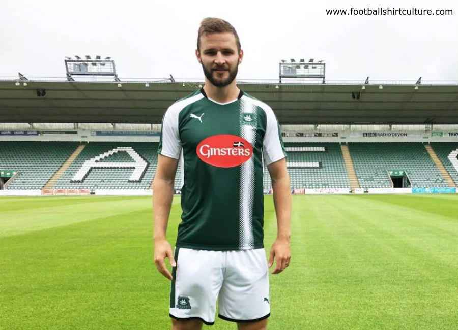
Plymouth Argyle have revealed their new Puma home strip for the upcoming 17/18 season.

The Pilgrims' new kit is a darker shade of green compared to last season's, and also has a single white strip down the left side of the shirt.

The kit, which was modelled by new signing Jamie Ness, has white sleeves, along with the shorts and socks, with green trim.

Sign in or create an account to earn points for voting, keep track of your reviews, edit them, and more.

It has been stylised with kit maker Puma's dotted branding for the season.


Write comments...
You are a guest ( Sign Up ? )
or post as a guest
Loading comment... The comment will be refreshed after 00:00.
  • This commment is unpublished.
    PlymouthFan · 7 years ago
    Truly awful. The worst kit we've had in years... and we've had some shockers.

    The tyre track looks like a complete afterthought and was designed by a 5-year old. Totally unnecessary and completely out of place. It's a mess.

    The Ginsters logo has always been a bone of contention. They got rid of the red disc on last year's away kit, so why could a compromise not be made on this kit?

    Terrible effort from Puma and the club.
  • This commment is unpublished.
    Steve Cordingley · 7 years ago
    A Devon club with a Cornish flag on it.......:D
  • This commment is unpublished.
    John · 7 years ago
    I duno if anyone from Plymouth FC actually reads this but for goodness sake ditch the red of the Ginsters logo, at least make it black or something that fits in with the team like you seem to be able to manage on the away tops, when I started supporting Plymouth they had LTC and they had the decency to fit in with the colour scheme, if it wasnt for that logo these tops would look alot better. I support a green team not a read one.
  • This commment is unpublished.
    Forest Phil · 7 years ago
    nearly as bad as a mauve kit they had last year?? with a green badge and a red sponsor logo
  • This commment is unpublished.
    pachyderm · 7 years ago
    your away kit is worse though.

    great badge and one of the only teams wearing green. what a waste puma.
  • This commment is unpublished.
    Wessex · 7 years ago
    Totally ruined by the Ginsters logo.Shame.
  • This commment is unpublished.
    j · 7 years ago
    sponser and stripe ruined it
  • This commment is unpublished.
    Stone · 7 years ago
    Nice socks... ;)
  • This commment is unpublished.
    John · 7 years ago
    @PlymouthFan Yeh I cannot stand that awful red Ginsters logo, I think teams should be required to have sponsors fit in with the team's colour scheme whats the point in going for a green team if you then get red all over it. Its not even a small logo its plastered across the entire thing and ruins any design. And they can get rid of it for the away tops so why not home. I can only hope eventually Ginsters get replaced.
  • This commment is unpublished.
    paul m · 7 years ago
    does look like a car has driven over it .....that looks like a tyre mark down the side!
  • This commment is unpublished.
    Weeto · 7 years ago
    It would have looked a million times better without the stripe. I hate asymmetrical shirts.

    Seeing Jamie Ness in green and white is kinda weird as by far the most famous thing he did at Rangers was score a fantastic goal against Celtic!
  • This commment is unpublished.
    Ballack's Ambulance · 7 years ago
    That deep, dark green is beautiful, but this is just dire :D No harmony, looks like it was made with clip art.
  • This commment is unpublished.
    Boinggobaggies · 7 years ago
    OH MY DAYS WHAT A DISASTER ?
  • This commment is unpublished.
    BaddersTUFC · 7 years ago
    A real mess.

    Argyle have some classic templates in the history room and Puma come up with this mess?
  • This commment is unpublished.
    vivareeves · 7 years ago
    That is the worst new kit I have seen this summer. Sleeves or stripe. Not both.
  • This commment is unpublished.
    Torquay Tom · 7 years ago
    @Steve Cordingley Exactly what I was thinking!
  • This commment is unpublished.
    Pete JF · 7 years ago
    The stripe on the shirt looks awkward and out of place, sponsor logo doesn't help, poor.
  • This commment is unpublished.
    Bazz · 7 years ago
    Shocking ...
  • This commment is unpublished.
    Aj · 7 years ago
    As an Argyle supporter even I'm finding it difficult to say anything positive about this....?