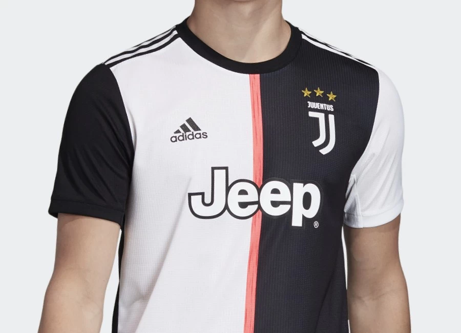
Juventus 2019-20 Adidas Home Kit

Juventus 2019-20 Adidas Home Kit #juve #juventus #adidasfootball #adidassoccer

Juventus FC have revealed the new home kit created by Adidas for the coming 19/20 season. The daring new design evokes the past, whilst igniting the future of the club through the evolution of the iconic black and white stripes.

The new jersey will continue to have the iconic black and white colours, but in the shape of the new half-and-half stripes, along with an unexpected flash of pink that sits at the heart of the design and honours the first colour the club ever played in.

The unexpected design keeps to the tradition that is woven in the club’s DNA but has evolved to mark the progressive new era of Juventus. A clean crew neck collar with black and white sleeves is featured on the shirt, each with contrasting three stripes, creating a miss-matched stripes look on each shoulder. In addition, the kit also features CLIMALITE technology, to wick sweat and keep you dry, allowing players to experience peak performance.

Sign in or create an account to earn points for voting, keep track of your reviews, edit them, and more.

It is an invitation to fans to embrace a new thought. Different. But always, deeply, Juventus. #BETHESTRIPES

The team will debut the new jersey on Sunday 12 May, when they take on Roma in the third final match of the Serie A season.


Write comments...
You are a guest ( Sign Up ? )
or post as a guest
Loading comment... The comment will be refreshed after 00:00.
  • This commment is unpublished.
    Dan · 5 years ago
    We moan like sh1t about kits being average and no one doing anything different, this is class, elegant, well cut, well proportioned, well done Adidas, taking on a design stereotype and challenging it
  • This commment is unpublished.
    tom bola · 5 years ago
    Just a word to FSC, Bring the "like" facility back. We'll decide what we do and don't think appropriate, we don't need you doing it for us. Cheers.
  • This commment is unpublished.
    Steve-o · 5 years ago
    Heard it’s aimed at the American market,as the old style shirt looked like a referees shirt in their “football” they changed it to suit the yanks,shame on you Adidas.
  • This commment is unpublished.
    Michael Flynn · 5 years ago
    I prefer the traditional black and white stripes for the home shirt.

    I am not keen on this shirt for the home shirt.

    Thus shirt would be good for a third shirt, NOT the home shirt.
  • This commment is unpublished.
    John Q Public · 5 years ago
    Finally, a shirt as bad as the badge.
  • This commment is unpublished.
    Bill · 5 years ago
    Adidas What on earth are you doing ? Used to produce some of the best kits around , now all look the same just different colours or change just for the sake of it !!!!! 200 + hall of shame !!!! Juventus wear stripes !!!!!
  • This commment is unpublished.
    Stone · 5 years ago
    What is the problem with football shirt designers today? What is so difficult to comprehend about the concept of "stripes"?!
  • This commment is unpublished.
    ASRU · 5 years ago
    s*i* shirt for a s*i* club
  • This commment is unpublished.
    Daz · 5 years ago
    Thats the worst Juventus strip I've ever seen
  • This commment is unpublished.
    ! · 5 years ago
    Disgrace
  • This commment is unpublished.
    Traditionalist · 5 years ago
    This is terrible, absolutely terrible
  • This commment is unpublished.
    Scott · 5 years ago
    200th vote of shame. What a disgraceful kit from Adidas.
  • This commment is unpublished.
    Joe · 5 years ago
    Whilst I hate the back, I can’t believe what people are saying on here.

    I can only explain it with one word. Trolls.

    The original colour was pink (salmon pink for the picky)

    Get over it, they’re not killing a club because of a design change. Grow up.

    The back is horrible. The front looks good, not the best effort, but a good try at reuniting tradition with the present.
  • This commment is unpublished.
    Jim o · 5 years ago
    Nearly all Juventus kits are ruined by the solid square on the back
  • This commment is unpublished.
    Ade31121 · 5 years ago
    Utter and total SH@T. If I was a supporter I’d be going bonkers now. Firstly the badge went and now the iconic stripes. Adidas hang your heads
  • This commment is unpublished.
    Spidey · 5 years ago
    Badge gone
    Stripes gone
    Identity gone
  • This commment is unpublished.
    Vecchia Signora · 5 years ago
    Burn it...with fire...
  • This commment is unpublished.
    Willie · 5 years ago
    The front is controversial, but the back is simply awful.
  • This commment is unpublished.
    Dan Hater · 5 years ago
    @Dan Dan, what drugs have you taken? THIS IS NOT CLASS!! It’s utter c*c*, like the Serie A. I hope it gets dropped halfway through the season because it’s that s*i*.
  • This commment is unpublished.
    Anti-Dan Fan · 5 years ago
    @Dan Oh Dan, u wilson. Use your specs bro!
    Class??? Of 1398 AD....elegant??? for a rhino...well cut??? for a butcher...well proportioned??? for a giraffe...
    And then u really top it off by saying Well Done Adidas!!!:o:(
    Thanks Adidas for taking on design stereotype and buging it up!