Leeds United 2019-20 Kappa Centenary Away Kit

Leeds United 2019-20 Kappa Centenary Away Kit #LeedsUnited #footballshirt #lufc

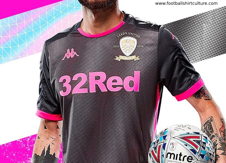
Leeds United have unveiled the new away kit for the 19/20 season.

The new away shirt is platinum in colour featuring the club’s gold and white centenary crest and a bold pink 32Red logo and Kappa omni-logo, there is also a printed graphic featured on the front panel and shoulders of the top.

A fluorescent pink trim then features on the round neck collar and sleeves and there is a pink stripe down either side of the body of the shirt. The back of the shirt displays a white Clipper logo and repeat pattern of sublimated text which reads ‘LEEDS UNITED 1919 – 2019.’

Sign in or create an account to earn points for voting, keep track of your reviews, edit them, and more.

The shorts and socks are also platinum, both with a pink stripe feature and pink logos for Official Kit Supplier Kappa. The shorts have a white Clipper logo and the socks feature a white ‘Leeds United’ message across the front.

The strip is available in a standard replica fit or a Bodyfit Pro version featuring a high performance fabric, as used by the first-team players. The standard Kombat kit is a stretch fabric with hydro-way protection technology.

View the: Leeds United 2019-20 Kappa Centenary Home Kit

View the: Leeds United 2019-20 Kappa Centenary Third Kit

View the: Leeds United 2019 Kappa Centenary Shirt

{minipolls id="leedsunited20192020awayjersey" title="What do you think?"} masterpiece|| good|| above average|| average / nothing special|| below average|| bad|| hall of shame {/minipolls}


Write comments...
You are a guest ( Sign Up ? )
or post as a guest
Loading comment... The comment will be refreshed after 00:00.
  • This commment is unpublished.
    Zebio · 5 years ago
    Could've been a lot worse. Grey/pink is a good combination...the club badge should have been embroidered in pink thread...the badge looks clunky on that background. Bring back the smiley badge!
  • This commment is unpublished.
    Swadlad · 5 years ago
    @Softwinky You need a pair of glasses mate.
  • This commment is unpublished.
    Softwinky · 5 years ago
    It actually looks like an elephant's penis...
  • This commment is unpublished.
    Bobby · 5 years ago
    If Bielsa s*i* in his bucket then threw the contents over a plain shirt it would still look better than this abomination
  • This commment is unpublished.
    Stacey from t seacroft · 5 years ago
    My favourite of the 3 leeds tops. Should be the first kit should this ....
  • This commment is unpublished.
    Sheila · 5 years ago
    @Zebio Starfish badge were much better... itd look nice sewn on that
  • This commment is unpublished.
    Swadlad · 5 years ago
    One of the best away kits in the football league imo. Stands out isn't boring and has had alot of thought put into it.
  • This commment is unpublished.
    The One · 5 years ago
    The kit is fantastic, and I’m going to buy the shirt... but it doesn’t scream “Leeds United”... then again what kit does?

    Our first kit was black and white stripes and then we basically played in Huddersfields kit for 10 years.. if we had a kit released to suit the first ever LUFC kits our fans would have gone mental for replicating Huddersfailed.
  • This commment is unpublished.
    Fred North · 5 years ago
    Disgusting. Vile. Horrendous shirt. They should be kicked out of the football league and Bielsa can take his bucket with him. Jokers.
  • This commment is unpublished.
    Mark · 5 years ago
    What the hell ?
  • This commment is unpublished.
    BFC Nursery Club · 5 years ago
    @Swadlad No need to be rude