Newcastle United 2019-20 Puma Home Kit

Newcastle United 2019-20 Puma Home Kit #NewcastleUnited #footballshirt #nufc

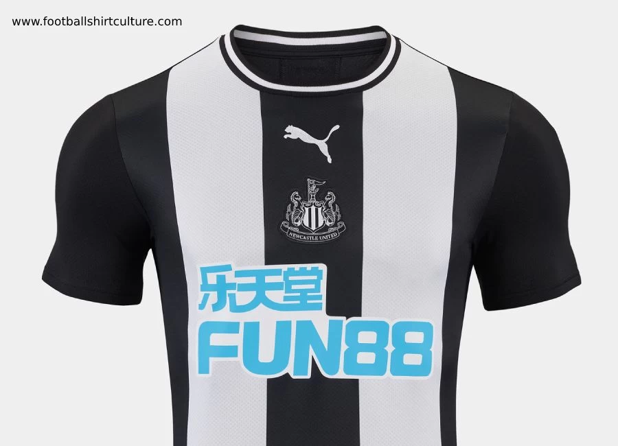
Newcastle United has unveiled its brand new 19/20 home kit by Puma, which pays tribute to the 50th anniversary of the club’s Inter-Cities Fairs Cup win.

Just like the black and white jersey proudly worn by the stars of 1969, the new home shirt will feature a familiar black round-neck collar with white trim, while a tonal crest will adorn the Magpies’ classic black and white stripes.

Below, the club's primary partner, FUN88, will proudly feature across the front of adult shirts.

Sign in or create an account to earn points for voting, keep track of your reviews, edit them, and more.

The kit will again feature black shorts, while traditional black and white turnover socks - as worn by Joe Harvey’s triumphant side - also make a return.

The Magpies marked the 50th anniversary of the successful Fairs Cup campaign just last week, with 11th June 1969 the date of a 3-2 win away in Hungary which gave United a 6-2 aggregate victory over Újpest Dósza in a two-legged final.


Write comments...
You are a guest ( Sign Up ? )
or post as a guest
Loading comment... The comment will be refreshed after 00:00.
  • This commment is unpublished.
    Tudor and his dog · 5 years ago
    The fairs Cup comparison is nothing more than a marketing joke! That shirt had thin stripes, the only similarity is the collar. Yet again, the sponsor ruins the shirt. They shouldn't allow the sponsors to be any more than 10% of the club shirt, it always looks awful.
  • This commment is unpublished.
    Ady · 5 years ago
    Better than some recent home kits, but not quite right somehow. Don't love the black sleeves, or the wide stripes, or the badge/logo being central and don't like sponsors... Apart from that great
  • This commment is unpublished.
    MrTito · 5 years ago
    I get that you can’t do much with black ‘n’ white stripes, but Newcastle have had some lovely kits in the past. Puma should stick to trainers, all their kits look cheap
  • This commment is unpublished.
    Shite · 5 years ago
    s*i*e
  • This commment is unpublished.
    Bmhole · 5 years ago
    Good to see Coloccini back modeling it
  • This commment is unpublished.
    Dan · 5 years ago
    That sponsor is dogger, wish clubs saw beyond betting firms and went for local firms
  • This commment is unpublished.
    Anthony · 5 years ago
    Decent top, but, like most, ruined by sponsors
  • This commment is unpublished.
    DUNK · 5 years ago
    I don't mind it. Shame about the sponsor though, couldn't it at least be b&w? Blue on the front with red numbers on the back (it's still striped!) is going to look ridiculous yet again.
  • This commment is unpublished.
    Hendo · 5 years ago
    Lovely shirt. Horrendous sponsorship.
  • This commment is unpublished.
    Abother bloke · 5 years ago
    @That bloke In that case all black and white stripe shirts must pay tribute .
  • This commment is unpublished.
    Charles · 5 years ago
    Its not the worst NUFC home shirt I've seen - at first glance, I like it more than at least 3 recent home kits - and I do like the colour-keyed crest. But it looks nothing like the 1969 shirt.
  • This commment is unpublished.
    ANON · 5 years ago
    apart from having a round neck it doesn't really look anything like the kit they wore when the won the fairs cup.