Brighton & Hove Albion 2020-21 Nike Home Kit

Brighton & Hove Albion 2020-21 Nike Home Kit #BHAFC #BrightonHoveAlbion #nikefootball

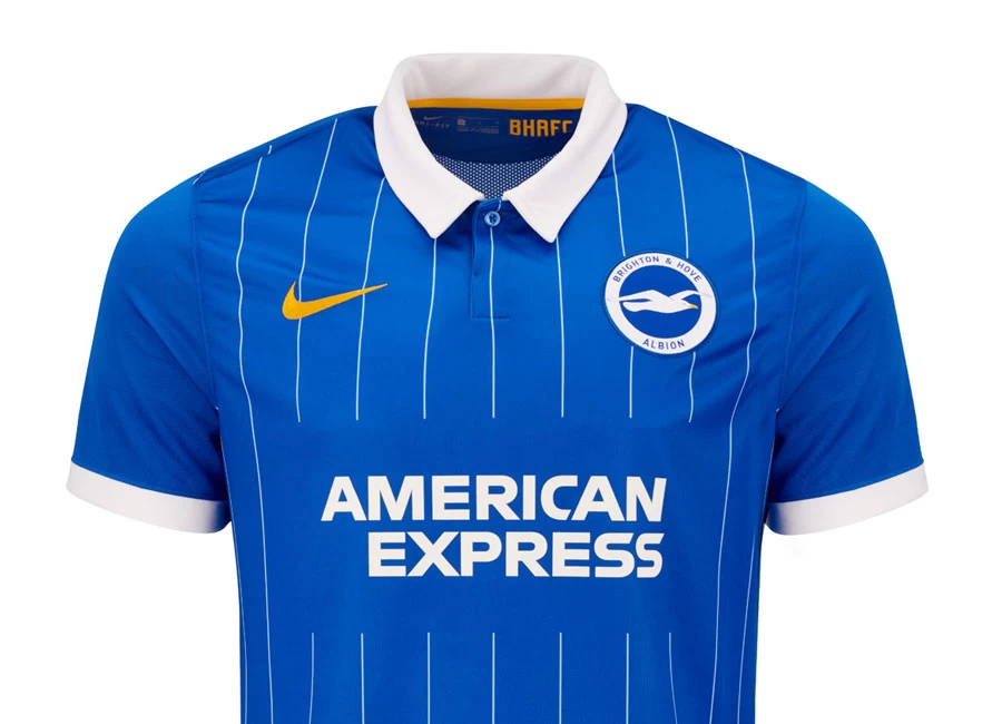
Brighton & Hove Albion revealed their new Home kit by Nike for the 2020/21 season.

In a bold move away from our traditional stripes, fans will immediately notice a pinstripe fabric which is a nod to a classic shirt of yesteryear.

The pinstripes are subtly broken to carry the logo of club partner American Express and the shirt — which will be worn with white shorts and blue socks — sports a smart white collar and has yellow trim on the side seam.

Sign in or create an account to earn points for voting, keep track of your reviews, edit them, and more.

The pinstripe first featured on Albion’s 1983/84 kit, which was a white pinstripe on a blue shirt, sponsored by Phoenix Brewery, and worn that season and the following one.

Albion also wore a shirt featuring blue and white pinstripes with solid blue sleeves in 1993/94 which was worn for two seasons.

 

Write comments...
You are a guest ( Sign Up ? )
or post as a guest
Loading comment... The comment will be refreshed after 00:00.
  • This commment is unpublished.
    Seagull Steve · 4 years ago
    @Angry Andy Only Palarse call us that - as you well know. Don't worry yourself - the fans love the new shirts, and at least we don't have to look like a fifth rate park team trying to pretend to be Barcelona every season, eh? ;)
  • This commment is unpublished.
    Angry Andy · 4 years ago
    But their nickname is the Tesco bags! This is ridiculous! How can they call themselves the Tesco bags when they don't look like them anymore?!? Fans will hate it.
  • This commment is unpublished.
    David Hirst · 4 years ago
    Sheffield Wednesday 2016-17
  • This commment is unpublished.
    Paul R · 4 years ago
    Cracking kit- a throwback to the Man Utd final kit. I like it better than the striped kits of the last 2 seasons. Only minor quibble is yellow insert at the bottom on the side, no need for that really.
  • This commment is unpublished.
    JF · 4 years ago
    The collar looks cheap and hideous.
  • This commment is unpublished.
    Ade Royal · 4 years ago
    Boring third rate kit for a boring tin pot club. Descent back to the levels you belong at to commence forthwith!
  • This commment is unpublished.
    Der K · 4 years ago
    I don't like it when teams that wear stripes change into one-color shirts, but this kit is amazing.
  • This commment is unpublished.
    Gully135 · 4 years ago
    This is fantastic i look forward to owning this
    One of the best shirts going so far in premier league.
  • This commment is unpublished.
    VillaFan · 4 years ago
    For a Brighton kit, I think that's very nice
  • This commment is unpublished.
    Hatterman · 4 years ago
    Mincers shirt.
  • This commment is unpublished.
    Bondi Jeff · 4 years ago
    Should have gone with the blue shirt with white sleeves circa 1969/70
  • This commment is unpublished.
    Seagull Steve · 4 years ago
    Pretty classy, and a throwback to our early 80s kits. And once again, Palarse fans are seething with envy. It comes with having to live in Croydon...:D
  • This commment is unpublished.
    sharpy · 4 years ago
    The pinstripes are "subtly" broken pffft...guys the word you were looking for is "needlessly"
  • This commment is unpublished.
    Eli Hep · 4 years ago
    Love the shirt. But not the sponsor.
  • This commment is unpublished.
    Seagull Steve · 4 years ago
    @Heterosexual Course, I mean ..there's absolutely loads of eagles in Croydon aren't there? Do they all roost at the top of Lunar House? :D:D:D:D:D:D

    It's not even really Palarse's real badge. Truth is Malcolm Allison nicked it from Benfica 'cos he thought it was slightly less s*u*i* than having a big greenhouse on the badge. "Team of the 80s"?? :D:D:D:D:D That worked well, didn't it?

    Seagulls will nick your chips and then crap on you and don't give a f*c*. Brilliant birds.

  • This commment is unpublished.
    Far Acre · 4 years ago
    Something that would make it better would be if the pinstripes weren’t stopped at the sponsor or on the back.
  • This commment is unpublished.
    n9andy · 4 years ago
    shame to break the pin stripes around the sponsor, seems unnecessary
  • This commment is unpublished.
    Smallhausen · 4 years ago
    Very similar to the 1983 shirt. Nice.
  • This commment is unpublished.
    Jason · 4 years ago
    That is one lovely shirt! I’m not a Brighton fan but if I was I would buy this one!
  • This commment is unpublished.
    Get Shirty · 4 years ago
    Brilliant, very stylish.
5.3
4 ratings
Vote now!
  • 3
  • 0
  • 0
  • 0
  • 0
  • 0
  • 1
Paul R
  • Member
  • 1
  • 8
 · 4 years ago
Comment (Not Required)
Cracking kit- a throwback to the Man Utd final kit. I like it better than the striped kits of the last 2 seasons. Only minor quibble is yellow insert at the bottom on the side, no need for that really.
Show more
Der K
  • Member
  • 1
  • 108
 · 4 years ago
Comment (Not Required)
I don't like it when teams that wear stripes change into one-color shirts, but this kit is amazing.
Show more
 · 1 year ago
Show more
 · 1 year ago
Show more
 · 2 years ago
Show more
 · 2 years ago
Show more