Bristol City 2020-21 Hummel Home Kit

Bristol City 2020-21 Hummel Home Kit #WeAreTheRobins #BristolCity #ShareTheGame #hummelsport

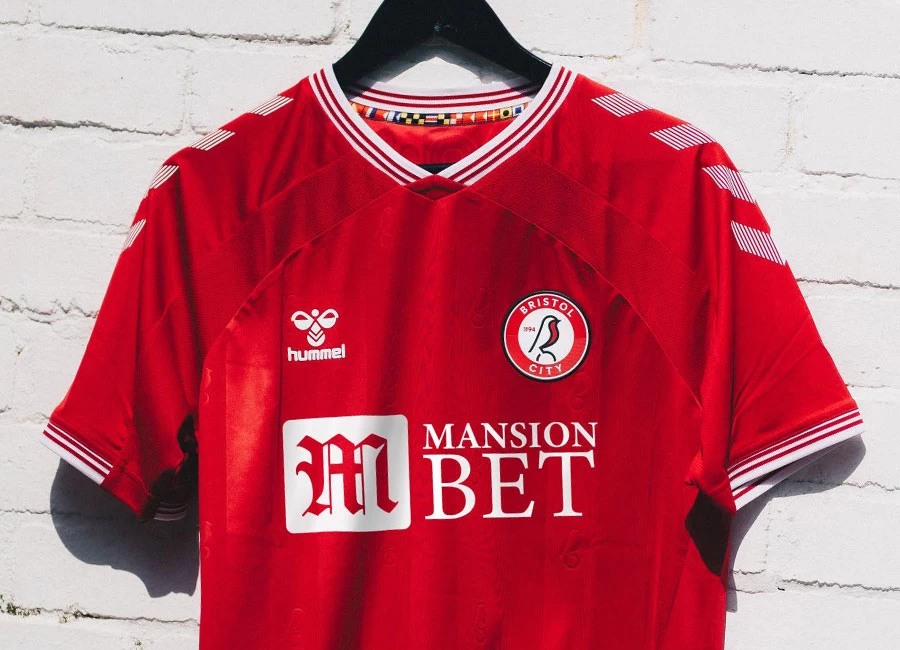
Bristol City revealed their new 20/21 hummel home shirt which pays tribute to the Ashton Gate Eight.

In 1982, Jimmy Mann, Trevor Tainton, Geoff Merrick, David Rodgers, Gerry Sweeney, Peter Aitken, Chris Garland and Julian Marshall selflessly tore up their contracts to save the club from financial ruin – an act which will never be forgotten.

The first strip designed in conjunction with the club’s new technical partner hummel, and proudly displaying the club’s sponsor MansionBet, honours the Robins’ history as it pays tribute to the Eight.

Sign in or create an account to earn points for voting, keep track of your reviews, edit them, and more.

And, as a mark of gratitude and to celebrate their actions, each of those eight club legends have their names printed on the inner back hem, while being listed within a printed stand-out Ashton Gate Eight logo on the reverse. In addition, a monotone graphic of each player is pictured on the inside of the neck, giving those individuals a more direct visual nod.

The striped design is a take on the old ’82 kit the Ashton Gate Eight would have worn had they not ripped up their contracts. This design has been modernised and includes hummel’s iconic chevrons across the shoulders and sleeves – which are also featured on the white shorts and red socks. To add to the detail, jacquard robins run vertically down the front and back panels of the traditional red shirt.

The shirt - along with the already launched training tees - include bespoke semaphore flags across the inner neck. These flags spell ‘Bristol City Football Club’ in maritime flag alphabet, referencing the city’s rich nautical heritage.


Write comments...
You are a guest ( Sign Up ? )
or post as a guest
Loading comment... The comment will be refreshed after 00:00.
  • This commment is unpublished.
    Bemmy Gas · 4 years ago
    Sh1t shirt for the sh1t 82’ers.

    Never mind.
  • This commment is unpublished.
    Gas Lighter · 4 years ago
    @Pugwall I’d rather have that than our ground taken over by a rugby club.

    Still getting council back handers?
  • This commment is unpublished.
    Pugwall · 4 years ago
    @Bemmy Gas Must be tough seeing them in a higher division without a stadium that looks like something out of the jungle at Calais.
  • This commment is unpublished.
    Edwardian Timber · 4 years ago
    Really impressed with Hummel, great shirt.
  • This commment is unpublished.
    BitterGas · 4 years ago
    As a g*s*ead it pains me to say that even though this is one of Hummels less innovative designs this season, its a mile better than the abhoration we've got from Macron. Say what you will about the City, but they're in a plane we can only dream of. If only we had a rich owner...oh yeah, we'd do!!!
  • This commment is unpublished.
    j.futuristic · 4 years ago
    Hummel's doing some good work this year. Bristol City fans should be stoked with this one, I'd think.
  • This commment is unpublished.
    Bloobird · 4 years ago
    As a football club, I really dislike the red third of Bristol but I like that Hummel are adding unique touches to their kits.
  • This commment is unpublished.
    Bob24 · 4 years ago
    Another take on last year's Rangers kit.
  • This commment is unpublished.
    J · 4 years ago
    @Bemmy Gas Another obsessed South Gloucestershire Rovers fan. Your club died the moment you became homeless.
  • This commment is unpublished.
    Pugwall · 4 years ago
    @Gas Lighter Is that better or worse than stealing a ground from a rugby club?
  • This commment is unpublished.
    Get Shirty · 4 years ago
    Looks really good, can understand the comments surrounding Charlton but it's a little difficult when you have two teams with the same kit. I suppose you could try something radical like when Middlesbrough brought out the white hoop, or Birmingham's classic penguin strip? Perhaps that would be seen differently today and not go down as well.
  • This commment is unpublished.
    bertie · 4 years ago
    Looks cheap - like they scooped up all the leftover strips from everybody else's red shirts and stitched em together.
  • This commment is unpublished.
    Brian · 4 years ago
    I like the badge, it's nice clean and uncluttered. A lot of these crests are getting to be outdated now. The kit isn't bad though. It's pretty basic but the colour is vibrant and just pops out
  • This commment is unpublished.
    Ashton · 4 years ago
    Hummel have produced some really nice kits for the coming season and then they go and give us the same design as Charlton . OK there are some print differences and the inside neck trim ( Why ? ) basically it's the same shirt . Stand 2 foot away and wouldn't notice the difference . Really disappointing for both sets of fans .
5
1 rating
Vote now!
  • 0
  • 0
  • 0
  • 0
  • 0
  • 0
  • 0
j.futuristic
  • Member
  • 1
  • 28
 · 4 years ago
Comment (Not Required)
Hummel's doing some good work this year. Bristol City fans should be stoked with this one, I'd think.
Show more