Inter Milan 2020-21 Nike Away Kit

Inter Milan 2020-21 Nike Away Kit #forzainter #inter #intermilan #nikefootball

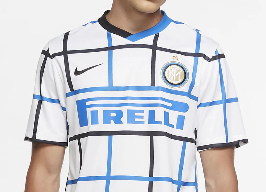
Nike and Inter Milan revealed their new away kit for the 20/21 season.

After a season of playing in aquamarine, Inter switches back to its familiar white away jerseys, this time accompanied by a new Nerazzurri grid graphic. The graphic represents the community of Milanese people that looks to the future of the city and the Club with an innovative approach.

Buy Now    Shop Classic Inter Milan Shirts

Sign in or create an account to earn points for voting, keep track of your reviews, edit them, and more.

Building on the themes established by the club’s new home kit, the away is "Made of Milano" too, taking inspiration from the Milanese post-modernist movement, which changed the global face of art and design in the 1980s. “The alternating black and blue lines make for a really fresh interpretation of the club’s typical away look and really reinforces their Nerazzurri identity,” says Scott Munson, VP, Nike Football Apparel.

Inter’s new away jersey has a white base with black and blue lines, forming an all-over grid graphic that covers the front, back and sleeves. The shirt has a blue and black color-blocked V-neck collar that overlaps in the center and at the nape of the neck. White shorts and socks complete the full look, with the word "Inter" appearing on the shin in a post-modernist font.

View the: Inter Milan 2020-21 Home Kit

View the: Inter Milan 2020-21 Third Kit

{minipolls id="intermilan2020awayjersey" title="What do you think?"} Masterpiece|| Good|| Above average|| average / Nothing special|| Below average|| Bad|| Hall of shame {/minipolls}

 

Write comments...
You are a guest ( Sign Up ? )
or post as a guest
Loading comment... The comment will be refreshed after 00:00.
  • This commment is unpublished.
    Cuthbert · 4 years ago
    I thought crewe was the winner of the worst away kit... but that is a close 2nd.
  • This commment is unpublished.
    Birkenshaw route · 4 years ago
    this just hurts my eyes ffs :(
  • This commment is unpublished.
    S G · 4 years ago
    Looks like a duvet cover. Or like Rossco said, its a lovely table cloth. :D :D :D :D
  • This commment is unpublished.
    Predator pro 35 · 4 years ago
    it's perfect to play sudoku or a picnic in a sunny day
  • This commment is unpublished.
    It333 · 4 years ago
    If worn by the goalkeeper, it appears invisible. ;)
  • This commment is unpublished.
    Lutz · 4 years ago
    Hahahahahahahaha !!! ?
  • This commment is unpublished.
    Ettore · 4 years ago
    Imbarazzante..
  • This commment is unpublished.
    Real Lettuce · 4 years ago
    "The graphic represents the community of Milanese people that looks to the future of the city and the Club with an innovative approach." What a load of old bollox.
  • This commment is unpublished.
    Konstantinos · 4 years ago
    Veramente schifo
  • This commment is unpublished.
    Ho oh · 4 years ago
    @Rossco Exactly what I was thinking! :D
  • This commment is unpublished.
    Bob24 · 4 years ago
    That is terrible. It would have been far better either to make it plain and have a thick black and blue line above and below the sponsor, or make the grid pattern pinstriped with one colour going across and the other going down.
5
1 rating
Vote now!
  • 0
  • 0
  • 0
  • 0
  • 0
  • 0
  • 0
Der K
  • Member
  • 1
  • 108
 · 4 years ago
Comment (Not Required)
Trash.
Show more
Togga2112
  • Member
  • 1
  • 24
 · 4 years ago
Comment (Not Required)
Nice design for a tea towel ?
Show more