Juventus 2020-21 Adidas Home Kit

Juventus 2020-21 Adidas Home Kit #juve #juventus #forzajuve #adidasfootball

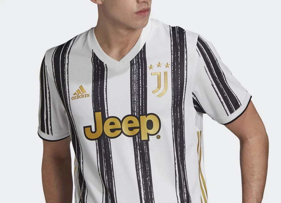
Juventus revealed the new Adidas Home kit for the 20/21 season.

Taking inspiration from the unity of art and football - and their shared celebration of creativity and identity - the resulting jersey reimagines the classic stripes with a unique brushstroke approach on its front and sleeves. Adding elegance to the iconic black and white, the colour gold is prevalent throughout the kit, including within the brushstrokes, club crest and sponsor detailing.

Continuing the modernization of the club’s classic iconography, the away shirt features HEAT.RDY – KEEP COOL, adidas’ cooling innovation that keeps the wearer feeling dry and confident in the game. The replica shirt offers similar benefits with AEROREADY – FEEL READY, a technology that helps players feel comfortable and ready to play.

Sign in or create an account to earn points for voting, keep track of your reviews, edit them, and more.


Write comments...
You are a guest ( Sign Up ? )
or post as a guest
Loading comment... The comment will be refreshed after 00:00.
  • This commment is unpublished.
    AdamK · 4 years ago
    Looks like it was made by my old printer
  • This commment is unpublished.
    taq · 4 years ago
    the strips look like traces of tires! apparently they made the shirts by having cars drive over the shirts :Dlol
  • This commment is unpublished.
    Herah · 4 years ago
    Jersey with a story not just design. FORZA JUVE <3
  • This commment is unpublished.
    beboop · 4 years ago
    tires' prints, s*i*ty inspiration
  • This commment is unpublished.
    BaddersTUFC · 4 years ago
    Utter s*i*e, and god how I hate plain backs on striped shirt kits.
  • This commment is unpublished.
    Greg · 4 years ago
    Poor kid who designed it clearly had a mare when his black felt ran out and could only find a black biro to try and finish the colouring...
  • This commment is unpublished.
    Nick · 4 years ago
    Cheap would be a more appropriate sponsor
  • This commment is unpublished.
    Northern Problems · 4 years ago
    Oh dear! That is absolutely awful, it looks like something a 15 year old has drawn in class 5C.
  • This commment is unpublished.
    Alberto Marcelino · 4 years ago
    Too much white. The broken stripes might just be their downfall next season. Everything is not right with this kit.
  • This commment is unpublished.
    Bob24 · 4 years ago
    Apart from their 2017/18 kit, all the Adidas Juventus home kits have been terrible.
  • This commment is unpublished.
    Get Shirty · 4 years ago
    Like that they've tried to be different but not sure that it's worked, 5 year old child, crayons? Back of shirt doesn't look right plain.
  • This commment is unpublished.
    SamSamSam · 4 years ago
    Reminds me of mascara
  • This commment is unpublished.
    AdamK is a legend · 4 years ago
    @AdamK This is the comment.
  • This commment is unpublished.
    Paddy Mac · 4 years ago
    I like this, just a shame that the 3 stripes weren't black, the gold looks horry bull.
  • This commment is unpublished.
    AndyGee · 4 years ago
    Hell's Bells.... I thought last years monstrosity was bad enough, but this is awful.
  • This commment is unpublished.
    Der K · 4 years ago
    @taq I agree. Not a very good effort from adidas.
  • This commment is unpublished.
    Stuart · 4 years ago
    Very appropriate bars for the Thieves...
  • This commment is unpublished.
    Webby1874 · 4 years ago
    Wonder why they`re not using the fan made updated juve logo ?
  • This commment is unpublished.
    Juventerrible · 4 years ago
    Not as godo as Worst Brem's barcode kit
  • This commment is unpublished.
    It333 · 4 years ago
    I have never seen such an error from a big club.
No votes yet
Vote now!
  • 0
  • 0
  • 0
  • 0
  • 0
  • 0
  • 0