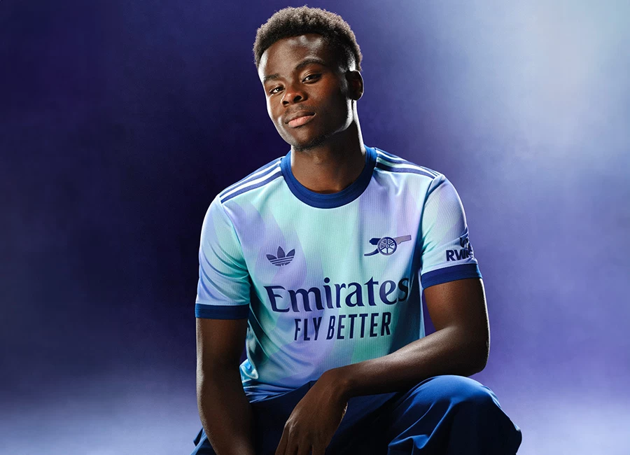
Liverpool 2020-21 Nike Away Kit

Liverpool 2020-21 Nike Away Kit #liverpool #lfc #liverpoolfc #nikefootball

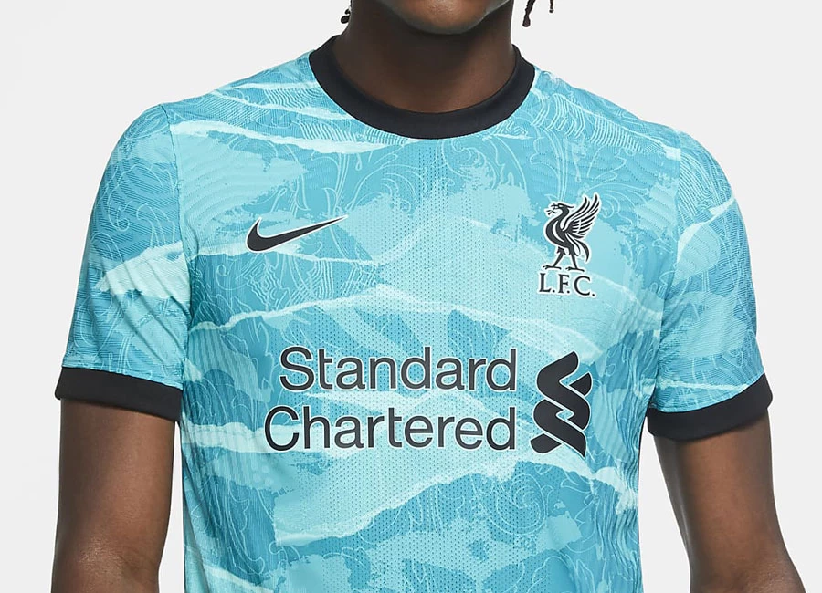
Liverpool FC has revealed the new Nike Away kit for the 20/21 season.

Having introduced teal through subtle design references in the home jersey, the colour explodes into a bold print on the 2020-21 away jersey — heavily influenced by the Liver Bird (the beacon of the city). The kit is also emphasized by the Shankly gates, which are brought to life through the swirling acanthus leaves that embellish the legendary You’ll Never Walk Alone motif.

Buy Now     Shop Classic Liverpool Shirts

Sign in or create an account to earn points for voting, keep track of your reviews, edit them, and more.

On the nape of the neck, and in memoriam of the 96 children, women and men who lost their lives more than three decades ago at Hillsborough in the worst disaster in British sporting history, a 96 emblem is encased by eternal flames.

The shorts are teal and have a black stripe down the side and the socks carry through the aesthetic of the jersey.

View the: Liverpool 2020-21 Home Kit

View the: Liverpool 2020-21 Third Kit

{minipolls id="liverpool2020awayjersey" title="What do you think?"} Masterpiece|| Good|| Above average|| average / Nothing special|| Below average|| Bad|| Hall of shame {/minipolls}


Write comments...
You are a guest ( Sign Up ? )
or post as a guest
Loading comment... The comment will be refreshed after 00:00.
  • This commment is unpublished.
    Paddy Mac · 4 years ago
    @. He will be in 21/22
  • This commment is unpublished.
    Scouser · 4 years ago
    Only Nike would think that blue's an acceptable colour for a Liverpool away kit. Absolutely s*u*i* cretins.
  • This commment is unpublished.
    WiganSpurs · 4 years ago
    I don't get the use of this colour - it's too close to blue, a colour which Liverpool would never use. All for a funky away kit, after releasing a classic and simple home, but what a horrible colour. Maybe actual green, or something else entirely. Just my 2p
  • This commment is unpublished.
    Mighty Mackem · 4 years ago
    It’s looks like wallpaper from the 1970’s. Cheap 1970’s wallpaper. Not a fitting kit for the champions. Oh dear.
  • This commment is unpublished.
    CK · 4 years ago
    It looks like a really poor and cheap attempt at copying Forest Green Rovers' third kit.
  • This commment is unpublished.
    Rob · 4 years ago
    @Giles Park Totally agree . The sale garbage these manufacturers and clubs come out with is getting more ridiculous by the year . Just release the kit like teams used to do.
3.7
5 ratings
Vote now!
  • 1
  • 0
  • 1
  • 1
  • 1
  • 0
  • 1
ظطبذظذظطیذلب
 · 2 months ago
Show more
 · 3 months ago
Show more
 · 8 months ago
Show more
 · 2 years ago
Show more
 · 2 years ago
Show more