Luton Town 2020-21 Umbro Home Kit

Luton Town 2020-21 Umbro Home Kit #ltfc #LutonTown #LutonTownfc #umbro

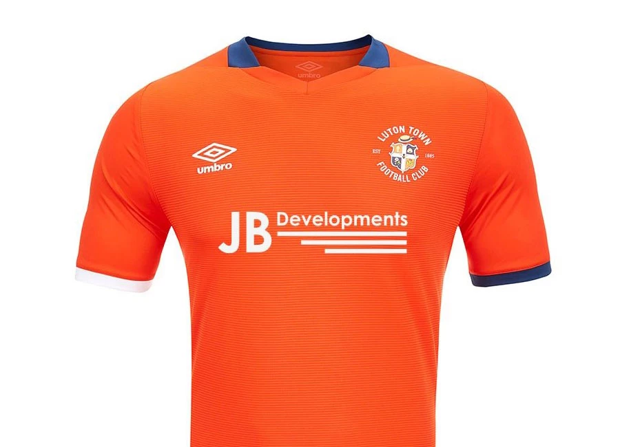
Luton Town and Umbro revealed their new Home kit for the 20/21 season.

Asymmetrical styling at the cuff trims in White and Navy give a distinctive look to the Home shirt. Orange textured Ottoman striped fabric mixes with solid Orange sleeves to give textural differences.

Features include: Stylised two-colour rib V neckline, classic full colour crest, stacked diamond logo, bespoke back neck sign off, dropped back hem with side vents and official licensed label to the side seam.

Sign in or create an account to earn points for voting, keep track of your reviews, edit them, and more.


Write comments...
You are a guest ( Sign Up ? )
or post as a guest
Loading comment... The comment will be refreshed after 00:00.
  • This commment is unpublished.
    Marsh Farm Hatter · 4 years ago
    Yes, the white cuff does offset it. I’ve always liked the retro vertigo stripe down the one side of the shirt, which makes a Luton Town shirt very distinctive from the madding crowd...
  • This commment is unpublished.
    PNH · 4 years ago
    The asymmetrical thing might have worked of they had done the same with the collar. Otherwise it just looks like a manufacturing fault
  • This commment is unpublished.
    Throstleman · 4 years ago
    Not bad I suppose. Seen a lot worse.
  • This commment is unpublished.
    Nigel Barnes · 4 years ago
    Blackburn fan here. I’m still awaiting our shirt reveals but they are by Umbro too so I’m basing my predictions on these shirts. I like the asymmetrical aspect of it, all in all a nice shirt but I’m concerned about the club badge and the Umbro logo. They look like stickers that will come off with a few washes.
  • This commment is unpublished.
    Peter Atkinson · 4 years ago
    NOT a 'bad' attempt, but I really just DON'T get the 'white' at the bottom of one arm, and the 'blue' at the bottom of the other! It looks like something has gone wrong at the factory! I think I would prefer a 'proper' collar, rather than this 'discreet' one! Other than the above, then I think it's OK, but, I wouldn't particularly 'write home' about it!!
  • This commment is unpublished.
    Terry · 4 years ago
    @Marsh Farm Hatter Would that the madding hatters ?
  • This commment is unpublished.
    Hot Dave's brother · 4 years ago
    As has been said, the asymmetric cuffs are a bit disappointing. I don't like pretend collars too. Make it a real one, and I'd be happy to wear this when I'm buying a saveloy from the butchers.
  • This commment is unpublished.
    Hatterman · 4 years ago
    Decent kit. Good to see all our sponsors are local businesses and not betting companies. This one in particular is a local boy done good.
  • This commment is unpublished.
    Neil · 4 years ago
    Like Derby and West Ham , smart but a bit bland . Umbro seem to have gone backwards . They reemerged about 4 or 5 years ago with some really nice kits .I always liked the diamond detail . Nowadays their best kits mostly seem foreign teams .
  • This commment is unpublished.
    Willie · 4 years ago
    @PNH I agree, it looks like a kid has forgotten to colour-in the other cuff.
No votes yet
Vote now!
  • 0
  • 0
  • 0
  • 0
  • 0
  • 0
  • 0