kb banner 30

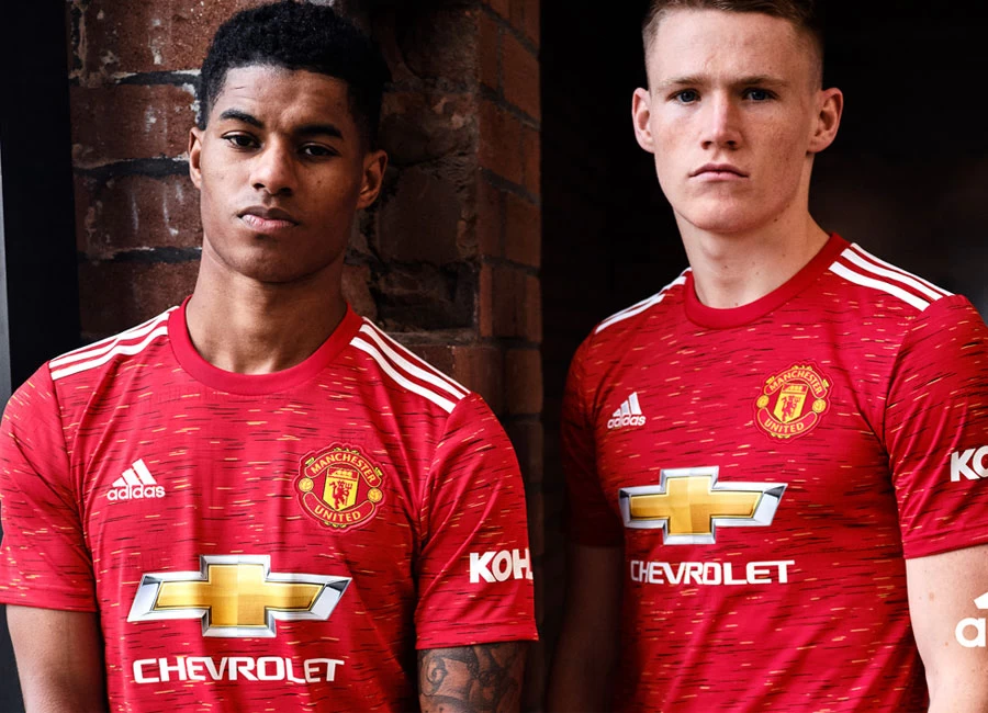
Manchester United 2020-21 Adidas Home Kit

Manchester United 2020-21 Adidas Home Kit #ManchesterUnited #mufc #ManUtd #adidasfootball

Manchester United and Adidas revealed their new 20/21 season home kit, inspired by the club’s iconic crest.

Taking influence from the intricacies of the yarn-stitched application onto the shirt, a fine graphic print provides a unique pattern and detailing onto a colour-block background. The name of the club is also proudly engineered into the print, visible through the use of different red tones.

Buy Now     Shop Classic Manchester United Shirts

Sign in or create an account to earn points for voting, keep track of your reviews, edit them, and more.

The product team achieved this nuanced design through an innovative ‘space dye’ technique that allows separate yarns to be dyed individually, and at different lengths, to give a finish with depth, and with full details only viewable by the wearer.

View the: Manchester United 2020-21 Away Kit

View the: Manchester United 2020-21 Third Kit

{minipolls id="manchesterunited2020homejersey" title="What do you think?"} Masterpiece|| Good|| Above average|| average / Nothing special|| Below average|| Bad|| Hall of shame {/minipolls}

 

Write comments...
You are a guest ( Sign Up ? )
or post as a guest
Loading comment... The comment will be refreshed after 00:00.
  • This commment is unpublished.
    Ryan G · 4 years ago
    Those little boys posing with the new jersey looked ultra p*s*e*.:p
  • This commment is unpublished.
    Scouse Dave · 4 years ago
    H&M sale rail t-shirt. Poor.
  • This commment is unpublished.
    Brada · 4 years ago
    They really find a way to mess up the shirt. Nike also the same.
  • This commment is unpublished.
    Malik · 4 years ago
    Lame shirt also the club :p
  • This commment is unpublished.
    tal · 4 years ago
    it's red and it's got a man utd badge on .... what more would you want ....
  • This commment is unpublished.
    Fud · 4 years ago
    There have been some absolute belters of kits this year. Designers have made amazing designs.

    So far 1st place goes to the Southampton third kit. Home is very good too.
    There are other great looking tops, Fenerbahce, Dortmund's 3rd cup shirt, B Munich's 3rd strip, the Man City kits (I'm a blue), even the Utd strip is good.There are great simple kits like Spartak Moscow. Very good.Even Valencia 3rd strip is great. Awaiting to see Sampdoria. Home as it is an iconic masterpiece of the past.

    There have also been some s*i*e as well. Newport County Away. Hang your head in shame. Palace 3rd kit. yuk
  • This commment is unpublished.
    2balloon · 4 years ago
    Why does it say Heat Roy on the label?
  • This commment is unpublished.
    Trousers · 4 years ago
    It's always off to a difficult start whilst they have that shirt sponsor and their logo.
  • This commment is unpublished.
    RA · 4 years ago
    @Ryan G yeh they went on a benda in wilmslow night b4
  • This commment is unpublished.
    Bulls · 4 years ago
    Didn’t particularly like it at launch - I like my Adidas shirts with a v-neck that’s a different colour. But have to say a red shirt, with white Adidas stripes, and just the plain badge with no shield, looks great on TV. I hope for EPL games the socks are black with Adidas stripes of either red or white.
  • This commment is unpublished.
    Redche · 4 years ago
    Horrendous rubbish....looks like a beach towel....didn't expect less from steaming pile of dog manure of a club.
  • This commment is unpublished.
    Dragon · 4 years ago
    Adidas should stop with those 3 stripes on the shoulders. The logo on the chest s enough. Those 3 white stripes don't blend in the shirt, would have been great without them.
  • This commment is unpublished.
    James · 4 years ago
    Wearing a bus seat.
  • This commment is unpublished.
    Are you an Ostrich? · 4 years ago
    Nasty by five to one. Adidas - what happened to you?
  • This commment is unpublished.
    Stefaan · 4 years ago
    Awful in any way,it's get worse and worse with adidas :(
  • This commment is unpublished.
    Clink · 4 years ago
    Londoner’s gonna look s*i* in this
  • This commment is unpublished.
    Observer · 4 years ago
    "Inspired by the club’s iconic crest.

    Taking influence from the intricacies of the yarn-stitched application onto the shirt, a fine graphic print provides a unique pattern and detailing onto a colour-block background."

    :o I want a job at football shirt marketing, it's an art form.
  • This commment is unpublished.
    It333 · 4 years ago
    When I saw it first I thought it was awful, the second time it was good, so I don’t know what it really is.
  • This commment is unpublished.
    Red is dead · 4 years ago
    This is a complete and utter crock of s*i* , Man Utd always had classy home shirts but those days seem to be over , adidas and Nike are bru g shown up by the so called smaller manufacturers
  • This commment is unpublished.
    Oh Serve · 4 years ago
    @Scouse Dave You called it. Horrible. That long back looks absolutely terrible like a cheap c*a* t shirt.
7.0
1 rating
Vote now!
  • 1
  • 0
  • 0
  • 0
  • 0
  • 0
  • 0
Der K
  • Member
  • 1
  • 108
 · 4 years ago
Comment (Not Required)
It's not that bad.
Show more
B
 · 2 years ago
Comment (Not Required)
Fantastic shirt, most people in the comments are a pack of morons
Show more