Norwich City 2020-21 Errea Third Kit

Norwich City 2020-21 Errea Third Kit #NorwichCity #ncfc #erreasport

Norwich City revealed the club’s new Errea third kit for the 20/21 season.

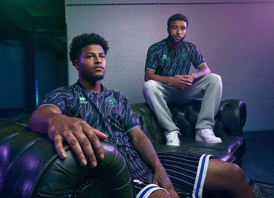
The kit has a black shirt featuring bold patterns of intersecting shapes and lines in fuchsia, white and purple on the front, along with black shorts and socks.

Other than the club's centenary kit, it's the only replica kit in recent times that features the iconic Canary situated outside of the crest, instead featuring on its own without the traditional lion and castle. This is to complement the unique design of the kit.

Sign in or create an account to earn points for voting, keep track of your reviews, edit them, and more.


Write comments...
You are a guest ( Sign Up ? )
or post as a guest
Loading comment... The comment will be refreshed after 00:00.
  • This commment is unpublished.
    Roberto · 4 years ago
    @Peter Peter also voted for Brexit & thinks All Lives Matter :D:p
  • This commment is unpublished.
    Peter · 4 years ago
    What the hell is that ? Are you trying to go into competition with Wolves and Man United for the worst kit ever ? Congratulations you've won . That is a disgrace to the club and only an idiot would spend money on buying it !!!
  • This commment is unpublished.
    Rollsy · 4 years ago
    This kit like the away kit has the same fit. The home one is baggier (if you don't buy player fit).

    I have this 3rd shirt as well as the away. I haven't owned a Norwich kit for years but both were worth the money in my opinion.
  • This commment is unpublished.
    Billy Bonds Sox · 4 years ago
    Norwich are multi title holders for worst kit awards - but what is this shambles? Truly awful - but that seems to be rule with these utterly pointless third strips.

    That’s pointless in that a decent change strip will more than suffice and pointless in that say Chelsea and city still insist on wearing sky and navy blue against each despite multiple change kits.

    I fear for lower league clubs right now but issuing money grabbing kits that have no design relevance to club or city are not the solution.

    Btw didn’t there used to be thumbs up and down functionality on here?
  • This commment is unpublished.
    Calder · 4 years ago
    Spurs but for woodland-dwelling, preindustrial folk.
  • This commment is unpublished.
    Germy Joss · 4 years ago
    Luv it, luv it, luv it, h*n*tanton here I come
  • This commment is unpublished.
    Geremy Joss · 4 years ago
    Will look good on holidays, strutting along h*n*tanton promenade like a boss!
  • This commment is unpublished.
    Bungay yellow · 4 years ago
    It just doesn’t scream Norwich at all!!!
  • This commment is unpublished.
    Jim · 4 years ago
    Vile
  • This commment is unpublished.
    Harvey · 4 years ago
    Third Kits should be wild and a bit different, don't get why people complain, if this was the away kit I would understand why people hate it but it'll only be worn twice so calm down
  • This commment is unpublished.
    The Carrow Sparrow · 4 years ago
    All white with green and yellow trim...

    As for this. f*c* ME.
  • This commment is unpublished.
    Torquinian · 4 years ago
    I’m old enough to remember when Norwich could go through an entire season without ever wearing an away kit, let alone needing a third kit. And I’m not even all that old.
  • This commment is unpublished.
    Waffles · 4 years ago
    It's a mess. I like it.
  • This commment is unpublished.
    Tony · 4 years ago
    @Roberto Is Peter also advising the government on how to deal with Covid? ?
  • This commment is unpublished.
    1% · 4 years ago
    @Roberto You had to go there didn't you?
  • This commment is unpublished.
    Coach and horses · 4 years ago
    @Peter Calm down.
No votes yet
Vote now!
  • 0
  • 0
  • 0
  • 0
  • 0
  • 0
  • 0