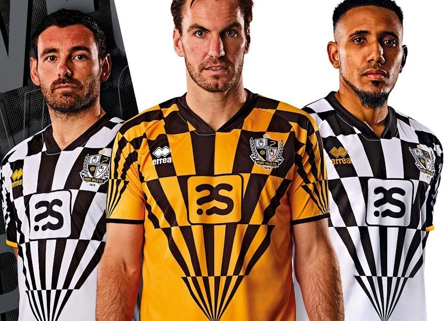
Port Vale 2020-21 Errea Home Kit

Port Vale 2020-21 Errea Home Kit #PortVale #PortValefc #PVFCxRW #pvfc

Port Vale FC revealed their new home kit for the 2020-21 Sky Bet League Two season…

Produced by Errea in collaboration with Robbie Williams, the unique “V” patterned home strip takes on classic Vale colours in the form of Black and White, with Gold trim.

Shop Port Vale Shirts

Sign in or create an account to earn points for voting, keep track of your reviews, edit them, and more.

The design process was a team effort – Robbie Williams’ ideas were developed by the Port Vale team of Patrick Shanahan and Club Chair Carol Shanahan, with the Gaffer (John Askey) giving the final seal of approval for the kits to be worn by the players.

Fans will see the letters W, N, E woven into the design on the back of the shirts echoing the Gaffer’s ‘Want, Need, Expect’ mantra.

While Synectics Solutions remains the front of shirt sponsor, the club announced commercial partnerships with Staffordshire University (Back of Shirt sponsor) as well as Global QA Consultants (Back of Short sponsor).

View the: Port Vale 2020-21 Away Kit

{minipolls id="portvale2020homejersey" title="What do you think?"} Masterpiece|| Good|| Above average|| average / Nothing special|| Below average|| Bad|| Hall of shame {/minipolls}

 

Write comments...
You are a guest ( Sign Up ? )
or post as a guest
Loading comment... The comment will be refreshed after 00:00.
  • This commment is unpublished.
    Kids grove Gaz · 4 years ago
    What are you going for this season something really original like red and white strips again!
  • This commment is unpublished.
    Gary · 4 years ago
    @Kids grove Gaz So do you like the kit or not ? More bothered about the fact that the Potteries is a dump . I have been to Bolton and it's far better than Stoke , Hanley , Burslem etc . Don't live anywhere near Cheshire unlike yourself . Am from Bristol .
  • This commment is unpublished.
    Kids grove Gaz · 4 years ago
    It’s a marmite, you either like it or hate it. Oh and as for the Potteries being a s*i*hole Gaz, have you ever been to Bolton it makes our City look like Westminster. Suppose you are the Cheshire way are you Mr Perfect.
  • This commment is unpublished.
    Gary · 4 years ago
    Robbie stick to singing !!! That is absolutely abysmal . One of the worst kits I have ever seen . Having said that Port Vale and there fans deserve it , Potteries is a complete s##t hole .
  • This commment is unpublished.
    kiter · 4 years ago
    a lot of many boomers here...
  • This commment is unpublished.
    kiter · 4 years ago
    AMAZING
  • This commment is unpublished.
    Joanna White · 4 years ago
    Its cool as fook
  • This commment is unpublished.
    MuckaMarraMorrow · 4 years ago
    This kit has made me change my football manager team, not being associated with them.
  • This commment is unpublished.
    Andy Grays Perm · 4 years ago
    Tour de Port Vale anyone?
  • This commment is unpublished.
    Stuart · 4 years ago
    Arrgh! My eyes, my eyes....
  • This commment is unpublished.
    88milesperhour · 4 years ago
    Port Vale have had some really smart home kits the last 4 or 5 seasons. Sadly, this one is as bad as the other ones have been good :(
  • This commment is unpublished.
    forest phil · 4 years ago
    Had to double check the calendar to make sure it wasn't April Fools Day ! That is hideous ! :D:D
  • This commment is unpublished.
    Paddy Mac · 4 years ago
    Did the local hot air ballon company have a load of off cuts left over to make these kits?
  • This commment is unpublished.
    Wobbie Billiams · 4 years ago
    That's f*c*i*g s*i*e.
  • This commment is unpublished.
    BaddersTUFC · 4 years ago
    Abysmal. Just shocking. Trying to be cool and different but just looks wank.
  • This commment is unpublished.
    PG · 4 years ago
    Want a decent kit. Need a decent kit. Expect a decent kit.
  • This commment is unpublished.
    Rob · 4 years ago
    @Kids grove Gaz Who is this comment aimed at ?
  • This commment is unpublished.
    It333 · 4 years ago
    Too much. if only the pattern was on the sleeves and the top of the jersey, it could be a classic.
  • This commment is unpublished.
    Collier · 4 years ago
    @Gary Bristol's a s*i*hole.
  • This commment is unpublished.
    Burslem red · 4 years ago
    Looks like an expanding umbrella!!!!....tinpot!!!!!
No votes yet
Vote now!
  • 0
  • 0
  • 0
  • 0
  • 0
  • 0
  • 0