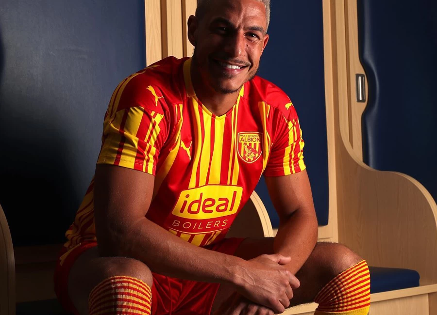
West Bromwich Albion 2020-21 Puma Third Kit

West Bromwich Albion 2020-21 Puma Third Kit #WestBromwichAlbion #WestBrom #WBA #pumafootball

West Bromwich Albion unveiled their new third kit for the 20/21 Premier League campaign – completing a 1992/93-inspired trilogy.

The red-and-yellow striped kit is the final strip to be revealed from the Club’s three barcode designs worn during the promotion-winning campaign of 27 years ago.

The home and away kits, which were released last month, have been selling at a record rate and the Club is delighted fans can now complete the set with a hat-trick of barcode strips ahead of the new Premier League season.

Sign in or create an account to earn points for voting, keep track of your reviews, edit them, and more.


Write comments...
You are a guest ( Sign Up ? )
or post as a guest
Loading comment... The comment will be refreshed after 00:00.
  • This commment is unpublished.
    Neil · 4 years ago
    Love all 3 of our kits this coming season , but it is a complete rip off to have yellow and green as away kit and then yellow and red in the same design as a third kit . Purely done for commercial reasons . Wonder how many times it will be worn , probably just once to justify its existence !!!
  • This commment is unpublished.
    Graeme · 4 years ago
    It’s good but at first glance I expected to see Roy Race wearing it.
  • This commment is unpublished.
    Hot Dave · 4 years ago
    @Old Sod I support Football.
    (And Hartlepool United)
  • This commment is unpublished.
    Old Sod · 4 years ago
    @Hot Dave Notice you make loads of comments on this site . Who do you actually support ?
  • This commment is unpublished.
    Hot Dave · 4 years ago
    Truly awful. Why they wanted to revisit this monstrosity of a design is beyond me. As the old saying goes, those who do not remember their past are condemned to repeat their mistakes.
  • This commment is unpublished.
    Paul M · 4 years ago
    @Neil Granted there is a commercial benifit for the club but I think they are also focused on history and nostalgia. The 92/93 promotion season was great, and during that season we had the three barcode kits. I think it's unfair to suggest that the club are ripping fans off.... if you don't agree with it then don't purchase one it's as simple as that.
  • This commment is unpublished.
    Tim nice but possibly dim ? · 4 years ago
    @Davide Sorry I may be misunderstanding this . The away kit is yellow and green . How does thar clash with the teams you mentioned ? All have red in as does this as a 3rd kit .
  • This commment is unpublished.
    Davide · 4 years ago
    @Neil It would have made more sense for the third and away to be swapped so at least they’d have the excuse of having to switch to it as Palace, Southampton, Sheffield Utd would all clash with both home and away.
  • This commment is unpublished.
    dex1lsp · 4 years ago
    What the HELL is this Ronald McDonald clown costume?!?
  • This commment is unpublished.
    BaddersTUFC · 4 years ago
    Not only are the three barcodes kits all a horrific design, the red and yellow version is completely unnecessary when they have a yellow and green one.

    And to remember a season from 27 years ago as though it is some glory season when in fact they were scr*p*n* past Port Vale in the play-offs of the third division. For a club of WBA’s stature, they have far more prestigious events to remember and with probably more stylish kits as well.
  • This commment is unpublished.
    Tipton skin · 4 years ago
    Baggies fans in the away end will certainly stand out with those colours on
  • This commment is unpublished.
    David L · 4 years ago
    West Brom's third kit taking it's inspiration from Melchester Rovers. Haha!!!
  • This commment is unpublished.
    PNH · 4 years ago
    @Graeme I was trying to think what it reminded me of ?
  • This commment is unpublished.
    Rhubarbtrianglulist · 4 years ago
    The designer is obviously not a baggies fan. I reckon he/she is from the Rhubarb triangle.
  • This commment is unpublished.
    Ron Harris · 4 years ago
    You need to wear a condom over your eyes to look at this kit.

    A wonderfully intentional piece of visual brutality.

    It's like if Graeme Souness and Kenny Burns had a lovechild, and that lovechild was a football kit.
  • This commment is unpublished.
    90s kid · 4 years ago
    Chupa Chups!!!!
  • This commment is unpublished.
    Ruud Mullet · 4 years ago
    Having this and a yellow and green away kit seems like a cruel joke on colourblind people.
  • This commment is unpublished.
    CK · 4 years ago
    West Brom channeling their inner Hulk Hogan.
  • This commment is unpublished.
    greedleaguesucks · 4 years ago
    Total ripoff with no other justification than greed.
    Boing boing bag o s*i*e.
  • This commment is unpublished.
    Socrates · 4 years ago
    @Hot Dave That might explain the misery that infuses your outlook on things.
3.0
1 rating
Vote now!
  • 0
  • 0
  • 0
  • 0
  • 1
  • 0
  • 0
Yam
 · 2 years ago
Show more