Coventry City 2021-22 Hummel Third Kit

Coventry City 2021-22 Hummel Third Kit #PUSB #CoventryCity #ccfc #sharethegame

Coventry City have unveiled the new Third Kit for the 21/22 season.

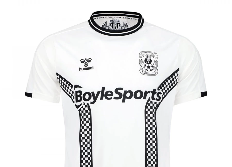
The new Hummel kit is in a 2 Tone theme, in recognition of the musical and cultural influence of the movement on the City and Coventry being UK City of Culture, and returning to a hugely popular theme from the 2019/20 campaign.

The bespoke, new 2 Tone kit incorporates the famous ‘tramlines’ which featured in Coventry City kits in the late 1970s – including in 1979, when The Specials released their first LP – but now with the distinctive checkerboard design closely associated with the 2 Tone era.

Sign in or create an account to earn points for voting, keep track of your reviews, edit them, and more.

The Hummel shoulder chevrons are black, while the black and white monotone Coventry City crest is on the chest alongside the Hummel logo. Meanwhile, ‘Sky Blues’ is on the rear of the shirt and the words ‘While We Sing Together’ are shown on the in the inside of the shirt.

Coventry City’s sponsor BoyleSports is on the front of the shirt too and is in keeping with the overall design of the kit. The BoyleSports logo will be on all retail shirts, except for Junior and Infant sizes. The XL Motors logo is shown on the rear of the shirt too.

The 2 Tone tramline pattern continues on the front of the shorts, while the G&R Scaffolding logo is displayed on the back of these too.

Coventry City’s kits this year use hummel’s ECO8 technology, meaning each shirt is manufactured from high-performing polyester produced from up to eight recycled plastic bottles.

 

6.5
25 ratings
Vote now!
  • 20
  • 3
  • 1
  • 1
  • 0
  • 0
  • 0
pachyderm
  • Member
  • 189
  • 123
 · 3 years ago
Comment (Not Required)
I want this one...
Show more
Futbal Don
 · 3 years ago
Comment (Not Required)
Brilliant 🙂
Show more
Matt
 · 3 years ago
Comment (Not Required)
The Checkerboard pattern does add a distinctive look although it is completely spoiled by that sponsorship logo. My eyes are drawn to the wording first and the design second which is just wrong. A thoughtful impactive shirt needs a strong sense of identity and it loses that somewhat because of the way the logo overpowers it.
Show more
Smallhausen
 · 3 years ago
Comment (Not Required)
It's a thing of beauty.
Show more
Joe Scrote
 · 3 years ago
Comment (Not Required)
Class. Half a star taken off for the sponsor on the back. It'd probably look ok with a number but without it's a bit odd.
Show more
M
 · 3 years ago
Comment (Not Required)
Class from Hummel again, shame about the gambling sponsor. We'll be seeing those tramlines again I've no doubt
Show more
Tess Tickle
 · 3 years ago
Comment (Not Required)
Loses half a star from me because the sponsor logo overlaps onto those fantastic checkerboard tramlines. Otherwise flawless.
Show more
WBA Fan
 · 3 years ago
Comment (Not Required)
An absolute classic, and one I will have to buy, in spite of a great rival club
Show more
856
 · 3 years ago
Comment (Not Required)
Knocked it out the park combining references to Admiral and the Specials/ska. What a lovely shirt.
Show more
Paul
 · 3 years ago
Comment (Not Required)
pusb
Show more