Napoli 2021-22 EA7 Home, Away and Third Shirts

Napoli 2021-22 EA7 Home, Away and Third Shirts #ForzaNapoliSempre #sscnapoli #napoli

Hot on the heels of the fashion house outfitting the Italian Olympic team, SSC Napoli’s new Home, Away and Third shirts were last week announced as being Giorgio Armani pieces.

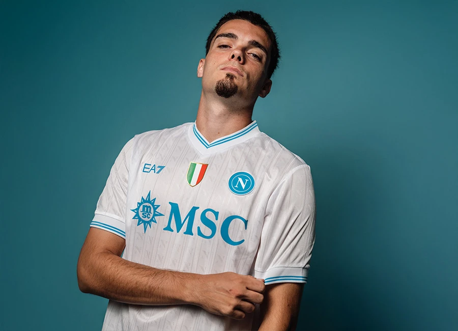
Carrying the EA7 (Emporio Armani) branding and delivered thanks to an agreement with Napoli’s president Aurelio De Laurentiis, the southern Italy side will have blue, red and white designs for 2021-22.

The Home version boasts navy neck and cuffs, the Away the familiar light blue for accents, and the Third is neatly trimmed in gold.

Sign in or create an account to earn points for voting, keep track of your reviews, edit them, and more.

With the partner branding and crest appearing similarly across the Serie A side’s wardrobe, the primary shirt is combined with white shorts and blue socks and the change kit releases have a nominally one-colour look.


3.3
33 ratings
Vote now!
  • 1
  • 0
  • 5
  • 11
  • 12
  • 1
  • 3
Partenop26
 · 3 years ago
Comment (Not Required)
Literally the worst kit off all time for Napoli. So sad, god how nice that Kappa kit was! I hope that they Drop EA7 moving forward, or they actually take the time to design a proper kit....but a return to Kappa would be most amazing.
Show more
Mud Baig
 · 3 years ago
Comment (Not Required)
Limited by what you can do with the Napoli template and those awful sponsors on the chest but still could have been better by Armani. Next season switch to AC Milan - would be a much better tie up.
Show more
Paolo
 · 3 years ago
Comment (Not Required)
Generic af, even very small brands could deliver this kind of stuff, I'm very disappointed
Show more
Chaz
 · 3 years ago
Comment (Not Required)
For as much hype as these shirts had because of the new kit manufacturer, these are flat out basic.
Show more
YYZ
 · 3 years ago
Comment (Not Required)
Boring.
Show more
DutchFootballfan
 · 3 years ago
Comment (Not Required)
Pretty decent. At least the Lete sponsor isn’t that big chunk of red block now. Minimalistic design.
Show more
Biggles
 · 3 years ago
Comment (Not Required)
Anymore sponsors and they’ll look like a stock car
Show more
Facchetti_68_NZ
 · 3 years ago
Comment (Not Required)
Yet more kits that took 55 seconds to design...Zzzzzzzzzzz
Show more
JK
 · 3 years ago
Comment (Not Required)
Mehhhhhhh
Show more
Brooklyn City FC
 · 3 years ago
Comment (Not Required)
Had such high hopes, and while these are solidly AVERAGE, the disappointment from the expectation means they sit even lower than that.
Show more