Newcastle United 2021-22 Castore Home Kit

Newcastle United 2021-22 Castore Home Kit #NewcastleUnited #nufc #BetterNeverStops #ANewBetter

This is the Newcastle United home kit for the 2021/22 Premier League season.

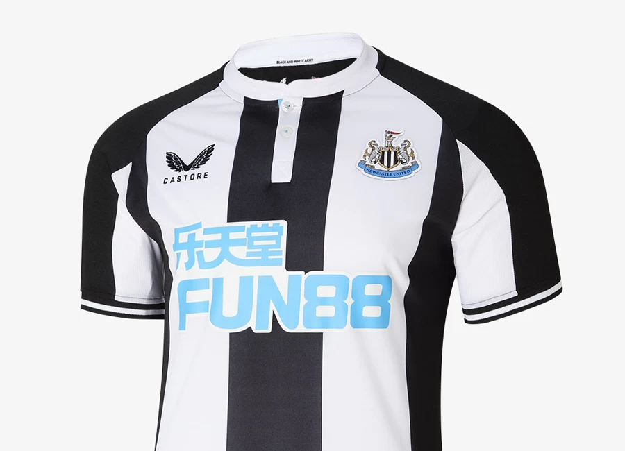
The Castore kit features a retro-inspired black and white shirt with a mandarin collar, referencing the famous jersey worn during the 'Entertainers' era of the mid-1990s.

The new design features a black stripe down the shirt's centre, wider white stripes either side and large black side panels, with light blue accents beneath the collar buttons and across the back to compliment the colour of the scroll on the club's famous crest.

Sign in or create an account to earn points for voting, keep track of your reviews, edit them, and more.

As a nod to the club's supporters, the words 'Black and White Army' adorn the inside of the collar, while the Castore slogan 'Better Never Stops' is inscribed at the base of the shirt.

All adult shirts also feature the club's primary sponsor, FUN88, in the company’s trademark blue across the chest.

The kit is complete with traditional black shorts, with a thin white and light blue side stripe, and black socks which feature a white turnover and light blue trim.

The shirt has been expertly crafted by Castore to be lightweight, highly breathable and moisture-wicking, with enhanced ventilation provided by mesh underarm panels.

Made from high-stretch fabric, it offers exceptional ease of movement to maximise performance and comfort.


3.0
47 ratings
Vote now!
  • 5
  • 5
  • 4
  • 4
  • 10
  • 3
  • 16
Kyle
 · 3 years ago
Comment (Not Required)
So bad. It’s awful. How can teams like Forest have a better strip than us when we are a miles bigger club. Joke.
Show more
Daz
 · 3 years ago
Comment (Not Required)
I like it. Far better than anything Puma have designed for us. Take my money 💵 🖤🤍
Show more
Arnold Taylor
 · 3 years ago
Comment (Not Required)
Love the design, but the sponsor really does spoil what would be a fantastic kit. Horrible colour for the sponsor text and it's HUGE.
Show more
Motherwell Bois
 · 3 years ago
Comment (Not Required)
That sponsor WTF!!!
Show more
Phichaya
 · 3 years ago
Comment (Not Required)
+ 4 stars for the great design
- 3 stars for the bad color on main sponsor logo
Show more
s87b
 · 3 years ago
Comment (Not Required)
The sponsor ruins this shirt and makes a 4 stand out, would sell more if Adults could have the no sponsor version like junior kits. What they need to do is get a sponsorship from a north east company like Nissan.
Show more
Kev
 · 3 years ago
Comment (Not Required)
Can’t believe a professional company can’t see the problem with the number 4 before releasing the kit especially as it’s their huge flagship opportunity to break into the market. Embarrassing
Show more
Waffles
 · 3 years ago
Comment (Not Required)
Poor effort again. The sponsor colour clashes badly.
Show more
ToonPaul
 · 3 years ago
Comment (Not Required)
What an absolute joke of a kit. Did no-one in the design process notice the massive number 4 on the front? It's quite appropriate that it's finished off with a terrible sponsor aswell. Gutted
Show more
Kyle
 · 3 years ago
Comment (Not Required)
I’m actually gutted. I was hoping we were going to have a good kit this year.
Show more