Here is the start of a countdown of the favourite top 35 kits from DesignFootball.com member Delicious Dinosaur.
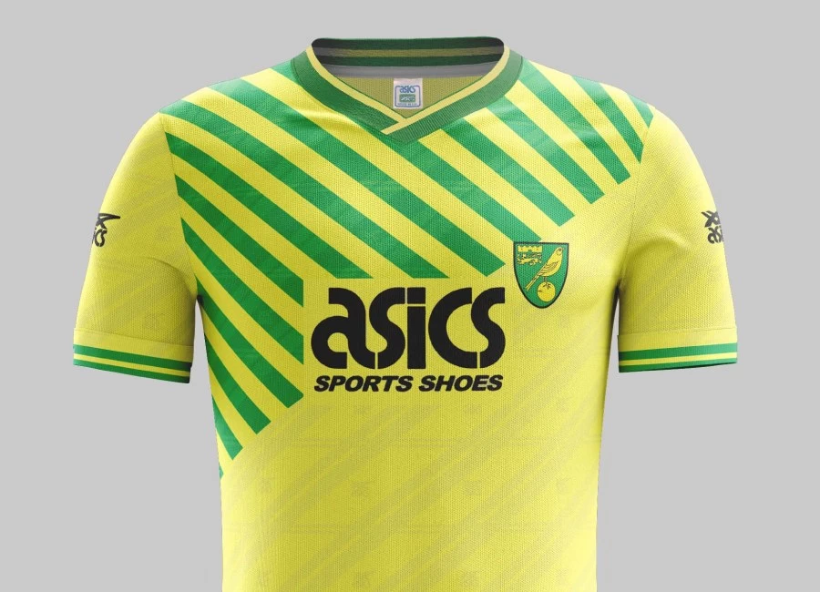
At #35 - Norwich Home '89.. Like a lot of kits in the late 80s/early 90s, this had a number of revisions over its lifespan. With the addition of the rectangle cut-out to make the logo clearer, and green collar/cuffs replacing black, I’ve plumped for this version. There’s actually an ugliness about this kit - with its weird placement of crest and absence of manufacturer; thus lacking aesthetic symmetry. A modern remake would be nice, otherwise it’s strange that the diagonal pattern has not been copied much elsewhere – it’s a striking feature, hence why it has charted.

Top 35 and Designs by Delicious Dinosaur
Sign in or create an account to earn points for voting, commenting, reading articles, and more.
Visit Designfootball.com. Keep up to date with the latest football designs by following @designfootball on Twitter and Liking the DesignFootball.com Facebook Page.