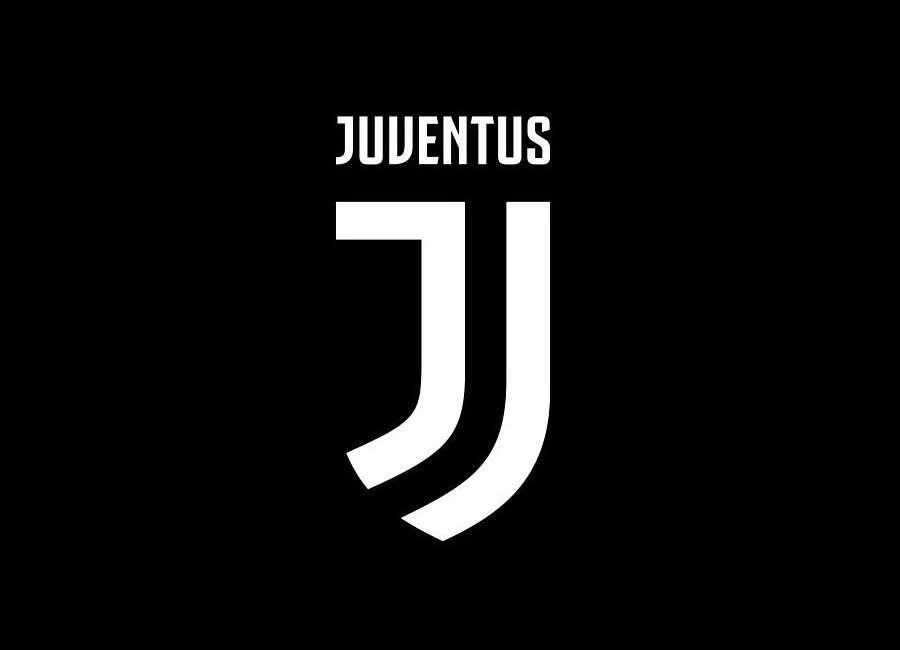
Juventus, the current Italian champions, have unveiled a new club crest. The new logo, which will be in use from July 2017, represents the very essence of Juventus: the distinctive stripes of the playing jersey, the Scudetto – the symbol of victory – and the iconic J for Juventus.
These three elements make up the DNA of Juve. The black and white stripes are the defining trait of the new visual identity and can be adapted to fit any setting. The Scudetto represents the club’s determination to strive for victory, now and forever. And finally, the J – that most distinctive of initials – occupies a special place in the heart of every fan.
Giovanni Agnelli: “I get excited every time I see a word beginning with J in the papers.” The new logo brings these three elements together into a unique, universal symbol capable of representing not just a football club, but an identity, a sense of belonging, a philosophy. It is a logo for the modern age in that it conveys its message effectively on any physical or digital format. Most important of all, however, is the way the new logo boldly leaves behind the accepted wisdom of classic football badges to blaze its own trail.
Sign in or create an account to earn points for voting, keep track of your reviews, edit them, and more.
{minipolls id="juve2017crest" title="what do you think?"} masterpiece|| good|| above average|| average / nothing special|| below average|| bad|| hall of shame {/minipolls}


