Umbro FAI Pro Training Shirt - White

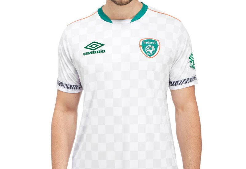
The Umbro Republic of Ireland Jersey, crafted using sweat wicking properties to ensure no matter how tense the training you will be cool and dry.

On the main body of the shirt a subtle but striking checkered pattern and a modern spin with contrast collar. Elsewhere, the Umbro logo and Ireland badge to the chest, band stripe to the sleeves and Pro Training to the left sleeve completes the look.

buy-now

Sign in or create an account to earn points for voting, keep track of your reviews, edit them, and more.


6.0
1 rating
Vote now!
  • 0
  • 1
  • 0
  • 0
  • 0
  • 0
  • 0
pepejima
  • Member
  • 1
  • 47
 · 14 years ago
Comment (Not Required)
I like it. The swoosh in that place reminds me the 2005-2006 Nike kits.
Show more
MW FROM WIDEOPEN
  • Member
  • 1
  • 485
 · 14 years ago
Comment (Not Required)
Guest, I think the reason why nobody wants to design a North Korean kit is because there so be no North Korea, just a unified Korea. as far as Im concerned, North Korea should not be at the world cup, and South Korea is the Korean National team.
Show more
MW FROM WIDEOPEN
  • Member
  • 1
  • 485
 · 15 years ago
Comment (Not Required)
Yeah, make the left side white, or the right side white and the tricolor on the left side. If the Tricolour is on the left side, it draws attention to the rooster on the shirt, rather than the number
Show more
bastien
  • Member
  • 1
  • 105
 · 15 years ago
Comment (Not Required)
Thanks MW. For the logos, I wanted to try an original way to put them.Apart from that, there is a thing which disturbs now I see it : the collar looks a bit weird, doesn't it ? On Netherlands, the left side wasn't the same color than the rest of the shirt. I think I should have done so with an all-white left side.
Show more
MW FROM WIDEOPEN
  • Member
  • 1
  • 485
 · 15 years ago
Comment (Not Required)
NIce shirt, but the placement of the number is iffy, it should be in the middle of the shirt and the swoosh should be where the number is. As for the rest of the shirt, its pretty good.
Show more
Tonesterwolf
 · 8 years ago
Comment (Not Required)
Very retro, umbro used that training pro logo some 20 years ago but why are they using different logos on kits and training wear - small letters on the kits but capitals on this?
Show more
Particulate Matter
 · 8 years ago
Comment (Not Required)
That is amazing, but I don't like that the Umbro patch and sleeve patch are different shades of green than the rest. Perhaps it's a lighting thing.
Show more
Laslow123
 · 8 years ago
Comment (Not Required)
That is epic.
Show more
Guest
 · 14 years ago
Comment (Not Required)
i see too many France kit. I think is better to design North Korean football team kit. I asked many people in here to design their kit, but no one listen. I like you to design north Korea football team kit. The home kit is all red and the away kit is all white, but i like to see it in black for the away kit. Their supplier are Puma.
Show more
 · 6 months ago
Show more