Atlético Madrid 24/25 Nike Home Kit

Atlético Madrid 24/25 Nike Home Kit

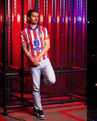
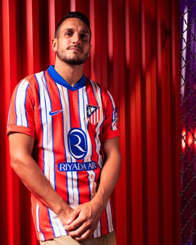
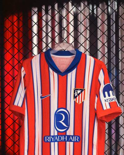
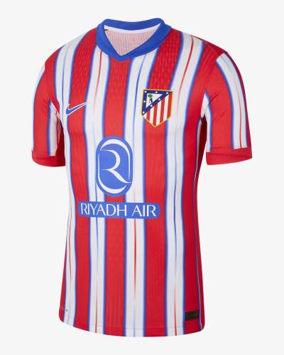
This is the 2024-25 Club Atlético de Madrid Home shirt from Nike.

The new primary design is marketed as nodding to the Double-winning 1995-96 season, when Atlético secured both Spain’s La Liga title and the Copa del Rey, and features Light Crimson (red) and white stripes divided with Hyper Royal (blue), with thin stripes graduating from red to blue (and vice versa) bisecting the white sections.

The neck is blue - matching partner/sponsor logos - the reverted-to crest is in full colour and the shorts and socks that complete the kit are blue and red respectively.

Sign in or create an account to earn points for voting, keep track of your reviews, edit them, and more.

View the: Atlético Madrid 24/25 Away Kit

Load More


3.7
105 ratings
Vote now!
  • 9
  • 17
  • 18
  • 16
  • 13
  • 18
  • 14
eightsouls
  • Member
  • 24
  • 6
  • 8
 · 4 months ago
Comment (Not Required)
marketing 0/10
Show more
i like football shirts
  • Member
  • 75
  • 4
  • 60
 · 4 months ago
Comment (Not Required)
Old badge retuning is good, red back isn’t great. Decent kit aside from the back though.
Show more
  • i have different taste 4 months ago
    You do know player's name and number visibility is very important? There's no matching color that could contrast with the stripes.
B
 · 4 months ago
Comment (Not Required)
Average shirt for an average club
Show more
Razza
 · 4 months ago
Comment (Not Required)
A little too fussy and the plain back is always a no no. Marks off for that
Show more
480
 · 4 months ago
Comment (Not Required)
Back spoils it
Show more
  • i have different taste 4 months ago
    It's a design sacrifice for player name and number visibility. No matching color that could contrast with the stripes.
Don Atkinson
 · 4 months ago
Comment (Not Required)
Way too fussy. Could have been a classic.
Show more
b
 · 4 months ago
Comment (Not Required)
So why isn't the badge on the shirt the same as the new/old logo they just released? Yellow border, bear is slightly different, strawberries are arranged differently. Compare it to the logo on their website or social media. It's not the same.
Show more
Ash
 · 4 months ago
Comment (Not Required)
Not sure on the colours. I really dislike these collars as well.
Show more
Fløthe
  • Member
  • 569
 · 4 months ago
Show more
CSD
  • Member
  • 323
  • 6
  • 58
 · 4 months ago
Show more