Carlisle United 24/25 Umbro Home Kit

Carlisle United 24/25 Umbro Home Kit

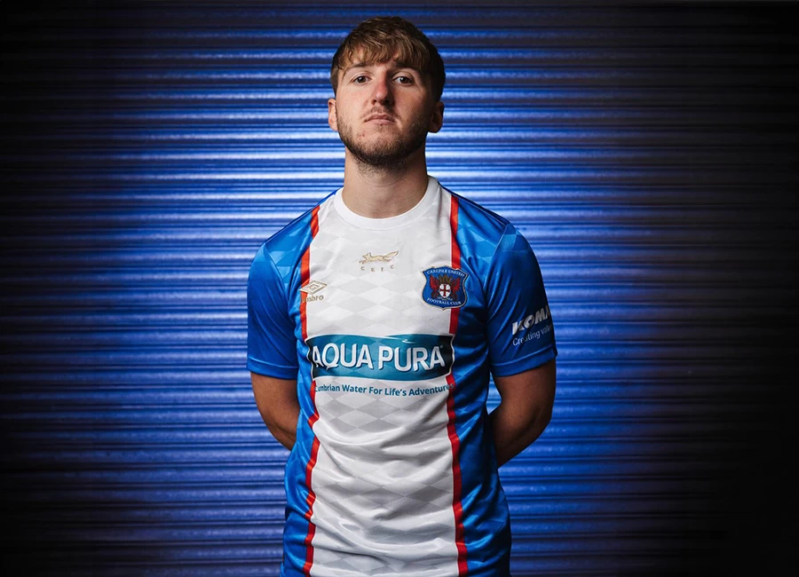
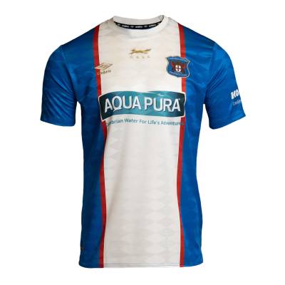
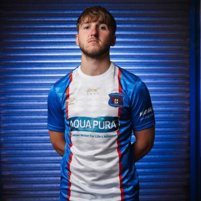
This is the new Carlisle United Football Club (FC) 24-25 Home shirt from Umbro.

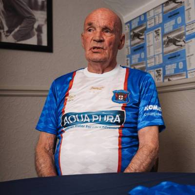
Inspired by the look sported in the 1974-75 season spent in the English top flight, the 2024-25 primary release for the Cumbrian side - celebrating the 50th anniversary of the said high-water mark - is in blue with a large white central stripe running vertically and flanked with red.

There is also a diamond jacquard pattern and both the chest version of the secondary throwback crest and the British supplier’s logo are in gold - 2024 also represents Umbro’s centenary - while other crests and partner/sponsor logos are in full colour and the first-choice kit for the upcoming EFL League Two campaign is completed with blue shorts and socks.

Sign in or create an account to earn points for voting, keep track of your reviews, edit them, and more.

View the: Carlisle United 24/25 Away Kit

Load More


4.9
120 ratings
Vote now!
  • 36
  • 29
  • 18
  • 9
  • 11
  • 8
  • 9
redphil
 · 6 months ago
Comment (Not Required)
It makes you look like you are wearing a white T-shirt under a blue cardigan with red trim........ its AWFUL.
Show more
simon templer
 · 6 months ago
Comment (Not Required)
a classic mid 70s throwback...excellent running fox emblem to 10/10
Show more
  • Paragon 5 months ago
    A classic shirt. Looks like it’s being modelled by some of the 1974 team.
Brett Simons
 · 6 months ago
Comment (Not Required)
Classic.
Like it.
Show more
Ras Tafari
 · 6 months ago
Comment (Not Required)
not bad..

on a different none, coming to this website is like gong to the dentist...

Please, someone make this it load faster that dial up

Show more
Razza
 · 6 months ago
Comment (Not Required)
Can see what they are trying to do but the sponsor ruins it and the Umbro logo looks lost. A nearly kit
Show more
Bloosy
 · 6 months ago
Comment (Not Required)
Great homage to the 74 kit.
Show more
Wessex
 · 6 months ago
Comment (Not Required)
Shame about the sponsor logo but besides that,pretty good.
Show more
C
 · 6 months ago
Comment (Not Required)
Loved the original back in the 70s.
A good effort, though don't like the sponsor logo and the (umbro) diamonds on the shirt material.
Show more
Matt
 · 6 months ago
Comment (Not Required)
I just think it looks a bit untidy. The Sponsor logo looks so cheap it devalues the look and the Umbro diamond and the club badge needs to be either fully inside the red line or out and not placed where it is. Perhaps it's my OCD kicking in, it just looks very messy to me
Show more
Conrad Bartelski
 · 6 months ago
Comment (Not Required)
If they'd just used the old badge and had it in blue it would have been perfect. A good effort anyway.
Show more