Coventry City 2023-24 Hummel Home Kit

Coventry City 2023-24 Hummel Home Kit

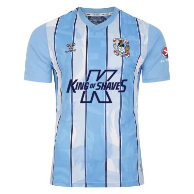
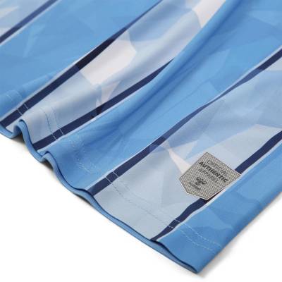
Coventry City have unveiled their new home kit for the 2023/24 season, marking a return to stripes for the Sky Blues.

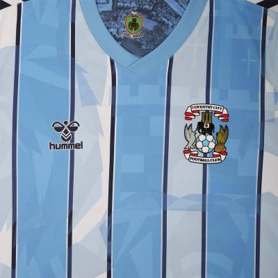
In collaboration with hummel, this season's home kit draws inspiration from the club's renowned crest, incorporating various elements onto the front of the shirt.

The shirt proudly features the emblematic elephant, which is prominently displayed on both the crest and the city's coat of arms.

Additionally, the kit showcases the mythical Phoenix bird, symbolising Coventry's resilience and rebirth after the destruction of World War II.

cfs Christmas Jumpers 10

Another notable symbol is the Eagle, harkening back to Coventry's ancient history as the emblem of Leofric, Earl of Mercia, and husband of Lady Godiva.

Inside the neckline, a special tribute is paid to the club's 140th anniversary in August, while the traditional civic crest of the City is prominently displayed. This civic crest was worn by the club's players at the beginning of the last century.

The front of the shirt proudly features the logo of Coventry City's new principal partner and front-of-shirt sponsor, King of Shaves.

View the: Coventry City 2023-24 Away Kit

View the: Coventry City 2023-24 Third Kit


5.4
98 ratings
Vote now!
  • 37
  • 24
  • 11
  • 15
  • 5
  • 4
  • 2
Tommy Hutchinson
 · 2 years ago
Comment (Not Required)
A big fat mess.
Show more
Razza
 · 2 years ago
Comment (Not Required)
Coventry have been blessed with some gorgeous Hummel kits the past couple of seasons. Absolute bangers. And Hummel have done some stunners this year for other sides. This however is a stinker
Show more
Matt
 · 2 years ago
Comment (Not Required)
It's so average that it's actually a surprise that Hummel didn't deliver something outstanding.
Show more
Sky Blue Dave
 · 2 years ago
Comment (Not Required)
Average. Was really looking forward to this after the kits Hummel have been producing recently. This really disappoints.
Show more
JK
 · 2 years ago
Comment (Not Required)
Plain back loses points
Show more
Smallhausen
 · 2 years ago
Comment (Not Required)
Very 1987.
Show more
JohnnyH
 · 2 years ago
Comment (Not Required)
It's nice, but the Hummel logo not sitting centrally to the stripes really messes with my OCD! Argh.
Show more
  • Me 2 years ago
    You have no idea what OCD is, do you?
    • JohnnyH 2 years ago
      I suggest you look into symmetry and ordering OCD. Enjoy your reading and have a nice day friend.
    • Tom Bola 2 years ago
      It's a perfectly rational comment. I find the asymmetrical positioning of the Hummel badge ****** annoying too.
Get Shirty
 · 2 years ago
Comment (Not Required)
Sorry but decidedly average, look forward to seeing what Hummel produce for Coventry, normally something special but in my opinion this is very average.
Show more
  • Billy King 2 years ago
    I agree
Christian
 · 2 years ago
Comment (Not Required)
Hummel with yet another masterpiece!
Show more
Lennie Briscoe
 · 2 years ago
Show more