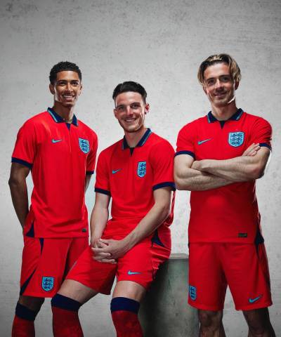
England 2022-23 Nike Away Kit

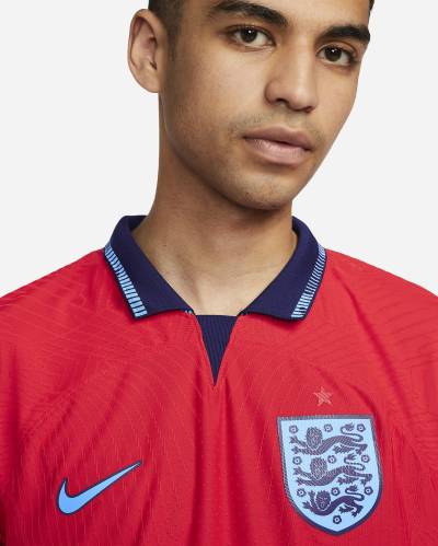
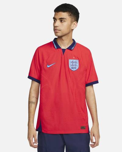
This is the new England Away shirt for the 2022 World Cup in Qatar.

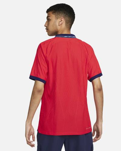
In “Challenge Red” with “Blue Void” and “Blue Fury”, the 2022-23 Nike design for the Three Lions seemingly nods heavily to the Umbro primary-change release taken to the Italia ’90 World Cup 32 years ago.

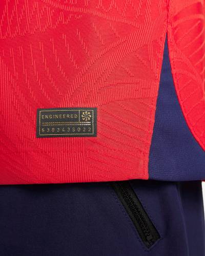
The two tones of blue are used in tandem on the crest, the US manufacturer’s “Swoosh” logo and the collar, while the cuffs and the inserts on the hem are just in the darker shade.

Sign in or create an account to earn points for voting, keep track of your reviews, edit them, and more.

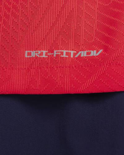
The shirt, which includes an elaborate, performance technology-filled jacquard/knit, will be combined, if called upon, with red shorts and socks to form a nominally single-coloured kit.

 

2.9
77 ratings
Vote now!
  • 12
  • 4
  • 6
  • 7
  • 9
  • 13
  • 26
Scotland
 · 2 years ago
Comment (Not Required)
Exceptionally awful.
Show more
Cart Horse
 · 2 years ago
Comment (Not Required)
The collar looks good and the shirt colour is ok. It’s better than the home shirt, just a pity is on a ****ty Nike template that we’ve all seen so many times before over the past 3 years. It’s like they came up with an ok concept, then gave up part way through.

Not sure why the badge is blue either.
Show more
  • Tom 2 years ago
    Who over the last 3 years has used that template ?
Johnino
 · 2 years ago
Comment (Not Required)
Terrible!
Show more
A Burton
 · 2 years ago
Comment (Not Required)
Only marginally better than the home disgrace. Looked almost pink on tv on monday night. The sky blue (the actual name) numbers dont show well and must be difficult for the colour blind to pick out. All in all another poor effort from Nike
Show more
Colin Hunt
 · 2 years ago
Comment (Not Required)
You can't change the colour of the badge to blue. That's tihsllud. Change all the sky blue to white and its fine.

These kits are basically designed to get people angry! I think they will scrap these and change to new kits and say 'look we listened, now buy this one too'
Show more
  • Aaron 2 years ago
    Shut up you whinging ****
Matt
 · 2 years ago
Comment (Not Required)
Like others have commented the fact that it isn't an original design makes this one such a letdown. It makes me angry that it is so blatantly a copy of a much respected kit and that Nike, whilst aiming for a fresh take on it, have missed an open goal.
Show more
UTT
 · 2 years ago
Comment (Not Required)
Better than the home shirt, but please bin off Nike and bring back Umbro.
Show more
Ron
 · 2 years ago
Comment (Not Required)
Can't really understand all the criticism . If it had an Umbro diamond instead of a Nike swoosh everyone would be praising it . It looks similar to the 1992 shirt and that was popular. My main gripe is what's with the red shorts ?
Show more
Jamie
 · 2 years ago
Comment (Not Required)
Billions of dollars worth of engineered tech fabrics and a collar that looks like it was sewn on by a middle school student in home economics. It's awful and somehow better than the USA kit.
Show more
Jim
 · 2 years ago
Comment (Not Required)
'Orrible; pretty tricky to mess up a red England away kit but they nailed it.
Show more