Everton 24/25 Castore Away Kit

Everton 24/25 Castore Away Kit

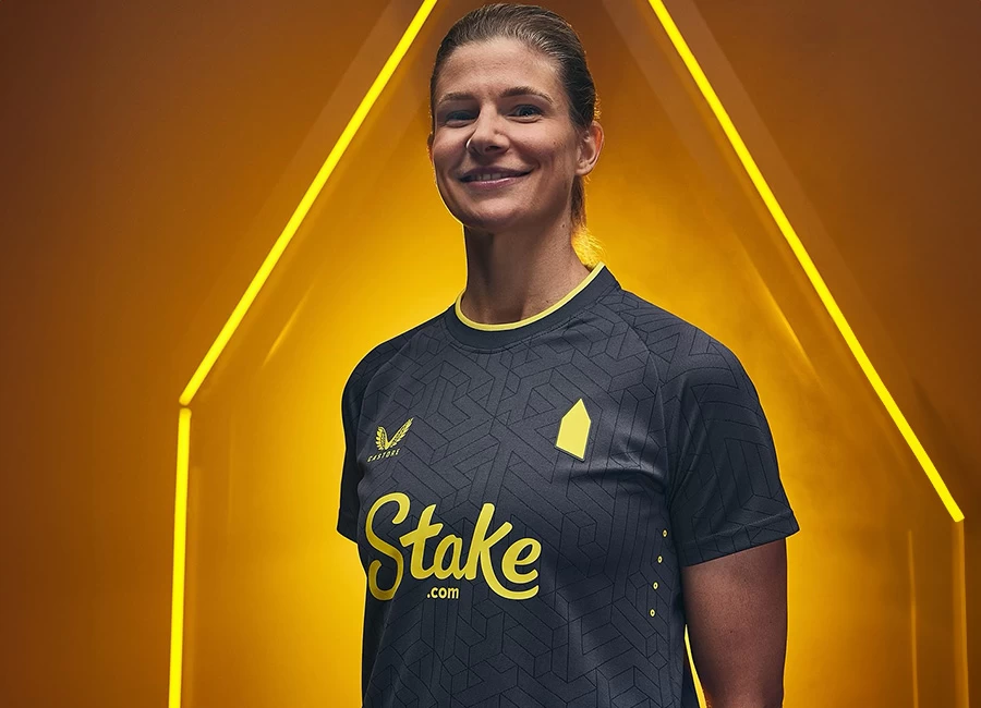
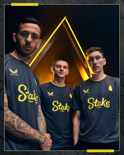
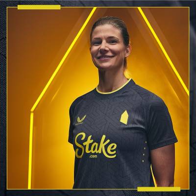
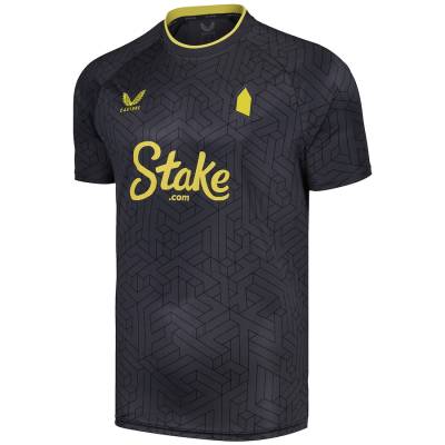
This is the new Castore Everton Football Club 24-25 Away shirt.

The 2024-25 secondary release for the Toffees - the first with their latest supplier - is in black (greyscale) with yellow trim and detailing, including the Prince Rupert’s Tower silhouette in place of the standard crest.

There is a geometric/isometric pattern and the styling of this design - which extends to the matching shorts and socks that complete the kit - is intended to refer to floodlit matches at the outgoing Goodison Park home ground in its final season.

Sign in or create an account to earn points for voting, keep track of your reviews, edit them, and more.

View the: Everton 24/25 Home Kit

View the: Everton 24/25 Third Kit


2.2
78 ratings
Vote now!
  • 4
  • 2
  • 3
  • 13
  • 6
  • 16
  • 34
i like football shirts
  • Member
  • 75
  • 4
  • 60
 · 4 months ago
Comment (Not Required)
Ah, the return of the weird pentagon thing that looks nothing like the tower in their badge. Awful because of that alone.
Show more
Razza
 · 4 months ago
Comment (Not Required)
Castore rubbish. Standard
Show more
Brett Simons
 · 4 months ago
Comment (Not Required)
Do not mind the kit too much.
The so called crest just drags it right down.
Show more
Sleeping Giants
 · 4 months ago
Comment (Not Required)
Whoever designed that badge for everton should be kicked out of town... to add insult to injury they got castore this season . Still,, good luck to em , cos ive time for their manager ..
Show more
Pat Custard
 · 4 months ago
Comment (Not Required)
That's terrible.
Show more
Baron von Tibzee
 · 4 months ago
Comment (Not Required)
Poor effort, would be better as a v neck and should have the club badge on it. Shame about the sponsor too, why can’t we have a decent amber shirt with blue shorts for our last season at the old Lady.
Show more
Stan
 · 4 months ago
Comment (Not Required)
Dear God 😱 WTF have they done! It would be a straight no anyway for being black but to do that the the club badge is a major **** up, looks horrendously bad
Show more
bobbin on the jobbin
 · 4 months ago
Comment (Not Required)
Is this some kind of Joke?
Show more
B
 · 4 months ago
Comment (Not Required)
Stake FC, I understand clubs are taking an element of their crest and using it as a badge, but this is just a kindergarten shape that resembles nothing to someone who doesn’t know the club
Show more
Matt
 · 4 months ago
Comment (Not Required)
Castore seem to think that using an all over shadow pattern makes up for the lack of actual design on almost all their shirts.
They seem to do this frequently.
It wouldn't be a bad idea if they tried to incorporate something that stood out.
Show more