Galatasaray 2022/23 Nike Home Kit

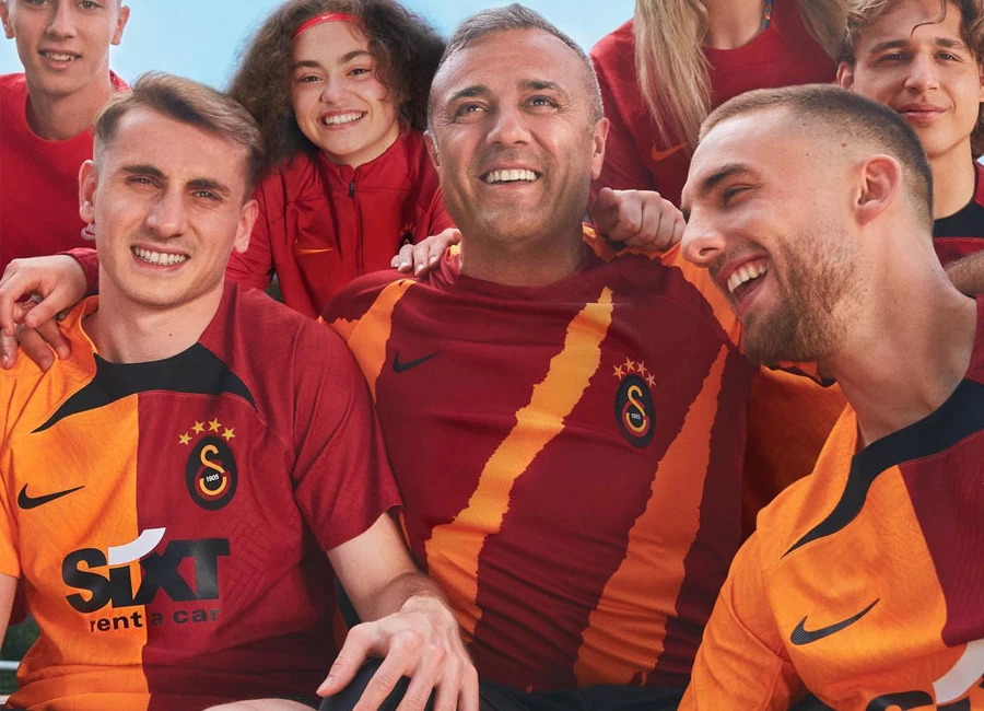
The new Home shirt of Turkish football giants Galatasaray Spor Kulübü has been revealed.

The 2022-23 design is in red and yellow halves - the sleeves are alternate coloured too - with the backing to the full-colour crest in black, matching the panel just below the neck (or the crew neck on the fan version).

Placed centrally is the logo of “SIXT Rent a Car” and the reverse of the trunk is plain yellow - topped with black again.

Sign in or create an account to earn points for voting, keep track of your reviews, edit them, and more.

Completing a kit which will be worn in the Istanbul side’s upcoming Süper Lig campaign, the shorts and socks are black, with the latter featuring “odd” turnovers/tops which replicate the halves of the shirt.


2.6
47 ratings
Vote now!
  • 6
  • 2
  • 2
  • 5
  • 3
  • 10
  • 19
dimisfinesthour
  • Member
  • 1641
  • 1
 · 2 years ago
Comment (Not Required)
Do halves on both sides of the kit or don't do them at all
Show more
Tayfun
 · 2 years ago
Comment (Not Required)
Great Club!
Great Jersey!
Show more
B
 · 2 years ago
Comment (Not Required)
Looks like a dropped Kebab
Show more
Matt
 · 2 years ago
Comment (Not Required)
Well, it just sums up how companies think they can treat us.
Let's have 15 home kits, 88 away, 105 GK shirts and 10,000 pre-match shirts and see who notices, change them all mid-season introduce a 'landmark celebration anniversary' shirt with ****s on and then f**k off back to HQ to design more and bleed us all dry with corporate overkill.
What a load of *****.
Show more
itzu1812
 · 2 years ago
Comment (Not Required)
usual gimmicks from Nike, sh*itting over every club's history, image, and fans alike, in pursue of their own branding. They are football's parasites
Show more
  • Jack 2 years ago
    Couldn't have put it better myself
Shay Hu
 · 2 years ago
Comment (Not Required)
Confusion all round!
Show more
Guest
 · 2 years ago
Comment (Not Required)
The black splodge on the front of the shirt is awful
Show more
Me
 · 2 years ago
Comment (Not Required)
The player version & fan version are two totally different designs! It's like the 'elite' get the fancy one, while the 'minions' get some dodgy knock off from the back of a catalogue
Show more
  • Catalogue of Erreas 2 years ago
    Sixty quid too!

    Fans of my club aren't best pleased we're switching from Adidas to Errea but I'm just thankful we're not switching to Nike!

    Con artists!
Tomarto
 · 2 years ago
Comment (Not Required)
There's 3 different kits there!!! Guy posing in round neck, guy in the middle with stripes and guy on the left with daggers coming off the round neck!!!!! Which one am i voting for!!!!!!
Show more
Goodbuytojane
 · 2 years ago
Comment (Not Required)
Pointless and bad
Show more