Inverness Caledonian Thistle 24/25 Puma Home Kit

Inverness Caledonian Thistle 24/25 Puma Home Kit

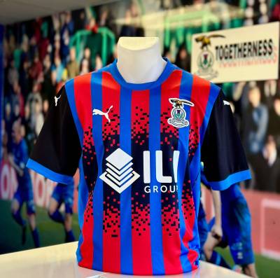
Inverness Caledonian Thistle have unveiled their new Puma home shirt for the 2024/25 season.

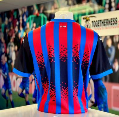
Celebrating the club's 30th anniversary, the design features blue and red stripes with black sleeves and a central black pixelated panel as a nod to the club's history. The shirt displays the Puma logo in white on the chest, matching the primary sponsorship, alongside the club crest in full colour.

Completing the kit, the shorts and socks are in blue with black accents and white detailing to tie in.

Sign in or create an account to earn points for voting, keep track of your reviews, edit them, and more.


3.3
94 ratings
Vote now!
  • 9
  • 8
  • 14
  • 12
  • 16
  • 12
  • 23
lukedeux
  • Member
  • 108
  • 33
 · 5 months ago
Comment (Not Required)
I'm not sure what they were going for here, but it feels like they've missed the mark. It just looks disjointed and sloppy.
Show more
i like football shirts
  • Member
  • 75
  • 4
  • 60
 · 5 months ago
Comment (Not Required)
An absolute mess.
Show more
Not impressed
 · 5 months ago
Comment (Not Required)
"In order to celebrate our 30th annuversary let's design a mess of a shirt featuring lots of black, a colour that has nothing to do with the club's tradition eiher pre or post-merger."
Show more
Ok
 · 5 months ago
Comment (Not Required)
Terrible kit for a terrible team. Bankruptcy is calling.
Show more
Cullen Skunk
 · 5 months ago
Comment (Not Required)
Really bad, almost makes tartan look good
Show more
LukeDeux
 · 5 months ago
Comment (Not Required)
Like the trim on the collar nice bit of tailoring . Bit taken a back by the central black design seems a bit OTT . still i think the Inverness Caledonian Thistle supporters will be pleased with this new seasons offering , and i expect this kit would be a great addition to ones wardrobe.
Show more
CSD
 · 5 months ago
Comment (Not Required)
Inverness' shirts have been pretty bad over the past decade or so, but this one might be the worst yet.
Show more
  • CSD 5 months ago
    D E C A D E

    🧐
Matt
 · 5 months ago
Comment (Not Required)
Don't mind this one, looks good.
Show more
Matt
 · 5 months ago
Comment (Not Required)
Not great at all.
Show more
Waldschrat
 · 5 months ago
Comment (Not Required)
Don't like the pixel effect, but do very much appreciate the addition of black to their shirt. Red, blue and black is a very original colour scheme.
Show more