Manchester City 2022-23 Puma Home Kit

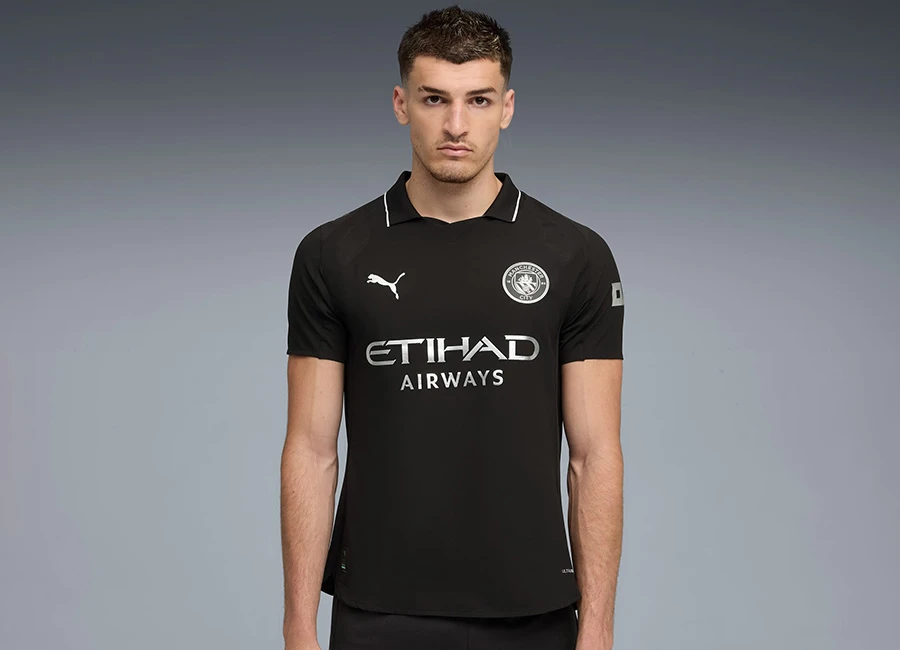
Manchester City revealed their new 22/23 Home football kit by Puma.

Celebrating iconic teams of the past and Club legend Colin Bell, the new kit takes its inspiration from the fearless City teams of the late 1960s - but also from the man the fans nicknamed 'Colin the King'.

The new 2022/23 home kit echoes the classic designs of the past, placing the Club crest at the centre of the light blue jersey with signature maroon trims on the sleeve cuffs.

Sign in or create an account to earn points for voting, keep track of your reviews, edit them, and more.

The crown logo placed inside the neckline pays tribute to ‘Colin the King’.

One of City’s greatest ever players, Bell was inspirational for the Club for a decade and in 1967/68, he was the driving force in a side that won its first league title in 31 years.

As one of City’s biggest icons, the new home kit pays tribute to Bell and the City sides of that era.

The authentic jersey features ULTRAWEAVE performance fabric and dryCELL sweat-wicking technology, making the jersey the lightest PUMA has ever made.

View the: Manchester City 2022-23 Away Kit

View the: Manchester City 2022-23 Third Kit


4.3
140 ratings
Vote now!
  • 38
  • 21
  • 20
  • 12
  • 17
  • 14
  • 18
dimisfinesthour
  • Member
  • 1641
  • 1
 · 2 years ago
Comment (Not Required)
Shame the collar doesn't run all the way through...
Show more
Tony Urmston
 · 2 years ago
Comment (Not Required)
Nice collar. Too much central alignment of badge, puma and sponsor. Like a kid in Word centrally aligning all their typing. Should they actually write four lines.
Show more
B
 · 2 years ago
Comment (Not Required)
It's OK, not that good but OK
Show more
he67dge
 · 2 years ago
Comment (Not Required)
coolio
Show more
Mr Han
 · 2 years ago
Comment (Not Required)
Nothing special
Show more
itzu1812
 · 2 years ago
Comment (Not Required)
I do like, it's a bit simple but works.
Show more
Waldschrat
 · 2 years ago
Comment (Not Required)
Not bad, elegant and smooth, but with slight flaws. Collar is a bit awkward, a simple round collar would have been better. Crest placement is debatable, vintage look intended, but it just doesn't look right.

What I am missing (again) is any hint what shorts and socks will look like. A kit consists of shirt, shorts and socks, and the overall look cannot be judged without the latter two.
Show more
arvedui
 · 2 years ago
Comment (Not Required)
Puma's kits more often than not look quite peculiar. And not in a good way,
Show more
IFYM
 · 2 years ago
Comment (Not Required)
Have to say this is sensational
Show more
Hat Shoe
 · 2 years ago
Comment (Not Required)
A nice design ruined by the central Puma logo and as always ugly money grabbing sponsor.
Show more