Join our community

Manchester United 2023-24 Adidas Home Kit

Manchester United 2023-24 Adidas Home Kit

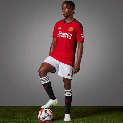
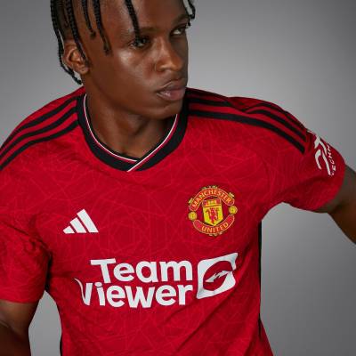
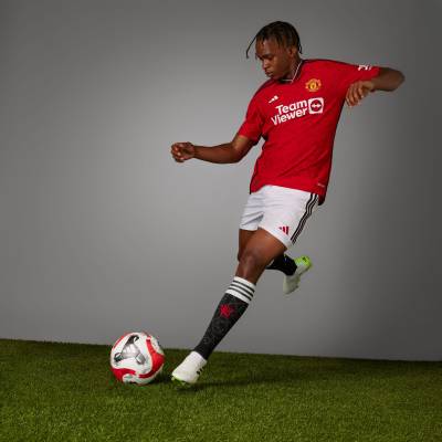
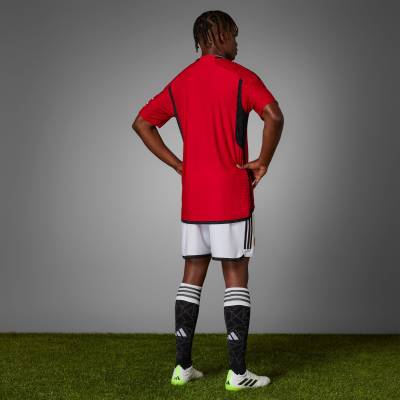
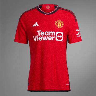
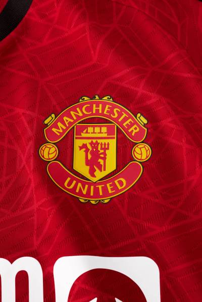
Manchester United and adidas have revealed their new home kit for the upcoming 2023/24 season, which celebrates the deep connection between the city and its rich industrial heritage.

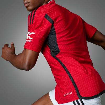
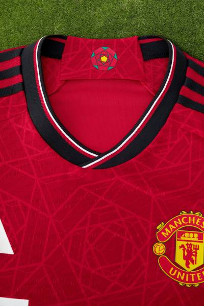
The kit pays tribute to Manchester's iconic red rose through a geometric design, while drawing inspiration from the bridge over the River Irwell that links Manchester and Salford. This bridge symbolises the city's resilience and its significant role in the industrial revolution that shaped the world.

The jersey is predominantly red and features striking black detailing on the shoulders, along with a red, white, and black striped flat-knit crew neck collar.

Sign in or create an account to earn points for voting, keep track of your reviews, edit them, and more.

View the: Manchester United 2023-24 Away Kit

View the: Manchester United 2023-24 Third Kit


4.6
146 ratings
Vote now!
  • 37
  • 34
  • 23
  • 14
  • 9
  • 7
  • 22
Masterpiece
Michael Rosen
 · 1 year ago
Noice
Show more
Above Average
SL
 · 1 year ago
It's nice, but I prefer United with white accents not black. The geometric rose design is a bit much too
Show more
  • White is better 1 year ago
    White is better and stronger than black so I agree with you.
    • Blinded by the edge 1 year ago
      You must be the edgiest edgelord in year 6.
    • Harry Paboiled 1 year ago
      @Rolf Berlingo I didn't realise decades as in denominations of 10 years was a rude word?
    • Rolf Berlingo 1 year ago
      @Riberto O'Feeling You are so right. The shorts offend me the most. Pure white and so proud. Don't they know what their kind did to millions of people over the decades? Or do they chose to forget? Just remember how both World Wars started and get these shorts redesigned before it's too late.
Good
Alex
 · 1 year ago
Good
Show more
Below Average
Ted Edwards
 · 1 year ago
Am improvement on last season’s offering. I personally can’t see what all the fuss is about when some on here describe the shade of red as being too masculine? Glad to see our club emblem back without that ridiculous border incorporated, as with last seasons design. Actually preferred the white edging as opposed to the predominantly black including the Adidas shoulder stripes.
Show more
  • Jonathan Moore 1 year ago
    They’re being trolls and hope people take the bait that’s all.
    • Shenlock Mugabe 1 year ago
      It's not trolling. It's taking the p*** regarding what people think about football kits.
Above Average
Johnino
 · 1 year ago
Better than usual for adidas. Has a vintage vibe about it. Black trim is also a winner.
Show more
Bad
Evan (she/her)
 · 1 year ago
Very offensive. Overtly masculine and toxic. The color scheme will trigger generational trauma in the players who are ethnic. I gave it 2 stars because they have a minority model.
Show more
  • Shenlock Mugabe 1 year ago
    You are so right. I'm going to shave my eyebrows off in protest.
Good
NaplesBrit
 · 1 year ago
Best effort in years.
Show more
Average
Mark
 · 1 year ago
Mediocre kit for a mediocre club.
Show more
Good
Scott
 · 1 year ago
At the end of the day the shirt is good and very wearable for the average United fan. Best in a while, nice retro collar. As usual would be nicer sponsorless but thats life...
Show more
Average
Red Cyril
 · 1 year ago
The stripe on the shorts and top of the socks would look better in red. Usual corporate stuff for MU though!
Show more
No results

Loading...