Join our community

Manchester United 24/25 Adidas Home Kit

Manchester United 24/25 Adidas Home Kit

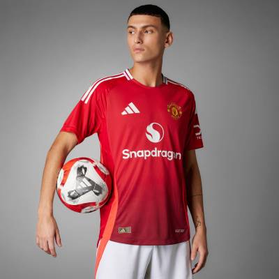
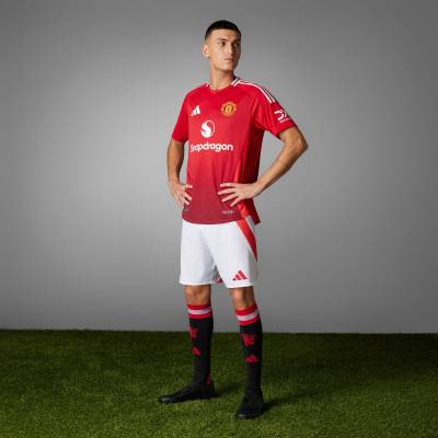
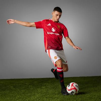
Manchester United and adidas have launched their new home kit for the 2024/25 season.

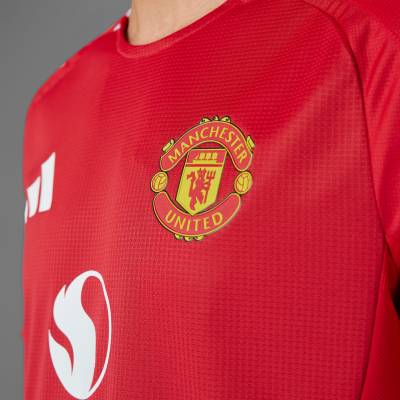
The new kit stands out under Old Trafford's lights with its array of red shades, creating a unique glow effect. Inspired by the 1952 Busby Babes shirt, which used reflective materials for better visibility under floodlights, the design features a gradient of red hues from light to dark down the shirt's body.

A striking flame-like red insert, a new colour for a Manchester United home kit, runs down the side panel of the shirt and shorts, adding a dynamic element against the stadium backdrop. The look is finished with a seasonal crew neck and contrasting white elements, including the adidas three-stripes, the adidas logo, and the logo of the new principal partner, Snapdragon.

Sign in or create an account to earn points for voting, keep track of your reviews, edit them, and more.

The black socks accompanying the kit feature a red devil sign-off, paying homage to the club’s rich heritage.

View the: Manchester United 24/25 Away Kit

View the: Manchester United 24/25 Third Kit

Load More


3.1
188 ratings
Vote now!
  • 21
  • 10
  • 18
  • 34
  • 27
  • 25
  • 53
Bad
Shaun
 · 9 months ago
Top of the kit looks nice, then you get to the fade and the orange-ish stripes and it ruins it really. Could have been clean
Show more
Hall of Shame
Simon Templer
 · 9 months ago
Adidas putting out some poor efforts this season
Show more
Below Average
Dec
 · 9 months ago
Poor adidas template to start with.
A weak effort.
Show more
Average
Russel1311
 · 9 months ago
This one’s been leaked for so long it already feels old
Show more
Hall of Shame
Get Shirty
 · 9 months ago
Missed opportunity, one shade of red, great, this is a mess,
Show more
Below Average
Sobby Ntyles
 · 9 months ago
Way too much going on. Could have been good but it isn't.
Show more
Average
UTT
 · 9 months ago
Like the collar and the shoulder stripes, but there's too much going on with the fade + the orange/fluro red. I'd have just gone with one of those as a detail.
Show more
Good
NaplesBrit
 · 9 months ago
I quite like it. Subtle and not over fussy. I think it’s a grower.
Show more
Below Average
Ropers
 · 9 months ago
It’s fairly innocuous but I don’t like the collar or (lack of).
Show more
Hall of Shame
PNH
 · 9 months ago
Poor
Show more

People

Nature

Symbols

Food

Flags