Middlesbrough 2022-23 Errea Home Kit

Middlesbrough have revealed their new home kit for the 22/23 season.

The traditional red home shirt features a mandarin collar with white placket and buttons, with the signature white band extending to under the arms, the white band adorns the logo of principal partner unibet and on the reverse of the shirt bears the branding of club partner Host & Stay.

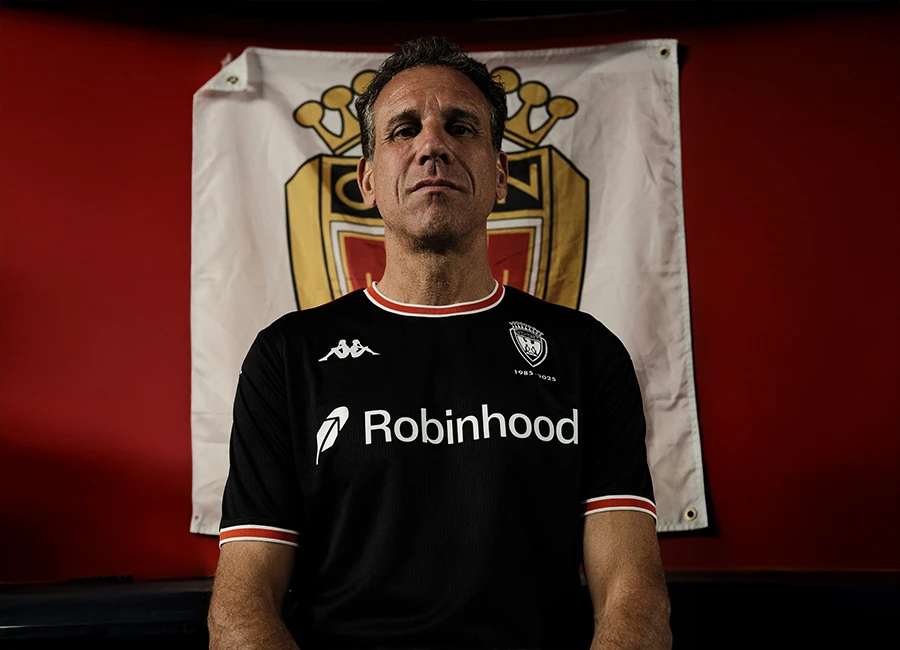
In homage to the club's return to Errea as Technical Kit Partner, Italian icon Fabrizio Ravanelli has taken up modelling duties - with countryman Massimo Maccarone to do the same for the away shirt which will be unveiled in the coming weeks.

View the: Middlesbrough 2022-23 Away Kit

cfs Christmas Jumpers 10

View the: Middlesbrough 2022-23 Third Kit


3.1
86 ratings
Vote now!
  • 7
  • 8
  • 7
  • 19
  • 12
  • 13
  • 20
Brett Simons
 · 3 years ago
Comment (Not Required)
Always liked the white band. Not liking the collar though.
Show more
Herborovore
 · 3 years ago
Comment (Not Required)
Would only buy this shirt without the sponsor (and if the badge is moved 1cm closer to the middle)
Show more
Cart Horse
 · 3 years ago
Comment (Not Required)
Not a Boro fan but will never forget his debut hat trick against Liverpool!
Show more
Manicmonk
 · 3 years ago
Comment (Not Required)
All my fears made true when we heard errea wherr returning and it looks like some league 1/2 style of shirt we look forward to seeing what the away looks like hope it dont resemble a non league style ?
Show more
Ravanelli’s Love Monkey
 · 3 years ago
Comment (Not Required)
Nice simple traditional kit and bonus points for getting one of their legends to model it
Show more
Snorkie
 · 3 years ago
Comment (Not Required)
No disrespect to Ravanelli, but the shirt looks better without him modelling it. As previously mentioned, the band is far too broad, side parts and crest.
Show more
Steve Gorman
 · 3 years ago
Comment (Not Required)
Its brutal I do not know of 1 Boro fan that likes it, looks cheap will be cheap apart from the price and we always miss a trick when it comes to our kits. The amount of amazing concept Boro kits I have seen recently all top this disaster. I just wish Boro would wake up and sort it out and actually get the fans on board do a competition or something
Show more
Dean
 · 3 years ago
Comment (Not Required)
Awful gambling sponsor, which is the first thing you notice because it’s in massive black letters. Looks like a Unibet FC shirt.

Also the Middlesbrough crest is too close to the armpit. Dreadful.
Show more
Matt
 · 3 years ago
Comment (Not Required)
IMO the band is too high. With some careful placement and moved lower the sponsor wouldn't have looked so bad, If the band was that little bit more towards the centre of the shirt the sponsor wouldn't have had much attention to it.
I dislike the side parts that complete the band, they are just not needed.
Show more
Big Alan
 · 3 years ago
Comment (Not Required)
Garbage
Show more