Middlesbrough 2023-24 Errea Away Kit

Middlesbrough 2023-24 Errea Away Kit

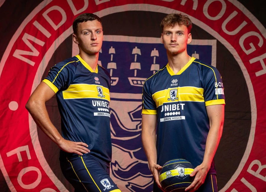
Middlesbrough's new away shirt for the 23/24 season, designed by Errea Sport, has been unveiled.

The shirt features a bold blue colour with a vibrant yellow stripe and trim. The Middlesbrough town crest, with its motto 'Erimus', is proudly displayed on the inside of the collar.

On the front of the shirt, the principal partners Unibet, part of the Kindred Group, have their logo prominently showcased. Additionally, BOXT is the sleeve and shorts partner for this season.

View the: Middlesbrough 2023-24 Home Kit

cfs Christmas Jumpers 10


5.2
88 ratings
Vote now!
  • 36
  • 17
  • 12
  • 7
  • 8
  • 2
  • 6
Guest
 · 2 years ago
Comment (Not Required)
Chap on the left of the first picture, he's a little teapot short and stout, I know this because I can see his handle.
Show more
  • Mr Humphries 2 years ago
    and where's his spout?
    • Guest 2 years ago
      in the usual place
Razza
 · 2 years ago
Comment (Not Required)
So much better than the awful Boro home kit
Show more
Phat Mike
 · 2 years ago
Comment (Not Required)
this kit leave me cold tbh. the club badge looks terrible, but then I've thought that for years.. need to go back to the circle 1986 badge imo.
The sponsor looks very bad on this too. Also, the Boca Juniors style feels very random.
Show more
Brett Simons
 · 2 years ago
Comment (Not Required)
Like it.
Show more
Scott
 · 2 years ago
Comment (Not Required)
Good. Very Italian looking. Bit Verona-esque too. Nice.
Show more
Tom
 · 2 years ago
Comment (Not Required)
Could have been a great kit but it's ruined by having the crest and manufacturer in central position.
Show more
Jophda
 · 2 years ago
Comment (Not Required)
Rubbish kit, bad colours unlike boro and **** looking design too.
Show more
  • Jophda 2 years ago
    How is n a f f on the swear filter this is crazy ?
Leigh
 · 2 years ago
Comment (Not Required)
This is the best away shirt Ive seen so far for the 23/24 season. The colours are fantastic and I like the placing of the badge in the middle of the yellow stripe as it really stands out.
Show more
  • Cart Horse 2 years ago
    Agreed.
Comment (Not Required)
Best shirt I've seen so far, beautiful. Shame about their home shirt, which is the worst I've seen. From the ridiculous to the sublime.
Show more
48
 · 2 years ago
Comment (Not Required)
Smart class
Show more