Netherlands 2022-23 Nike Home Kit

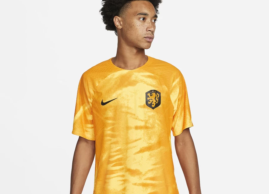
This is the Netherlands Home kit which will feature at this year’s Qatar 2022 World Cup.

The design, giving off a lighter orange - or “Laser Orange” - look, features an almost “tie-dye” effect which is overlaid with supplier Nike’s black “Swoosh” logo and the national-team crest - also in black and orange.

View the: Netherlands 2022-23 Away Kit

Sign in or create an account to earn points for voting, keep track of your reviews, edit them, and more.

Black is also used in trim and the 22/23 shirt will be combined with (plain) shorts and socks to form a nominally single-coloured kit as first choice.


1.6
105 ratings
Vote now!
  • 6
  • 3
  • 2
  • 6
  • 3
  • 7
  • 78
dimisfinesthour
  • Member
  • 1641
  • 1
 · 2 years ago
Comment (Not Required)
is it supposed to look like that lol
Show more
Dirk Gardiner
 · 2 years ago
Comment (Not Required)
It looks really bad. Why change a winning colour?
Show more
JH
 · 2 years ago
Comment (Not Required)
Surely this is a crime in the Netherlands.
Show more
Comment (Not Required)
Hideous, Hideous,Hideous, no black or white shorts, yellow in stead of ORANGE. Why that ugly shine effect???? opposite of Calvinistisch. So they have a good cjance to win the final, see 1988.
Show more
Bob
 · 2 years ago
Comment (Not Required)
Wrong totally wrong
Show more
WWB
 · 2 years ago
Comment (Not Required)
peeled mango
Show more
PNH
 · 2 years ago
Comment (Not Required)
The colour is just so wrong. What would anybody in Nike or anywhere think this is a good idea? For the Dutch kit the colour is a far stronger brand than any kit manufacturer's
Show more
stan
 · 2 years ago
Comment (Not Required)
This is like the colour orange from Wish or something
Show more
Matthew Ward
 · 2 years ago
Comment (Not Required)
Terrible. It’s not even the right colour. If I was Dutch I’d not be very happy. Hope it looks much better in person
Show more
Faccehtti_68
 · 2 years ago
Comment (Not Required)
Hahahaha!!!
Show more