West Ham United 2023-24 Umbro Home Kit

West Ham United 2023-24 Umbro Home Kit

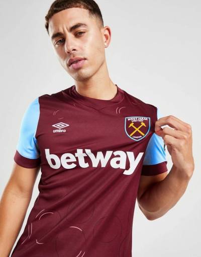
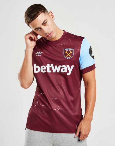
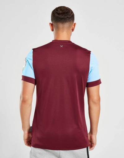
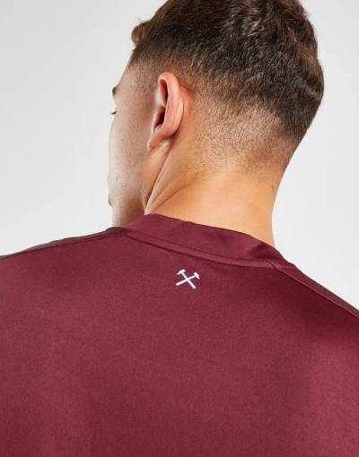
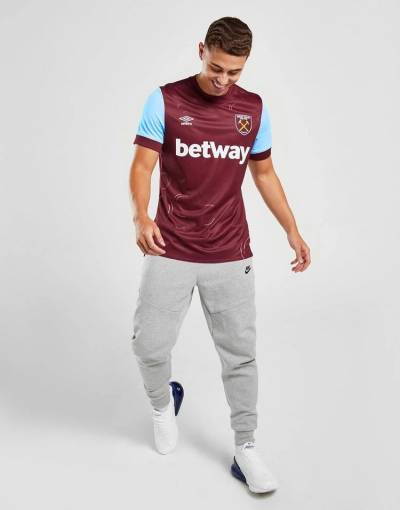
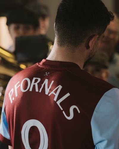
West Ham United have revealed their new Umbro 2023/24 Home (Anthem) Kit.

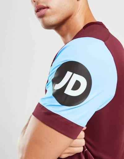
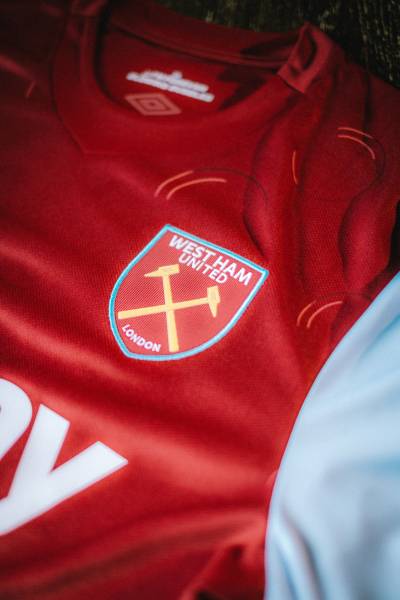
The Home Kit for the upcoming season retains the Club's iconic claret body with blue sleeves, but this time, it comes with a unique touch on the front of each shirt.

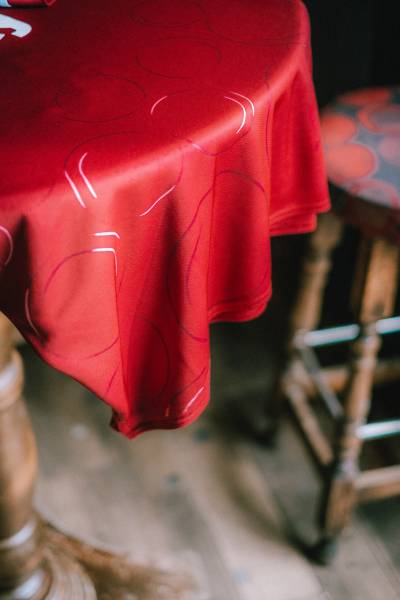
A distinct Bubbles pattern is intricately woven throughout the shirt, celebrating the cherished role of their beloved anthem, 'I'm Forever Blowing Bubbles,' in their rich heritage.

Sign in or create an account to earn points for voting, keep track of your reviews, edit them, and more.

View the: West Ham United 2023-24 Away Kit

View the: West Ham United 2023-24 Third Kit


4.0
95 ratings
Vote now!
  • 10
  • 13
  • 26
  • 15
  • 11
  • 10
  • 10
Yourmum12345
 · 7 months ago
Comment (Not Required)
Not a good kit. Best thing about it is the colours + shorts and socks. Seen a couole comments saying the shorts and socks are the "wrong" colour, dont know why west ham fans are so obsessed with seeing the same shirt, shorts, and sock combination every year. The shorts and socks look good, the shirt is the issue, especially those bubbles. Bog standard, lazy ass design. Quite literally a claret top with blue sleeves and some bubbles on it and nothing more. Both the home and away kit this year are worse than last year.
Show more
Leonardbrit
 · 1 year ago
Comment (Not Required)
Opting for a research paper writing service was a strategic move that profoundly impacted my college journey. The college paper writing service I selected adeptly balanced affordability with top-tier quality. This do my paper not only met but exceeded my academic expectations while staying within my budget. For those seeking a reliable and budget-friendly solution, I wholeheartedly endorse this do my paper service. It has consistently proven to be a trustworthy ally, delivering academic assistance that upholds excellence without compromising financial practicality.
Show more
Your name
 · 1 year ago
Comment (Not Required)
The bubbles design is a bit gimmicky 🫧
Show more
Pep
 · 1 year ago
Comment (Not Required)
Bubbles don’t blow me away 🍩
Show more
Guest
 · 1 year ago
Comment (Not Required)
Screams of Burnley with random circles
Show more
bennykill
 · 1 year ago
Comment (Not Required)
shirt is OK. but the shorts are the wrong colour and the less said about the socks the better
Show more
PsychoWarthog
 · 1 year ago
Comment (Not Required)
I gauge every Irons kit against the 1980-83 adidas effort. Claret is a decent shade but the bubbles look popped in many cases, not an apt metaphor. Please have white shorts and socks.
Show more
Luton MiG
 · 1 year ago
Comment (Not Required)
Tidy shirt, shame the sponsor fukks it up. Betting sponsors are sh1te anyway.

Forza Timmy Breaker!
Show more
CSD
 · 1 year ago
Comment (Not Required)
Those don't look like bubbles .. the shirt otherwise is fine.
Show more
UTV !
 · 1 year ago
Comment (Not Required)
Those are supposed to be bubbles ???πŸ˜‚πŸ˜‚πŸ˜‚
Show more