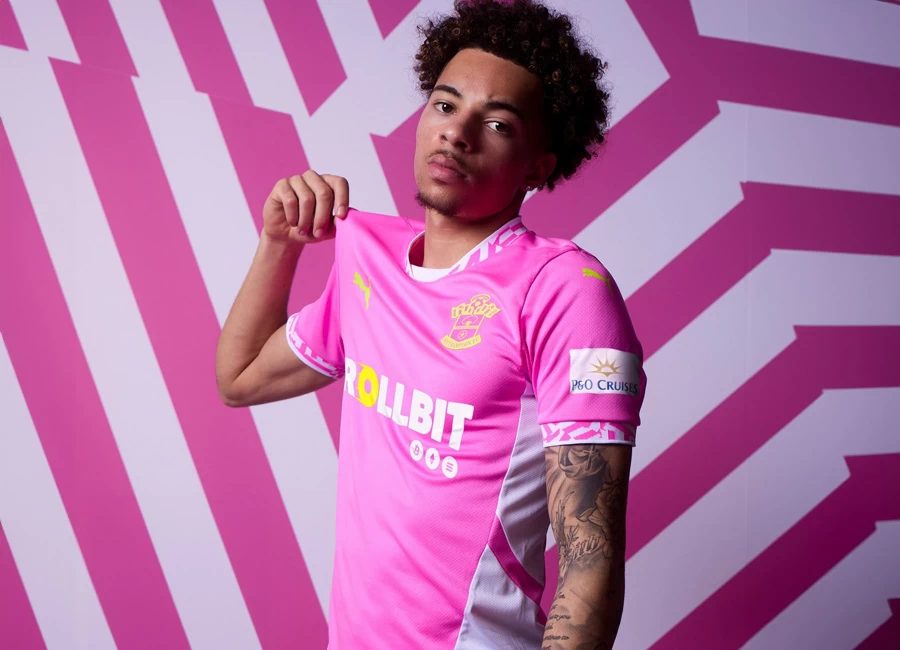
Orlando Pirates 17/18 Adidas Home Kit

Orlando Pirates launched their new Adidas home kit for the 2017/18 PSL season.

A version of the one players wear when defending their home Parktown pitch, it features traditional colours and an updated design.

Sign in or create an account to earn points for voting, keep track of your reviews, edit them, and more.


Write comments...
You are a guest ( Sign Up ? )
or post as a guest
Loading comment... The comment will be refreshed after 00:00.
  • This commment is unpublished.
    nwg · 7 years ago
    @Bob24 It looks just the same ..only difference is that it's tight fitting not footed like an xxxl
  • This commment is unpublished.
    Bob24 · 7 years ago
    I hated this design back in the 90s because the kits looked so poorly designed and poorly made. Here though, I think it works very well, probably because the material is of much better quality and fit. That said, it would be terrible if Adidas went in this direction again over the next few years, just like Nike have with their current uninspiring universal template.
  • This commment is unpublished.
    konstphoto · 7 years ago
    Looks like I'm in the minority here, but I'm not a fan of what is essentially just a huge adidas logo on the shoulder. Imagine the Nike swoosh or the Puma cat that size - it would look awful. Would rather not go there.
  • This commment is unpublished.
    Souness · 7 years ago
    Didn't we see these designs back in the early 1990s?
  • This commment is unpublished.
    Stone · 7 years ago
    I really like it, but it also depends on no other teams having the same design. If so, it dramatically reduces the coolness and retro factor.
  • This commment is unpublished.
    nwg · 7 years ago
    @nwg Fitted**
  • This commment is unpublished.
    Cathal Brew · 7 years ago
    What a rubbish kit.should say crown paints on it..
    Reminds me of the days Adidas and it's original trefoil came to an end and they started to use the 'current' Adidas equipment logo in the early 90s with this crappy design above ..
  • This commment is unpublished.
    Johnny boy 45 · 7 years ago
    Like USA 94' all over again!!
  • This commment is unpublished.
    Nick · 7 years ago
    @konstphoto How can you use a completely different logo as a argument? So what if a Nike tick looks out of place on the shoulder? Completely irrelevant as the two share only one thing in common, their TA. It's as if you are angry adidas have done this because Nike can't copy them.
  • This commment is unpublished.
    Master · 7 years ago
    Haha some delusional comments here. Utterly poor design, bland, and asthetically innacurate. You can do better Adidas.
  • This commment is unpublished.
    oj9j9u · 7 years ago
    That is utterly magnificent. More of this style please.
  • This commment is unpublished.
    Wessex · 7 years ago
    A reworking of the 90s strips...looks good.
  • This commment is unpublished.
    Russel1311 · 7 years ago
    So it's official: adidas are out of ideas. If they wanted to make this really authentic they should have made it out of super shiny nylon and it should have been really wide and baggy.
  • This commment is unpublished.
    Laslow123 · 7 years ago
    You could look at this in 2 different way, 1: lazy, been there done that before or 2: Retro heaven, I'm 2 all the way, I love it, and it would be epic to see a few big name teams go back to the template, Marseilles last year with Adidas, why didn't they do this classic design like when the won the Champions League with that very style in 1993.
  • This commment is unpublished.
    SouzyLFC · 7 years ago
    Instant classic
  • This commment is unpublished.
    Stonesthrower · 7 years ago
    @Souness You're correct. I can remember the Rangers Adidas kit like this one, Russia and many more.