Barcelona 2020-21 Nike Third Kit

Barcelona 2020-21 Nike Third Kit #barca #fcbarcelona #nikefootball

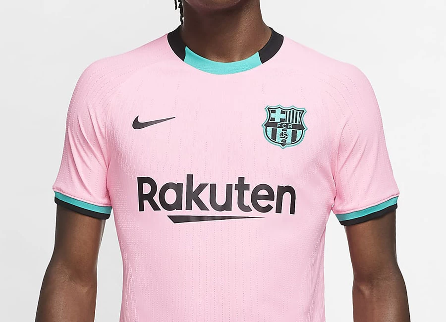
This is the new Barcelona Third kit by Nike. The kit is part of a wider Nike collection which celebrates jersey culture and the iconic Air Max archives.

FC Barcelona’s 2020-21 third kit is driven by the vibrant colours of the city and its famous beach.

The combination of pink and sea green conjures imagery of a Catalan sunrise, while both colours will evoke memories of much-loved past Barca kits.

Sign in or create an account to earn points for voting, keep track of your reviews, edit them, and more.


Write comments...
You are a guest ( Sign Up ? )
or post as a guest
Loading comment... The comment will be refreshed after 00:00.
  • This commment is unpublished.
    ads · 4 years ago
    nike are awful.
    Who decided on such a s*i*e colour scheme .
    Stick to baseball
  • This commment is unpublished.
    B721 · 4 years ago
    Hideous
  • This commment is unpublished.
    David L · 4 years ago
    It reminds me of Palermo....when they were in Serie A back in the day.
  • This commment is unpublished.
    j.futuristic · 4 years ago
    This is a really pretty kit but I'd prefer it one of the Italian clubs that Nike outfits--seems to have a distinct Italian feel to it to me
  • This commment is unpublished.
    Russel1311 · 4 years ago
    Don’t know about anyone else but I’m done with the football shirt releases that look like fashion shoots for JD Sports. What’s wrong with embarrassed looking players wearing the full kit and football boots in front of the main stand?
  • This commment is unpublished.
    Scintillating Simon · 4 years ago
    Now we know why Messi is staying...
    Amazing stuff here from Nike, how anyone can dis this is beyond me, shameful.
  • This commment is unpublished.
    Mariolino · 4 years ago
    I have lived in Barcelona for two years and I have never seen the city pink or teal in any scenario. Maybe they were high on something and they saw new, wonderful colours that no one else has ever seen. I don’t understand the need of creating a new colour combination that doesn’t exist in the heritage of a club and market them as “something cool”. It’s shameful, just like the FCB logo in those colours. Ridiculous.
4.5
1 rating
Vote now!
  • 0
  • 0
  • 1
  • 0
  • 0
  • 0
  • 0
j.futuristic
  • Member
  • 1
  • 28
 · 4 years ago
Comment (Not Required)
This is a really pretty kit but I'd prefer it one of the Italian clubs that Nike outfits--seems to have a distinct Italian feel to it to me
Show more
 · 2 years ago
Show more